

In contemporary luxury, a brand’s identity is not defined solely by its most explicit symbols but by a system in which print and materials help to cement and make its values memorable.
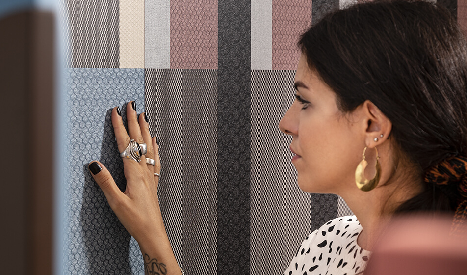
A pattern, a finish, the texture of a surface: these elements often make an impression even before the logo does. This is not merely an aesthetic matter but a system of signs that shapes perception, memory and desire, and which, in recent years, has extended its reach far beyond the product itself: a printed fabric, packaging, an invitation or a display all become strategies for brand identity. In this system, printing is not simply a reproduction technique: it is a tool through which an idea takes shape. But when does a surface cease to be mere decoration and become a language? What makes a pattern capable of standing the test of time and becoming a symbol? And what role do material, technique and mass production play in shaping desire? To understand this, we have brought together three voices: Giovanni Maria Conti, lecturer in Fashion Design at the Politecnico di Milano; Elena Salmistraro, designer and artist with a studio of the same name in Milan; and Valentina Ascione, co-founder of the Milan-based graphic design and art direction studio ascionemagro.
The blurred line between decorating and identifying
Not all surfaces are the same, even when they appear to serve the same purpose. There is a theoretical (but far from abstract) distinction between a surface that decorates and one that communicates identity. «The boundary is blurred: a decorative surface has a design, chromatic and geometric value; an identity-defining surface, on the other hand, becomes a true sign, with a semiotic function» explains Giovanni Maria Conti. «If I remove the LV logo from a product, recolour the Burberry pattern, or leave it in black and white, and the result remains recognisable, then the surface was already an identity-defining element. If it loses its meaning, it was merely decorative». For Conti, Bottega Veneta is the clearest example: the woven leather needs no monogram to be recognised. «Be careful», continues Conti, «not to confuse the logo with luxury. There are seasons when brands want the logo on display, others when they prefer the symbol to be embedded within the texture, but luxury is defined first and foremost by consistency: the same intention repeated across every surface the brand touches».
It is the same principle that Valentina Ascione articulates in terms of intentionality: «Rather than calling for a different kind of surface, luxury requires a surface that reflects its exclusivity». Customised papers, special finishes, complex treatments: printing can become a sensory experience, but the value does not lie in ostentation. «The true distinguishing feature is intentionality: every technical or material detail must be the result of a conscious design choice».
Mass production is not a flaw
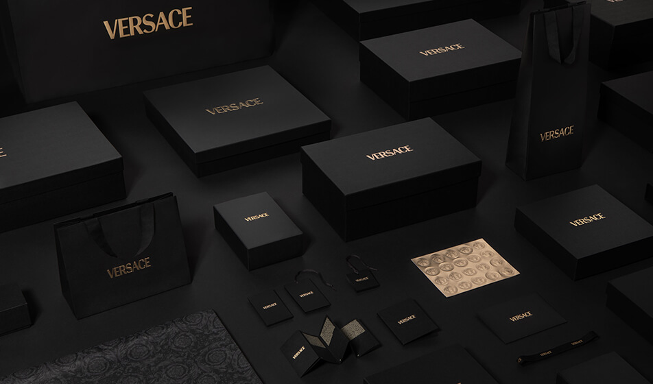
A widespread misconception holds that industrial reproducibility is the enemy of luxury. Conti refutes this with a concrete example: «Take the case of Pucci silk printed on large, engraved aluminium rollers, used for a run of several kilometres and then melted down. Even though it was industrially printed, the printing plate was discarded: a limited edition was created almost automatically». It is not, therefore, the printing technique that determines a product’s luxury value (Ken Scott, Versace and many others have made printing their distinctive language, not their weakness) but everything that accompanies it: the quality of the material, the authorship of the design, and the attention to detail in the finishes. «Value stems from the design, from the person who created it, and from the person who printed it», summarises Conti, quoting the painter Raoul Dufy, who designed Orientalist motifs for Paul Poiret’s coats: proof that behind an industrial print there can lie an entire visual culture, a unique gesture even when the process that brings it to life is mechanical. And today, he adds, luxury no longer seeks quantity but recognisability: «A few well-made, high-quality pieces: exclusivity is preferred over quantity».
For Ascione, the printing technique is never a stage that comes after the concept, but an integral part of the design process. In this approach, the material, rather than simply serving as a medium, becomes an integral part of the narrative. For the Moleskine collection dedicated to the Rolling Stones, the ascionemagro studio chose to ‘clothe’ the notebooks in fabrics such as denim, velvet and silk, evoking the band’s imagery through the material itself rather than through the printed image. For the NaturaSì in-store display, on the other hand, the material itself becomes the message: the link to sustainability led to printing directly onto untreated wooden panels, a surface that does not hide its nature but highlights it.
Technical constraints and creativity
For Elena Salmistraro, the creative process always begins with emotion: a search that draws on nature and mythological figures, captured on paper «in excessive quantities» before production costs are considered. Originally an artist, she now works as a designer, a language she describes as «influenced by different worlds. The artist seeks to express themselves; the designer solves problems. I try to bring these two souls together», she says. But technical constraints often push her in a different direction: in one of her projects, which won an award at the Salone del Mobile, the shift to parametric design (using Grasshopper) enabled her to replicate patterns that, if done by hand, would have been more traditional. «What seemed like a limitation led me in a direction I hadn’t expected and which the graphic concept alone would not have envisaged». Salmistraro rejects the dichotomy between one-off pieces and mass production, which is currently very much in vogue in design galleries: «It’s not right to demonise mass production. I feel at home in both fields, perhaps thanks to my cross-disciplinary background spanning art, fashion and industrial design, which means I’m not afraid to move between different disciplines». Mass production, therefore, is not the opposite of exclusivity; it is one of the ways in which exclusivity can take shape.
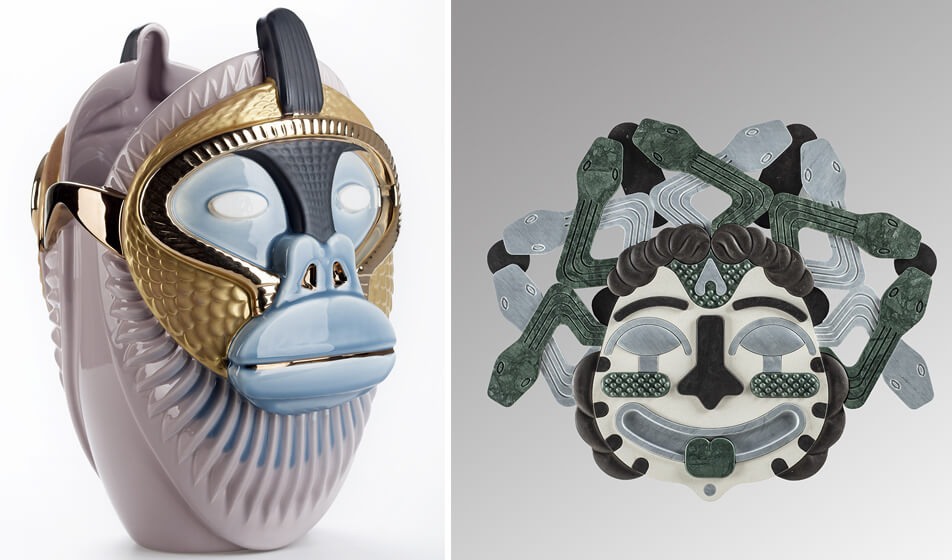
The grammar of materials
In the world of luxury, a surface is not judged solely by the eye. «At the MIC museum in Faenza, during an exhibition on Ginori entitled Alchimia Ginori 1737–1896. Art and Technique in Manufacturing – says Conti – you can see how Italian manufacturers adapted French and German models to local craftsmanship, proof that every material carries its own grammar, even when it originates by imitating a foreign language».
It is the same principle Salmistraro applied in a project for CEDIT, part of the Florim Group. «In that case, we used a printing technique on porcelain stoneware that allows you to feel the weft and warp of a fabric to the touch, recreating through ceramics a sensation that would normally belong to a completely different material». Ascione takes a similar approach when choosing denim, velvet and silk to ‘dress’ a publication: not colour variations, but textures that speak to the touch even before they speak to the eye.
From pattern to symbol, even without realising it
The transition from pattern to symbol is never immediate and sometimes occurs without the creator even realising it. “Missoni’s zig-zag,” says Conti, «arose from a specific technical constraint (the Raschel loom) and has become iconic because that yarn, woven on that loom, produces a pattern no other machine can replicate. Loro Piana developed technical systems for walking shoes that later became the brand’s hallmark. At the time, those who designed these distinctive elements were unaware that they had something iconic on their hands». Salmistraro agrees from the pattern designer’s perspective: «A pattern becomes a symbol when it is instantly recognisable and, at the same time, evolves and stands the test of time. We designers must steer clear of fads: when you follow a trend, you fall by the wayside immediately. It’s not just a matter of printing a logo everywhere, but of applying it with such consistency and coherence that it slowly becomes embedded in people’s visual memory». A pattern becomes meaningful not simply because it is repeated, but because every manifestation of it (be it a bag, a shop, a pair of shoes or a piece of furniture) maintains the same design intent.
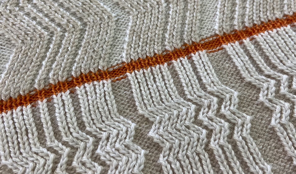
From product to space
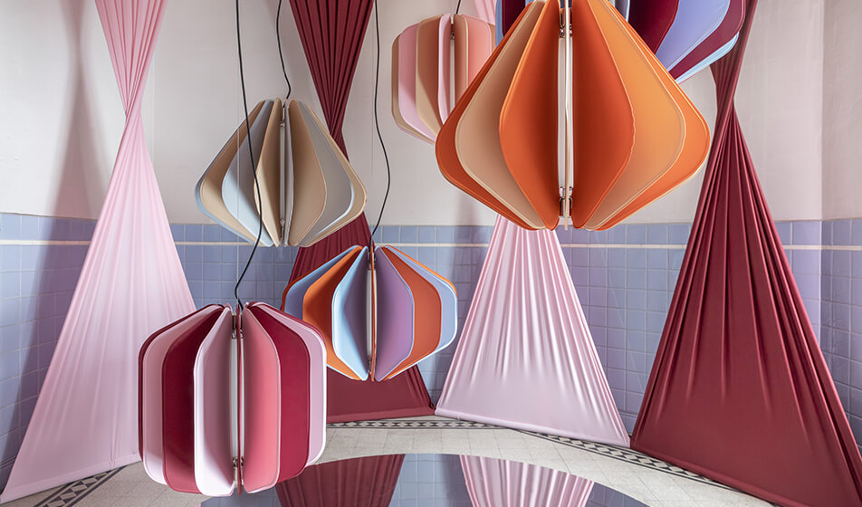
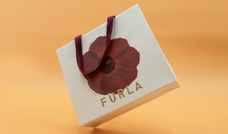
The printed surface is not confined to the product: it extends to packaging, invitations, physical spaces and publishing. For Salmistraro, in packaging and publishing, the starting point is the narrative, not the object: «Editorial storytelling is extremely important, and only gradually do I make it three-dimensional». In an installation, there is maximum freedom: «Normally I design in two dimensions; there, however, I enter my own worlds». Conti observes the same phenomenon from the perspective of brand consistency: Hermès packaging is not a container separate from the product, but a fragment of the same identity repeated across different scales. «A luxury brand cannot afford any inconsistency between what it prints on an invitation and what it prints on a garment. Different materials speak different sensory languages, but the identity-defining grammar that runs through them remains unique: it is this dual level – both material and conceptual – that makes print a tool capable of shaping perception as much on a handbag as on a paper invitation». Industrial printing is not the opposite of uniqueness, but the mechanism through which a visual code takes root.