

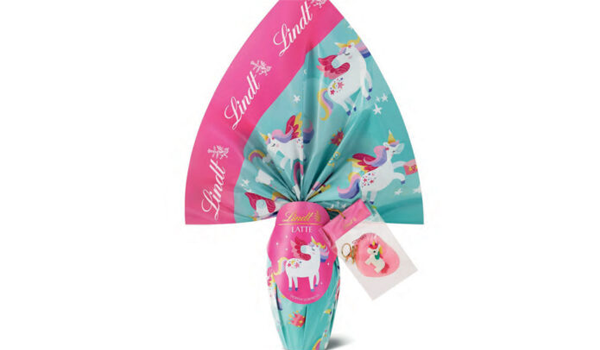
Packaging does far more than contain a product. It helps position it, signals who it is for, and suggests the cultural world it belongs to. Colors, shapes, typefaces, illustrations and words can all help consumers navigate choice — but they can also reinforce deeply rooted cultural stereotypes.
We spoke to Valeria Bucchetti, Full Professor in the Department of Design at Politecnico di Milano and a leading scholar of communication design, gender cultures and visual communication systems. She is also co-author of the Ethical Packaging Charter and the Manifesto for Gender-Sensitive Communication.
In 1973, Italian publisher Feltrinelli released Elena Gianini Belotti’s landmark social education essay Dalla parte delle bambine — literally, On the Side of Girls. The book examined gender identity as a social construct, shaped by an education system that, from early childhood, encourages different behaviors and personality traits in boys and girls.
What had long been presented as innate qualities — masculinity and femininity — were instead analyzed as products of the cultural environment in which people grow up. Consumer goods, with their own symbolic and semantic worlds, are an integral part of that environment. More than fifty years later, the responsibility of communication — and of packaging as part of it — remains just as important.
Point 7 of the Ethical Packaging Charter, written by Valeria Bucchetti together with Giovanni Baule, puts it clearly:
“Contemporary. Packaging is contemporary when it remains in constant dialogue with the society whose values it represents. Packaging reflects the culture of society and, in turn, helps shape it. Through its forms, graphics and symbols, it communicates models and contributes to the evolution of contemporary culture.”
It is against this backdrop that we asked Valeria Bucchetti to help us unpack the relationship between packaging, gender and cultural stereotypes.
What do we mean by gender-coded packaging, and in which sectors is it most common?
When we talk about gender-coded packaging, we are talking about a system of signs that helps people understand who a product is intended for. But there are two different levels to consider.
The first is functional: colors, symbols, images and words can help guide consumers and make product differences immediately clear. The second is where those associations become stereotypical. Diapers are one example. In some cases, stereotypically gendered colors are used to signal a genuine product difference linked to physiology, such as different absorbency needs for boys and girls.
The same can apply to certain areas of personal care, where intrinsic product differences may be supported by scientific factors, such as variations in skin pH. Beyond that, however, we move much more easily into the territory of cultural stereotyping. Some sectors are more affected than others. Some are evolving, while in others gender codes appear only in specific niches. Cosmetics are perhaps the most obvious example.
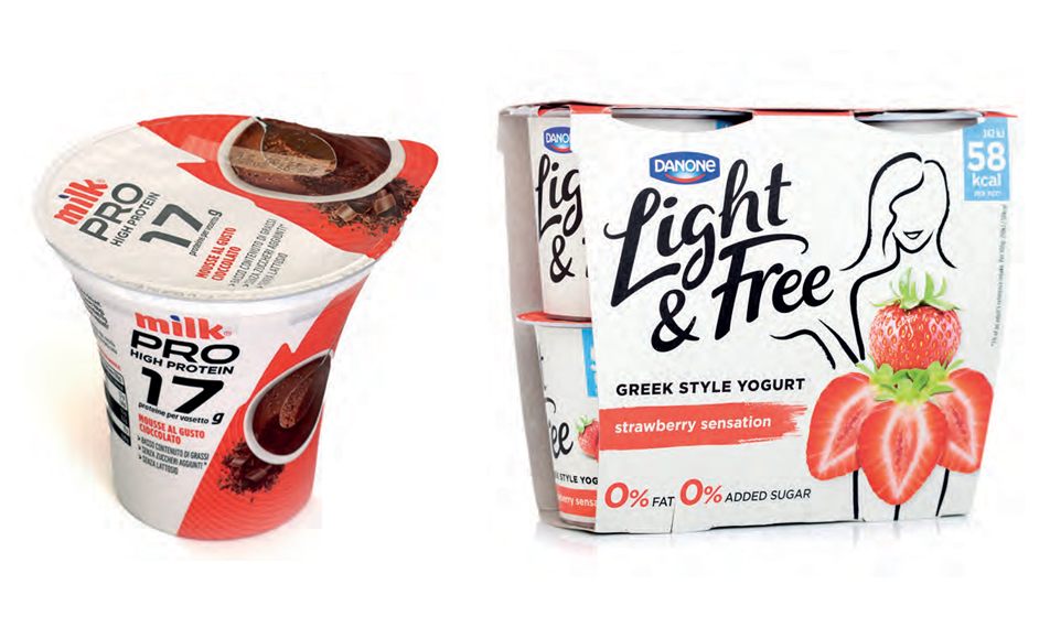
In food, the signals are generally less explicit, but a number of newer or recently repositioned categories — particularly those associated with health and wellness — still draw on very recognizable stereotypes. High-protein products, for instance, often use visual codes associated with a culturally constructed idea of masculinity: black packaging, strong contrasts, bold typography and references to strength, power and physical performance. Other products communicate lightness through female silhouettes, pastel colors and softer shapes.
Household cleaning is another interesting case. Historically, its visual language was aimed primarily at women, because domestic cleaning was traditionally considered a female responsibility.
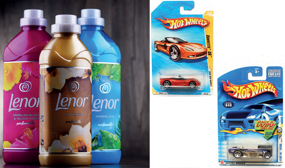
That communication has become somewhat more neutral over time, but certain color palettes and visual cues remain. Fabric softeners, for example, still frequently use floral imagery and pastel tones associated with a culturally coded idea of femininity.
What are the main visual codes used in gender marking?
The key codes are color, imagery, typography and composition. Color is the most immediate. Pink, lilac, pastel shades and light, soft tones are commonly associated with femininity, while black, blue, gray, dark green and strong contrasts tend to signal masculinity. Then there are images, icons, graphic elements, surface treatments, lettering, and even the size and posture of the people shown on the packaging. Some typefaces are more fluid, delicate or calligraphic and are associated with a feminine visual language.
Others are bolder, more geometric and compact, and tend to be linked to a masculine one. There are also explicit iconographic codes — hearts, flowers, silhouettes, technical tools, symbols of performance — but the signals can be much subtler. A hand, a gesture, a texture, a particular style of lighting, or a verbal tone that feels more emotional or more performance-driven can all contribute. Gender marking does not always need to say “for men” or “for women” explicitly. Often, it is the visual system as a whole that shapes perception. And when that signaling becomes less obvious, it can arguably have an even stronger effect, because it begins to feel “natural.”
What does a brand gain by gender-coding a product through packaging and visual communication?
It is partly a response to brands’ increasing need to segment the market and create ever more product variants. It reinforces the idea that everyone can find a product designed specifically for them — one that reflects the values, attitudes and qualities of their own world. It becomes a self-reinforcing cultural system in which people also express who they are through the objects they buy. That creates a strong need for consumers to recognize themselves in products through precise visual codes.
There are entire product lines labeled “Man” or “For Men,” from mass-market brands to luxury labels, all using the same kinds of visual codes we have been discussing. I believe brands have an ethical responsibility here. If they continue to reproduce codes based on stereotypical values — for example, presenting strength as an inherently masculine quality — they simply create new boundaries.

Children may not have direct purchasing power, but they are completely immersed in this coded system…
Absolutely. Childhood is one of the clearest examples. The way products for children — particularly toys — are designed and packaged shows just how persistent these mechanisms are. Toys associated with caring for the home and family — cooking, cleaning, looking after dolls — have traditionally been coded as feminine and marketed explicitly to girls. Scientific, technical and action-based toys, by contrast, have historically been associated with masculine codes. Even when brands try to broaden roles and aspirations, they often do not remove the existing codes. Instead, they create new niches.
Doctor Barbie, for example, introduces a professional role, but still within a strongly gender-coded visual framework. Likewise, when a chemistry kit is marketed to girls, it may be turned into a “perfume factory.” These stereotypes persist at every level — from inexpensive toys sold in blister packs at newsstands to brands and retailers that present themselves as more progressive, educational, ethical or sustainability-focused.
The codes may be less blatant in those contexts, but they are still there. And that is particularly concerning because play is part of a child’s education. Over time, it can reinforce the idea that boys and girls belong to two separate worlds. Unfortunately, this cultural divide still appears to be deeply entrenched.
Are there structural differences in packaging based on gender, as well as visual ones?
True structural differentiation is much less common, for two main reasons. The first is economic. Structural changes are among the most expensive aspects of packaging production, so creating different formats at that level would be difficult to justify financially. The second reason concerns the very logic of design.
When we work on ergonomics, easy opening, grip or the amount of force needed to use a package, we should not be designing around gender. We should be designing for accessibility across a much wider group of users. That means thinking about an ageing population, people with reduced grip strength, and people with permanent or temporary disabilities. That said, if we look at the historical development of certain packaging formats, some revealing examples emerge.
Take the rise of shower gel: as showers became more common in the home and began to replace baths, shower gel emerged alongside traditional bath products. Its packaging was often deliberately designed using masculine codes, so some bottles had cords so they could be hung up, evoking an active lifestyle outside the home — sport, gyms, swimming pools. The whole package communicated dynamism, action and practicality: values that the male cultural universe continues to be encouraged to identify with.
Other structural differences are more aesthetic than functional. In cosmetics and perfumery, for instance, we often find highly theatrical packaging: boxes that open like flowers, dramatic reveal mechanisms, precious materials and sophisticated finishes. These features often draw on aesthetic codes culturally associated with femininity. One particularly interesting area today is make-up, which is increasingly being marketed to men and non-binary consumers as well. Packaging can become an important space in which those visual codes are redefined.
When we talk about the “pink tax,” we mean products that cost more, despite offering the same function or having similar production costs, simply because they are marketed to women. How much does packaging contribute to that?
A great deal. Again, we are looking at a cultural system that reinforces itself. The idea of the pink tax includes all the additional costs women are expected to bear simply because they are women — because they are encouraged to believe they have specific needs related to body maintenance, care and appearance.
Take hair removal: it is a practice that has traditionally been culturally prescribed to women, although today it is also becoming more common among men, beyond groups that have long practiced it for functional reasons, such as some athletes. And yet women’s razors are, on average, more expensive than standard razors marketed to men.
The same pattern appears in many other areas. We still live in a society where women are often represented as having a particularly close relationship with shopping — almost as though consumption were an ordinary, defining part of female identity. Packaging plays directly into that system because it builds perceived value, desirability and differentiation. It can make an otherwise ordinary product seem more specialized. Moving beyond this system is extremely difficult because it is tied to the wider cultural imaginary that supports and legitimizes it.
In a society where the gender binary is no longer universally accepted, will gender marking gradually lose its effectiveness? And what role can future designers play?
From what I can see, the process has begun, but it is moving very slowly. A different kind of awareness is starting to emerge, and there are already brands created from the outset to speak to everyone. Often, a genderless approach goes hand in hand with accessibility and design principles aimed at accommodating diversity and embracing a more pluralistic view of users.
At the same time, however, we still live in a patriarchal culture that assigns specific roles on the basis of gender. Those roles then shape consumer habits, expectations and the values people are encouraged to identify with. Some recent research on younger generations also points to the persistence of fairly strong traditional attitudes. So it is not easy to predict exactly where society is heading. My perspective on students in the Communication Design course at Politecnico di Milano is somewhat privileged.
Around 70% of the students are women, and the university also has a well-established system of alias careers — an administrative measure that allows people undergoing gender transition to use a chosen name different from their legal one. In addition, students who choose the elective course on design and gender cultures already tend to arrive with an interest in exploring these issues. It would be wonderful to say that they will be the generation that changes the world. But they represent only one part of society, and certainly not all of its complexity. More than fifty years on, there is still a need to stand “on the side of girls.”