
He is the world’s best-known and most award-winning Italian advertising executive, who made his way from Sardinia into the international advertising world. Gavino Sanna tells us about his career, the campaigns that have stayed with him, the founding of Cantina MESA, and the design choices that, right from the start, made it a unique entity in the wine industry. And he offers us his perspective on the current language of wine.
‘Mesa’ means ‘table’ in Sardinian, just as it does in Spanish. It is the place in the home where bread, wine, and stories are shared. It is also the name Gavino Sanna chose for the winery he built from scratch in the early 2000s, purchasing 100 hectares of vineyards in the Sulcis region – an area dedicated to the cultivation (largely ungrafted) of Carignano. This province, however, has been scarred by a long mining history and more recent industrial models that have failed miserably. It might have seemed like an entrepreneurial folly, but it has transformed into a cultural laboratory capable of offering the whole of Sardinia a less stereotypical way of telling its story. Additionally, it has introduced new codes for interpreting the bottle-label system and words never before used to “let the wine speak”. But Gavino Sanna is much more than the founder of Cantina MESA, now part of Herita Marzotto Wine Estates. He is a visionary creative with solid roots in the world, whose mark on communication – we need only recall the slogan “Where there’s Barilla, there’s home” – remains undisputed and indelible.
From art to advertising, from Sardinia to New York—and vice versa. Could you tell us how you became an advertiser?
Ever since primary school, I was never a model pupil; I just loved drawing. My parents didn’t know what to do about my future. Then one day, an uncle of mine – the brother of the famous Sardinian painter Mario Paglietti – told them, “Gavino can draw very well; enrol him at the Art Institute.” So they did, and my life changed. I was lucky enough to attend the Art Institute in Sassari and to have teachers such as Stanis Dessy and Filippo Figari, who imparted to me the full richness of art: a gift that has stayed with me all my life.
Which artistic and cultural influences have had the greatest impact on your style?
Everyone and no one. Throughout my personal and professional growth, I have always absorbed whatever was valuable and positive that the people I met and worked with shared with me. One must be like a sponge and ‘absorb’ everything of value and constructive that others can offer.
You have received numerous awards for your work in communications, from the Cannes Lions to the Clio Awards. But is there one campaign that remains closest to your heart?
Through my work, I have earned the title of the world’s most well-known and most awarded Italian advertiser. I have created countless advertising campaigns across all sectors and countries, but the one I remember most fondly is the advert for Barilla pasta. Beyond its enormous commercial success and the fact that it even became a cultural phenomenon, it is the advertising campaign that best represents my values and my way of feeling. It’s a campaign that is still appreciated decades after its release and which leads people to remember me as the advertiser known as the “father of good feelings”. I am still happy and grateful for this today.
At a certain point, you decided to leave advertising and set up a winery in the Sulcis region. Can you tell us how it all began?
Frankly, the golden age of advertising in Italy had been showing signs of decline and change for some time. First and foremost, the shrinking of budgets. Then came the computer, which on the one hand opened up new creative possibilities but, on the other, in my view, somewhat stifled creativity itself. Sometimes we relied more on the new opportunities offered by machines and software and less on human ingenuity—more technique than thought, in short. After about 50 years of storyboards and layouts, it was, in any case, time to start a new chapter. So, one day, whilst shaving before heading to work, I said to my wife Lella, “That’s it, I’m calling the Americans and selling the agency!” The winery was born out of this life-changing decision, but above all from the desire to give something back to my homeland. This new step is also linked to my youthful choice to cross the sea and embark on what would become my career in advertising: those early years were by no means easy, beginning with leaving a sunny, beautiful homeland only to end up in the fog and cold of Ospitaletto! Cantina MESA was born from the dream of creating a project that would be a source of pride for my island and, at the same time, create jobs in a beautiful yet impoverished and neglected area. I could now talk about MESA’s awards and accolades, its success with the public and critics; but it gives me even greater pleasure to speak of the many people employed in a thriving and healthy business, which offers them work and security in a region often cited as one of the poorest in Italy. The idea that my fellow islanders, right where they live and have their loved ones, have found stable and secure employment without having to emigrate is truly a source of greater satisfaction for me than the great oenological and commercial achievements we have attained.
Was MESA also a ‘pretext’ for developing good design? How did the bottles and labels, which still set the standard today, come into being?
Absolutely. I always say that Cantina MESA is my final advert for Sardinia. Creativity primarily involves knowing how to tell a story in an artistic, evocative, and emotional manner. For a long time—both as a professional and as a Sardinian—I found my island’s communication to be dull and repetitive. I couldn’t accept that a land so visually and emotionally powerful should be depicted solely through the usual stereotypes: sea, sun, sheep, nuraghi (ancient stone buildings typical of Sardinia Ed.), and so on. But beyond these elements—which certainly define the place—it was the way they were expressed that failed to inspire me. I have aimed to narrate the millennia-old soul of my land in a respectful yet fresh and unconventional way.
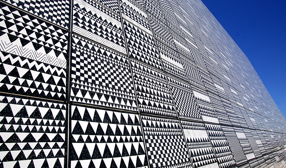
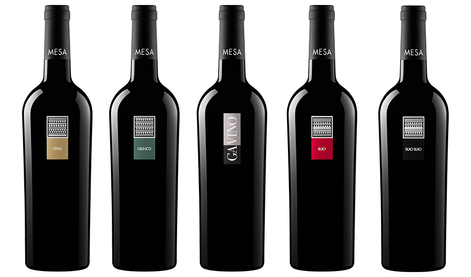
The winery’s shape resembles a nuraghe, perched atop a hill and serving as a landmark for both residents and the surrounding community. MESA’s ‘corporate’ colours are black and white: a simple two-tone scheme that reflects the natural colour of sheep’s fleece. The bottles are entirely black, exactly black! The original bottles were Bordeaux-style truncated cones weighing 900 grams. A completely black appearance is completed by the capsule, which initially did not even feature our name. With their sinuous and elegant shape, they evoke dark-skinned Sardinian women dressed in black woollen cloth. Austere and dignified, they carry the weight of ancient values and the wisdom and strength that only women can possess. MESA itself is a tribute to Sardinian women, who have always been the true soul of the island: they have preserved, passed down, and enriched the ancient traditions of the Sardinian people and land over the centuries. In a modest and archaic society, they have made the “greatness of simplicity” their hallmark. Consider Sardinian cuisine: masterpieces crafted from very little. This is genius; this is the Sardinian spirit.
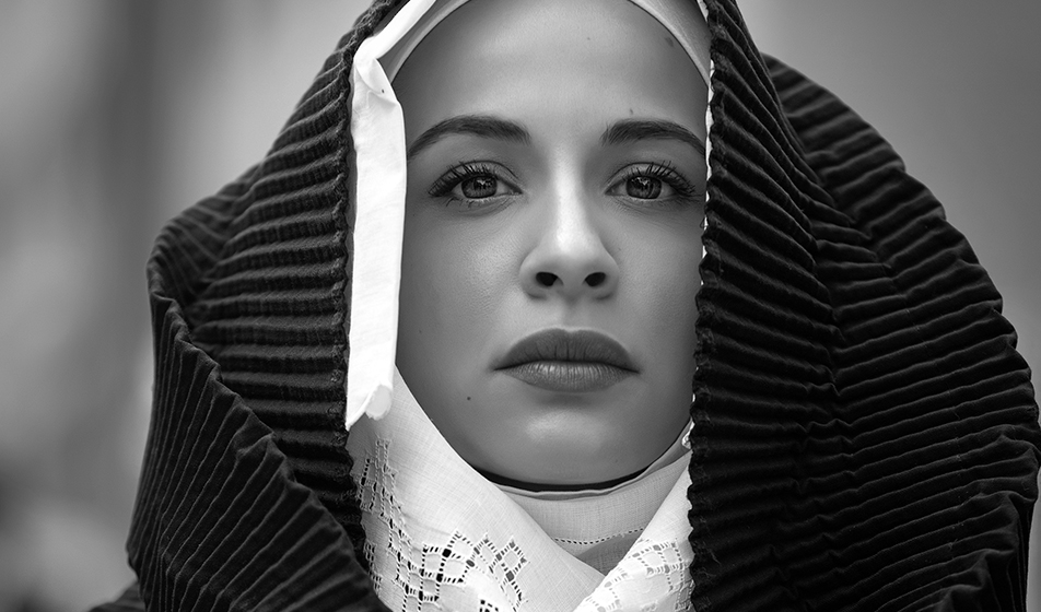
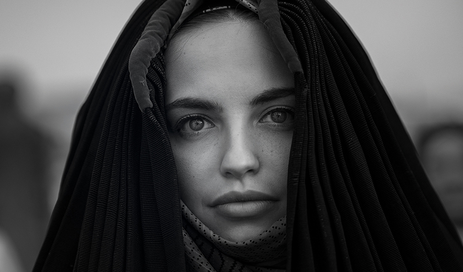
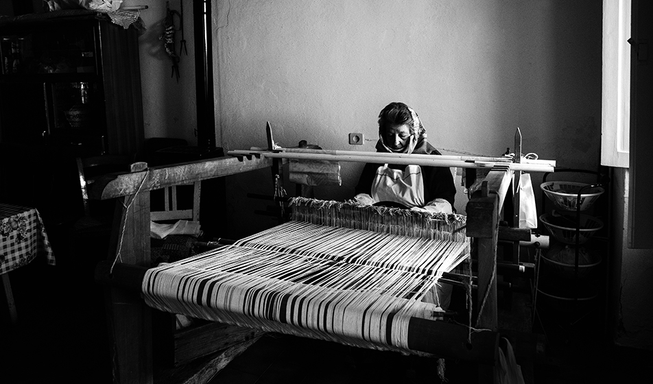
The labels I have designed are extremely minimalist, combining a stylized representation of Sardinia’s ancient tapestries—woven on looms by women using the ‘pibionis’ technique, meaning ‘grape-like’—with a touch of colour. This colour serves a dual purpose: it helps to identify each individual product and also pays homage to the island’s women’s traditional crafts. To the austerity of black, women would playfully add a small flash of colour—such as a green scarf worn as a neck detail or a red bonnet to hold their hair in place. I believe creating something refined and artistic was also a spiritual necessity for Sardinian women: considering the living conditions of the past, it was through this creative expression that women could fully showcase their personalities. The aesthetic and technical grandeur of the product—whether a rich bodice, a tapestry, or a plate of su filindeu (a type of pasta made from very fine strands layered in criss-crossed sheets)—reflects the woman’s greatness: ingenious, tenacious, skilled, creative. It is no coincidence that we dedicated Cantina MESA’s communication to the women of Sardinia, whilst visually, the bottle and the brand carry significantly less prominence. The headline features three adjectives that describe the character of the wine—and the beauty of Sardinia and its women. There is no explicit mention of the terroir, the appellation, or the technical characteristics of the wine.
Solid bottles, black even for white wines, with very small, minimalist labels. What were the technical challenges in creating MESA’s packaging?
From a design perspective, achieving the perfect balance in proportions between the bottle’s dark body and the front label. The label must not be overshadowed by the bottle, nor should it extend even a millimetre beyond its intended boundary. Practically, the key was positioning it at a height that was visually pleasing but did not complicate the labelling process, given the bottle’s shape, which featured a broad, sturdy shoulder and a noticeably narrower base. To be honest though, I must say that we abandoned this type of bottle many years ago. Beautiful, but not very eco-friendly given the weight! In line with our philosophy of practical sustainability, both in the vineyard and in winery management, I had to opt for a different container in terms of weight and colour.
Last year, you received the Lifetime Achievement Award at the Vinitaly Design Awards. What do you find interesting in the world of wine communication today, and what could be improved?
Honestly, I find it hard to answer. Today, much of the communication no longer seems to go through traditional channels, or at least not the ones I, who was born before the mid-20th century, have known. I don’t like social media, nor the communication they convey, so I won’t presume to pass judgment but merely offer an opinion. In my view, it seems contrary to the nature of wine. Both because of the media itself and the new ‘reading’ timescales for communication. Wine cannot be fully conveyed in the few seconds between “I look – I like – I move on to something else”. To communicate centuries of culture and history, millennia of civilization and territory within the limits of a single message? Difficult. Let’s say a new type of communication will be needed, which I’ll leave to young professionals to develop. Wine communication has always struck me as very ‘standardized’ for objective reasons. Photos of hands covered in soil, evocative images of sunrise or sunset in the vineyard, close-ups of lush bunches, interiors of barrel cellars with barrels of varying capacities… Wine has always been rightly communicated by emphasizing its ‘constituent’ elements, through a form of communication that has followed the dissemination of knowledge and awareness of this Italian excellence. This has gradually shifted from the educational to the emotional.
Regarding MESA’s communication, we have always chosen to uphold our values, knowing we are latecomers in a world filled with families who may boast centuries of vineyard history. Moreover, we are certainly not situated in an area – the Basso Sulcis – that is renowned or well-established for wine. MESA bottles in advertising campaigns have always been displayed fully, like still lifes against a plain background with striking headlines. There is very little information about the wine; certainly not the technical details I dislike and, frankly, now find somewhat outdated due to globalization and the mixing of cultures. Our communication style is, if I may say so, unusual, beginning with the back labels, where I insisted that – apart from what is legally required – nothing technical about the wine be written, only poetry. But note: this was not merely a literary exercise to be extravagant and original. Although in a unique way, the wine is genuinely ‘explained’ and communicated. Why speak tediously and didactically of the “perfect ripening of the grapes” when I can convey the same information and emotion by writing “bunches glowing like sun-drunk stars”? At least, that was my choice. Sometimes, it’s how you say things that makes all the difference; they teach you that as soon as you start out as a copywriter!
The campaign through which we introduced ourselves to the public remains, in my view, an excellent example of communication. It’s the early 2000s, in a market already flooded with wineries and products; we produce in a region that is barely known even from an oenological perspective, and I, as a producer, am just beginning today and… what can I say? Nothing. I’ll introduce myself. Against a neutral background, our range of bottles stands out, accompanied by a simple, friendly headline (“Smile, you’re among friends”) that gently invites us to approach potential wine lovers. In short, a calm “Good morning, may I introduce myself?” Does this page say anything about Cantina MESA, the wines, the terroir or the winemaking process? Amen! I’ll leave the communication of that information for another time; personally, I felt – and still feel – that this subject is far more eye-catching and suitable for a debut campaign.
Is there something about you that nobody ever asks, but that would be worth sharing? By now, everything has been said about me, and at my age, I wouldn’t know what else to disclose. Let’s say the question might be one to which I would reply: “Everything I have given to people has been done with affection and honesty.” A gift that comes from the heart: just like Cantina MESA.
