

Universal Design, Inclusive Design, and Design for All are umbrella terms for a universal, inclusive design approach aimed at everyone, grounded in the principle of designing for evolving human diversity to broaden the accessibility of products and services. How does this philosophy translate into packaging design? We discussed this with Antonella Manenti, Art Director at Henry&Co.; Luca Giulio Ferreccio, lecturer at NABA (New Academy of Fine Arts) and Creative Director at SoFarSoNear; and Marc Powell, Global Accessibility CoE Lead at Unilever.
The term “Universal Design” was coined in the late 1980s by architect Ronald L. Mace of North Carolina State University and his colleagues to describe a design concept accessible to everyone, regardless of age, physical or cognitive ability, social status, or language skills. In Europe, the concept is set out in the Stockholm Declaration (2004), a key document of the EIDD (European Institute for Design and Disability, now Design For All Europe). The principles of Universal Design are distilled into seven principles, six of which are fully applicable to packaging as well:
- Equity: usable by everyone;
- Flexibility: adapts to different abilities;
- Simplicity: use is easy to understand;
- Perceptibility: conveying effective sensory information;
- Error tolerance: minimising risks or unintended actions;
- Minimisation of physical effort: use with minimal exertion;
- Sufficient space and dimensions: ensuring the space is suitable for access and use.
The starting point is the idea that there is no such thing as a ‘standard’ human being, and that by considering the constantly evolving range of individual differences, it is possible to find design solutions whose benefits extend to society as a whole. This moves beyond treating accessibility merely as a retrospective adaptation of a design: not just compliance with standards but addressing usability for people of all ability levels right from the conception stage, including in product packaging. A three-pronged approach: accessible to almost all potential users without modification, easily adaptable to different needs, or accessible via standardised interfaces that can be easily utilised through adaptation and integration technologies.
In packaging design, this philosophy applies to a field that still has much to develop, as explained by Antonella Manenti, Art Director at Henry&Co., a design studio with a strong focus on sustainability: “We are in the early stages of development, where innovation is perceived as a cost, where a ‘one-size-fits-all’ solution does not exist and needs vary: the company’s requirements, the budget, the logistics. The technology is there, as are the printing tools and the materials: they need to be applied in this design direction. At Henry&Co., we aim to incorporate this aspect because accessibility and sustainability are interconnected issues. It is considered innovative by companies not so much from a technological point of view, but a cultural one, much like when the first brands began to incorporate sustainability principles into their supply chains: we are in a transitional phase, and the most pioneering companies will also be the ones remembered for this: a significant competitive advantage.”
Equity: usable by everyone
How can brands utilise materials and printing techniques to improve packaging accessibility? Marc Powell, Global Accessibility CoE Lead at Unilever, responds: “The greatest benefits come from the correct application of the fundamentals: packaging that is easier to open, hold, and use; clear, legible, and well-structured information; and visual contrast that enables quick comprehension. Tactile elements remain underused but can be highly valuable, especially for non-visual navigation. From a materials and printing perspective, small choices, such as reducing glare or improving text legibility, can make a big difference. These improvements help simplify: fewer materials, cleaner layouts, and more efficient production. The most effective approach is to treat the physical packaging as the foundation, which can be expanded via QR codes and Accessible QR codes. Packaging must communicate what matters most at that moment: clear identification, key instructions, and critical safety information, without relying on technology. Digital extends this by offering personalised and inclusive formats, such as audio, larger text, local languages, or guided experiences.”
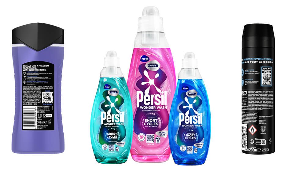
Unilever won the 2025 Disability Smart Technology Award, presented by the Business Disability Forum, for the “Accessible QR Codes” project. But integrating digital communication also brings unexpected benefits, including a habit of considering accessibility in coordinated communication, and therefore in packaging design, notes Manenti: “Accessibility requirements for web pages – that is, the entire set of guidelines on readability regarding contrast, colours, and fonts – also have a positive impact on printed materials, with packaging being the area most significantly affected. There is also a general shift in aesthetic and visual trends: large text and highly defined colours that serve a dual purpose: they attract the consumer and make text and graphics legible. There is positive feedback, whereby companies are getting used to being accessible online, and as a knock-on effect – given that communication is integrated – the benefits are also evident in areas where accessibility was previously treated as a secondary consideration.”
Flexibility: suitable for different abilities
But what is the state of the art in packaging design? Are there advances in print communication that make packaging more accessible and inclusive for consumers? Luca Giulio Ferreccio, NABA lecturer and Creative Director at SoFarSoNear, answers this question. Together with Margherita Soresina and Rosa Garofalo, he was a promoter of the first Inclusive Packaging Design Contest organised by ANS and NABA. “Technology is an extraordinary aid, but we must contend with the sometimes-limited digital literacy of a section of the older population. The average age of the European population is rising, with all that this entails. Tools such as QR codes and Navilens are already used in mass-market packaging, but the primary tool remains the smartphone. When it comes to printing and materials, glossy and reflective surfaces can hinder readability, whereas textured surfaces, as well as being seen, can be felt, helping to distinguish the various products within a range.”
Simplicity: easy to understand
But how can accessible design improve the experience for everyone, even in packaging design? According to Ferreccio, one of the challenges is scaling up: “Let’s imagine a world where the power of choice is enabled by effective communication. It’s not just about packaging communication but also about functionality: it opens easily, is easy to handle, requires little cognitive effort, and can be managed with a single movement rather than two simultaneous hand or finger movements. The challenge is to reach as many users as possible with the emotional appeal. For example, the private labels of large-scale retail chains can present a great opportunity and responsibility: they have the advantage of spanning a vast range of products across different product sectors.”
It is precisely this large-scale integration across millions of product lines that is one of the challenges Unilever is facing, as Powell explains: “On a large scale, the challenge is consistency. For accessible QR codes, currently implemented on 6 billion Unilever packages worldwide, the starting point is defining clear global standards and processes for design and printing, applicable to all brands and markets, whilst maintaining the necessary flexibility. Underpinning this is the need for a single, centrally managed source of product data. Without this foundation, accessibility cannot be reliably guaranteed on a large scale.”
Standardising practices and formats is the next challenge at European level, according to Manenti: “To date, there are directives from the European Union, but there is a lack of unified implementation on the ground. We are starting, for example, with environmental labelling, unifying standards across countries. We will move in a direction similar to that of the US: there, packaging labelling is strictly enforced, and this is not a limitation but rather a facilitator for both consumers and the company. The uniformity of language and visual codes, with the same information always presented in exactly the same way and in the same position, reduces cognitive load and provides a useful, shared standard.”
Perceptibility: conveying sensory information
Language illustrates why, in defining design for all, we speak of ‘evolving human diversity’: circumstances in a person’s life change, and so do their abilities. The packaging of everyday products must be safe for everyone. Manenti continues: “We need to work on cultural perception: when we talk about accessible design, we think of adaptations for physical or cognitive disabilities, but it concerns us all because we all grow older, so accessible design is an opportunity for independence. An example of information in plain language is the green, yellow and red labels for fresh produce; a visual code with which everyone is familiar, which tells you the condition of the product you are about to buy and does not end at the point of sale, but continues its communicative function at home too, making the communication of a basic issue such as food safety immediate.”
Error tolerance
What role can schools play in making accessibility an integral part of training new generations of packaging design professionals? According to Ferreccio, “we should update the very definition of design, starting from ‘form’ and ‘function’ – and here we see the seed of inclusivity – but one that also evolves into ‘access’ for as many users as possible and ‘respect’ for others, for the environment around us, and for differences. If this is what design is today, it goes without saying that it must be democratic, including from a communicative perspective. The role of education is vital to environmental and social sustainability, particularly regarding design and the accessibility it entails. I try to impress upon students in my courses that there should be no dedicated ‘inclusive design’ – rather, a paradigm shift is needed: don’t do ‘inclusive design’, just design: it is design’s inherent mission, not an afterthought.”
With minimal exertion “Ease of use benefits not only consumers but also brands,” concludes Marc Powell: “Accessible design reflects how people actually interact with products in everyday life. The context varies: time pressure, environment, physical abilities… and accessibility directly addresses this variability. When packaging is easier to read, understand and use, barriers are reduced for everyone. Products are easier to consult, instructions are clearer, and the overall experience is more intuitive. This builds trust and credibility, which are fundamental to brand choice. In practice, accessibility increases effectiveness: products that are easier to use are more likely to be chosen, used correctly and repurchased.”
