
Large-format printing leads outdoor spaces, combining brand messaging, local trends, and major event organization. Its goal is to guide and connect with audiences in constant movement. Balich Wonder Studio, D’Alessandro & Galli, IGPDecaux, and Moskito Design share insights on Out of Home strategies and tools.
If the trademark of the bustling city in the 20th century was neon signs, so iconic that they even inspired Umberto Saba (“I rest in Piazza del Duomo. Instead of stars, words light up every evening”), today communication in urban environments has evolved, occupying new spaces and rethinking traditional ones in innovative ways. It seeks ideas that can surprise and large-format printing technologies capable of revolutionizing the timing and methods of indoor and outdoor installations.
Domination everywhere
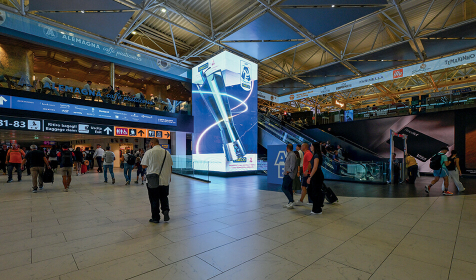
Giulia Salvioni and Evelina Borghesan, founders of Moskito Design, a full-service communications agency, tell us: “In a multi-channel campaign, Out Of Home has different purposes from the rest: it exploits spaces that are highly distinctive in terms of both size and the time spent inside them, and in recent years it has expanded beyond its traditional spaces, especially in urban centres.” PVC, vinyl, forex, corrugated plastic, printing on aluminium or dibond, plexiglass, foam sandwich panels, one-way window stickers, and lightbox frames work together with digital screens, LED walls, and totems: “One of the most popular formats is domination: instead of many different messages competing for attention, a single message is displayed throughout the space, in which large-format and digital printing are combined to boost memorability. With Fineco, we developed a campaign that, in the weeks leading up to the Fineco Women’s Volleyball Super Cup final in Rome, covered all the spaces in the terminal of Rome Fiumicino airport. The terminal was fully ‘dressed’ with content related to the Super Cup, culminating in an anamorphic video with an ultra-realistic three-dimensional effect of the trophy in motion. Print formats for a uniform message on different substrates include lightweight, modular Forex panels for covering escalators and columns, film for large surfaces, capable of adapting to surfaces with mouldings and grooves, using heat guns for perfect adhesion. Ease of installation and removal is crucial in communication projects that occupy the entire space but are only temporary.
Printing face-to-face with digital
According to Claudia Aznar Gracia, Head of Product Marketing at IGPDecaux: “The relationship between print and digital in outdoor advertising is a natural synergy. Growth has been incremental: a few years ago, it was 90% paper and 10% digital, but the percentages are now nearing a 50-50 split, even as the market continues to grow.” The visual connection between digital out-of-home and large-format print is created by frame lightbox installations, which consist of an aluminium profile covered with printed polyester fabric. High-definition printing and LED backlighting with warm or cold light and adjustable intensity are integrated with digital screens, enabling the replacement of only the fabric and turning the lightbox into an ever-updated medium.
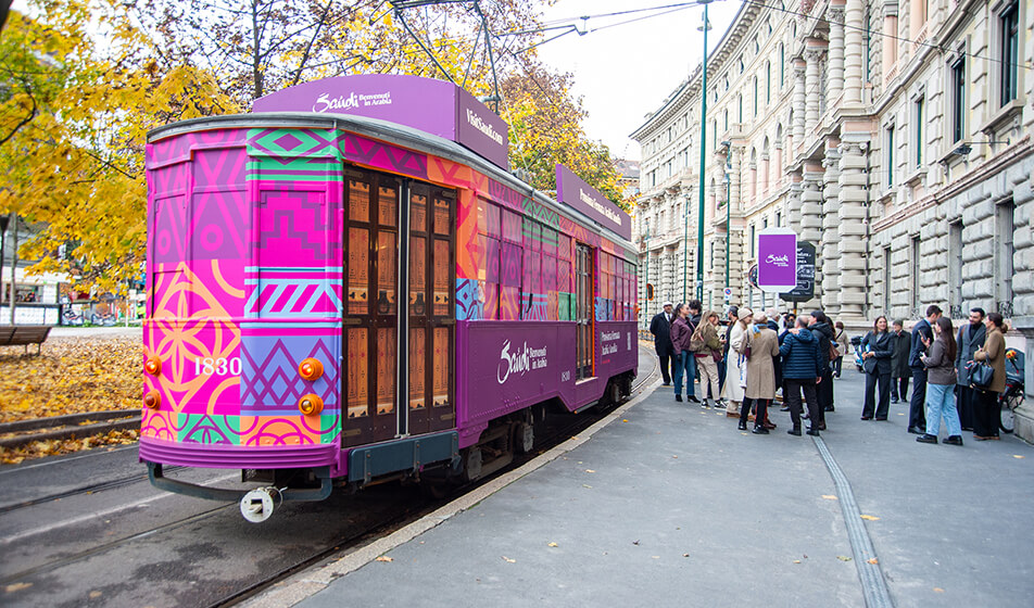
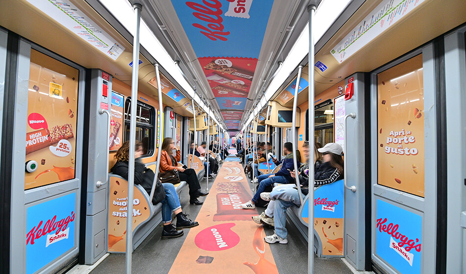
Marco Serrao, Head of Brand Solutions at IGPDecaux, who frequently oversees special projects, emphasizes: “Here, spaces are integrated with moving assets such as trams and subways. Vehicles like the Tram Evento are perfect for activities that combine OOH and second-screen content and collaborate with influencers and content creators. OOH creativity cannot simply copy editorial formats that give viewers time to browse, rewind, and review. For example, a bus shelter with an average wait of 3-4 minutes needs to display different information than a decorated tram passing by in 20-30 seconds. Calls to action must be straightforward, clear, and positioned exactly at the right height, with measurements down to the centimetre. The full-wrap decoration of a vehicle creates a high-impact visual effect on the exterior, which can also extend to windows with one-way film—a micro-perforated adhesive that allows visibility only from the inside out. For metro car customization, materials range from cast adhesives for walls and seats to permanent polymer adhesives for windows, dividers, and seats, as well as special adhesive films with non-slip lamination for flooring.
Large-scale, but on a hyperlocal scale
But communication in urban environments isn’t limited to cities, as Aznar Gracia notes: “In the case of IGPDecaux, we often talk about Milan, Rome, Turin, and Naples, but we are present with street furniture in more than 370 urban centres. We are increasingly able to create synergies by using SDK data, which helps us identify groups of products that are similar in terms of socio-demographic and behavioural characteristics for the target audience. We are a mass medium in terms of numbers, but outdoor advertising’s role isn’t just about linear national coverage. The installation itself provides context, in a semiotic sense: the urban space frames the message and interprets it accordingly.”
The main difference is the processing time, which requires a balance between the fast pace of marketing and that of government agencies, says Aznar Gracia: “We are a link between industry—advertisers such as brands or intermediaries like media centres—and the public sector, i.e., the government. Working closely with both allows us to align needs on long-term projects,” which also has implications for sustainability, as Sara Iovenci, Product Strategy & ESG Manager, points out: “Our model is inherently sustainable: we finance the maintenance of street furniture and services that serve citizens through advertising campaigns, with approximately 50% of the revenue transferred directly to the grantor, and thus to the community. Two years ago, we conducted research to measure the environmental impact of our facilities and compare it with other media. This research enabled us to develop a campaign measurement platform launched in September that uses the collected data. With the same number of impressions, outdoor advertising has a lower environmental impact, even when considering emissions, energy use, and water consumption. As a company, we have implemented several measures for the suppliers who produce our products. It’s a chain: if suppliers and partners for our production activities meet certain standards, we can guarantee those standards to customers who use our spaces. We are a one-to-many medium; the impact of a facility is spread over a large audience, and our products have a long life cycle—up to 30 years in the case of bus shelters.”
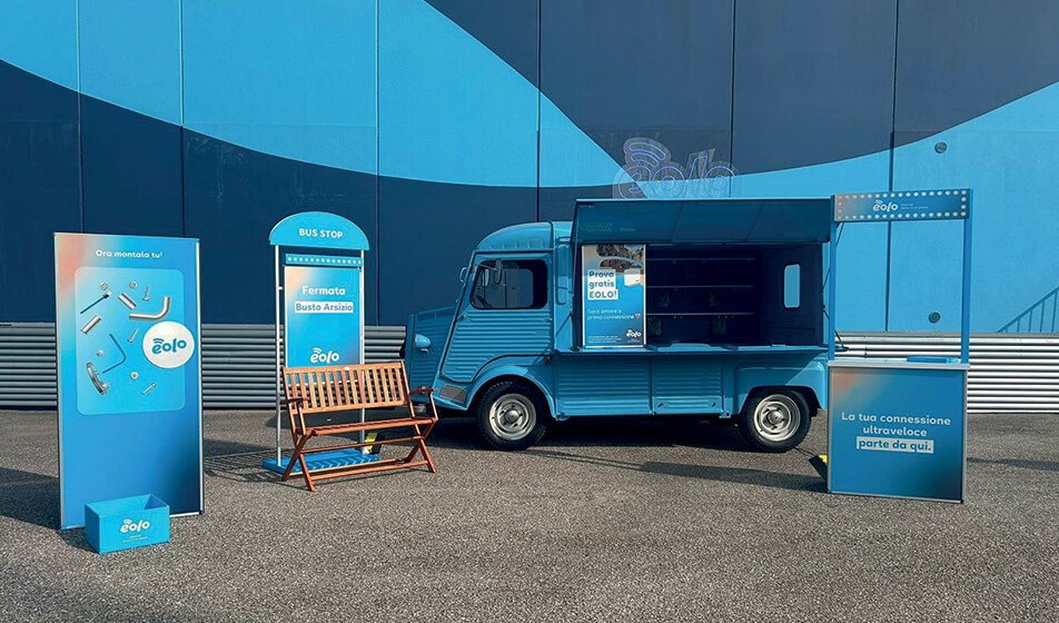
But if it is not possible to find a balance between communication times and audience times, it is crucial to explore new solutions, as Salvioni and Borghesan explain: “In the provinces, regulations are sometimes more uneven than in large urban centres with standardized procedures, and there is a risk of getting bogged down in response times. You have to achieve results by changing your approach: for Eolo, a client interested in the hyperlocal dimension—the primary target lives in small towns—we created a truck with customized wrapping that travels around village festivals, with spot activations. If there is no point of constant high traffic in the urban space where you want to communicate, you have to take large-format communication to where it is created.”
Live events in ad hoc spaces
But what happens when, instead of using an existing urban space, you have to create one from scratch with temporary structures? This is common in the organization of large events, where communication serves different purposes, from setting the mood to providing practical information. Daniela Selimaj, Head of Marketing and Branding Strategy at Balich Wonder Studio, a company specializing in large live events, summarizes it well: “The visual communication of an event is a three-dimensional, functional system that operates on three interconnected levels: brand awareness, tone of voice, and usability of space. Transforming visual communication into structures means giving the event a soul, where graphics serve people. Clear, well-designed signage that aligns with the brand is not only attractive but also reduces friction and makes the experience smooth. It is where emotional design and functionality meet.”
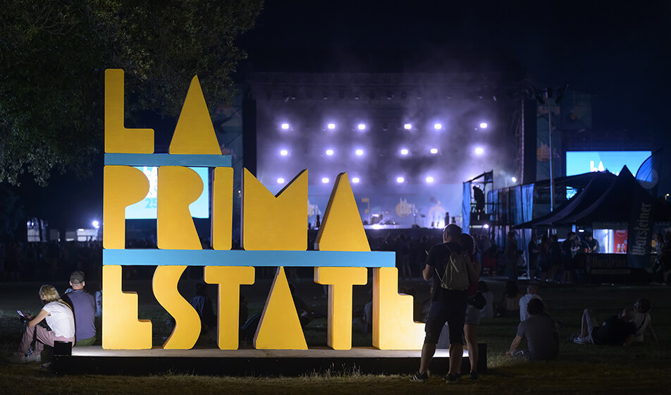
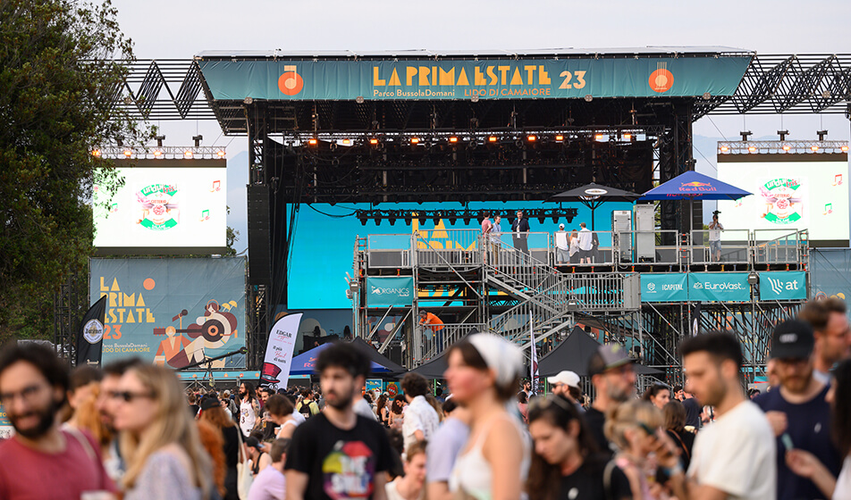
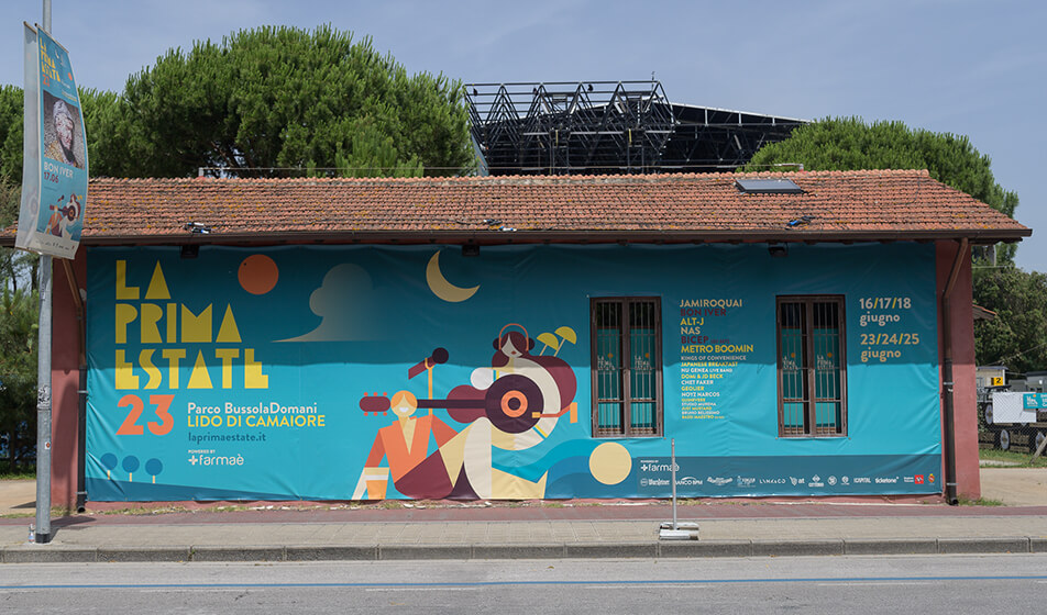
How do these principles work in practice? Enrico D’Alessandro, who oversees the Bussoladomani project for D’Alessandro e Galli, where the La Prima Estate Festival is held in Lido di Camaiore, explains: “How do you imagine concerts on a large lawn facing the sea? You try to create a festival that feels like a vacation. And we try to establish a dialogue with what’s outside the festival through a program that invites people to arrive just before sunset, allowing them to spend the day at the beach and participate in activities that serve as a bridge between the two moments.” Once a place and a name are established, the graphic identity brings the elements together. Michele Boroni, a journalist and communications consultant for the festival, and Francesco Poroli, an illustrator and art director who designed the visual identity, tell us: “The festival’s image is rooted in the imagery of the territory. A brief like this is rare: music, beer, sea, and feeling good—especially as we come into the first summer after the lockdowns and Covid restrictions, with a sense of reclaiming pieces of life we had missed.” Poroli adds: “The first thing I did was study the logo and lettering of the historic Bussola to recreate a font that spoke the same language. The park is called Bussoladomani, and for Lido di Camaiore and Versilia, that history is significant. With the colours, I aimed to recreate an atmosphere—that of summer days with the glare of the sea—and the sunset, to convey the feeling that a festival is a way to enjoy being together and experience something special.”
Large events use large-format printing to create functional, branded spaces, with structures covered in windproof and fireproof sheets, PVC in various weights, TNT banners, and mesh. Daniela Selimaj explains: “When you start from a ‘blank slate’, the coordinated image and large-format printing become environmental architecture, in which the covered and printed structures are not just barriers, but canvases that communicate the key message and establish a clear spatial hierarchy that guests can understand without maps, helping to divide the space into zones that immediately have a clear identity and purpose.”
An example of this creative use of temporary coverings and structures to connect indoor and outdoor spaces again comes from La Prima Estate, as D’Alessandro explains: “The idea for the tower in the concert area came from a concern: we are just a stone’s throw from the sea, we have concerts at sunset, but you can’t see the sea from the lawn. We built the tower as a place to see the sunset and the sea, and to watch concerts from a different view. We had the experience of D’Alessandro & Galli on our side: the Lucca Summer Festival is in its 24th year, with a solid structure in place for organizing and running the festival.”
Michele Boroni and Francesco Poroli explain: “In the case of Prima Estate, there was the chance to create communication from the ground up to be used across all touch points, both external and internal. The idea was to develop a modular visual identity composed of many small icons representing everything a festival offers, making areas immediately recognizable—from dressing rooms to ticketing and food & beverage—in a way that combines clarity and appeal. Researching the local style helped us align with the territory, drawing on seaside imagery that spans from Art Nouveau to modernism and updating it for today, without being stuck in a nostalgic past. This approach allowed us to seamlessly integrate large-format printed displays, digital screens, and site-specific installations that evoke the area: the logo sculpture in the meadow was made by the masters of the Viareggio Carnival floats, and on the seafront—in addition to the classic 6×3 billboards—there are hand-painted billboards by Franco Benassi, an art history professor and calligrapher, which Sergio Bernardini, the longtime impresario of the Bussola, used to hang on a ladder to hand-draw the names of stars like Mina and Ray Charles, who performed at the Bussola. We followed that tradition for the festival’s artists.” A reference to the history of the place that isn’t nostalgic, D’Alessandro notes: “It’s a way to reconnect with the past and make a generational handover with a practical twist: putting Versilia back on the map for an age group that looks elsewhere for its destinations. During these editions of La Prima Estate, we conducted surveys, and more than 50% of the audience had never been to Versilia before the festival. This means that we are working in the right direction: bringing people who want to come back.”
