
The sector is growing and the book’s physicality plays a fundamental role
At the Bologna Children’s Book Fair 2023, the latest data on children’s publishing were presented: the sector is growing, and the book’s physicality as an object continues to play a fundamental role. But a growing market is also a crowded market, where competition for readers’ attention is high. This means stealing a few arrows from the bow of other areas of visual communication: green light to fifth-colour illustrated books, fluorescent inks, die-cuts, foils and enhancements. How to put these tools at the service of stories? We asked Leonardo Aldegheri of Società Editoriale Grafiche AZ, Emanuele Basso of The6th, and illustrators and authors Anna Pirolli and Marianna Coppo.
By Roberta Ragona | On PRINTlovers 97
In an entertainment world where the most diverse content competes for the time and attention of the youngest, books are still a stronghold. According to the data presented by the Italian Publishers Association during the latest edition of the Bologna Children’s Book Fair – one of the most important fairs in the world for the book market and the key fair for the world of children’s publishing and illustrated books – boys and girls between the ages of 4 and 14 who have read at least one non-school book in the last year are an astonishing 96%. A significant number, especially when compared to 2018’s 75%. An increase that concerns reading, but also the so-called pre-reading, i.e. the manipulation of book-objects in which the experience is mediated by the relevant adults – parents, teachers, youth workers – and the interaction with the book is a sensory experience in which illustrations and visual communication accompany the written word that is not yet independently accessible, made up of textures of different materials, die-cuts, enhancements. But if in the 0-3 age group, ingenious gimmicks are used to familiarise boys and girls with books, for the higher age groups, the printing solutions must spark curiosity for that book and nothing else. In 2022, the publishing market for children and young people in Italy was estimated at 268.4 million euros, 283 million if comics are added: 18% of what was spent on books in Italy in 2022. More than one book in five. Not only has the number of readers increased, but people are reading more: 58% of readers say they dedicate between one and three hours a week to this activity. The book’s physicality plays a vital role: digital reading affects only 1% of the sample, while 51% of young readers continue to read exclusively on paper. On the other hand, the characteristics of the illustrated book favour this medium: the experience of the story is mediated by the language of visual communication through cover design, illustrations, comics and the use of images.
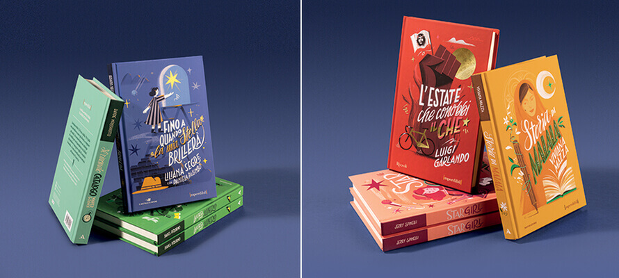
But a growing market also means a crowded market, with high competition for eyes and attention. This is why illustrated book design also looks to other disciplines, such as packaging design. Emanuele Basso, Creative Director of the agency The6th, tells us how his own experience of brand work has been put at the service of objects that must be able to tell a story, entertain, plant a seed of curiosity about the world: “We were contacted by Stefano Moro and Fernando Ambrosi, art directors working in Mondadori Ragazzi, to work on a new series. It was a series of titles belonging to different publishing houses of the group – Mondadori Libri, Il Battelle a Vapore and Rizzoli – brought together in a collection that would bring together the “new” classics, the contemporary books that have been added to the children’s canon in recent years. It was a matter of giving them a graphic look that reflected this status as modern classics. We worked on “Gli Imperdibili” with a mix of illustration and hand-lettering, using different lettering to reflect the character of the text but united by a style that held together the overall sense of the series. What distinguishes children’s publishing from other areas of publishing output,” Basso continues, “is the way they are presented as objects, with a strong visual component that is an integral part of the identity of the text. One aspect that emerged during the work was that some visual communication solutions borrowed from packaging design particularly resonated with the imagination of the 13-15-year-old age group. When we discussed possible solutions, an important point that was emphasised was the fact that we should not only focus on the strength of the images but that we should immediately think about a series of ennobling solutions that would strengthen the images and help the books to stand out on the shelves of bookshops. It is a battle played out on the field of colour, with all the tools at the disposal of enhancement and converting.
“The series covers are soft touch matt plasticised, both for tactile appeal and to make the coloured foils and polish on the front and spine stand out. We used the foil to highlight iconic elements of the narrative, either taken from previous editions that had particularly struck the imagination of readers or from other adaptations of the story, such as the film poster in the case of Jerry Spinelli’s Star Girl.
“In the training of illustrators, enhancement is not often addressed – the focus is more on the drawing and the subject matter – but the component of texture and material effect can be of great importance on the final output of the work. For this reason, communication with the art director and those in charge of the graphic project is important: once the right balance has been found on the subject, incorporating the reasoning on enhancements already in the colouring phase helps to solve problems and speed up the work considerably, playing on the different materials.”
But why has the use of these tools grown so much in recent years? Leonardo Aldegheri, CEO of Società Editoriale Grafiche AZ, a company based in San Martino Buon Albergo (Verona) specialising in printing illustrated books, explains: “Specialised paper solutions or combinations with textiles are not strictly new, but at present, they have become a necessity within a market in which more than 200 titles are published every day in Italy alone. We have specialised in becoming a printing centre of excellence for illustrated books. Print education and support for publishers have been in AZ’s DNA since its foundation in the early 1970s, starting with its collaboration with Stepan Zavrel from the first editions of the International Exhibition of Illustration for Children in Sarmede. Illustrated books are not just printed objects like any other, nor are they just books like any other; they are – in addition to being a commercial product – also an artistic object. It is not just a matter of reproducing the illustrations but of communicating the emotion and intent. This means paying attention to file calibration and colour curves, colour proofing, and “crafting” the file before arriving at the cyan, depending on the customer’s choice of paper.
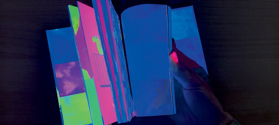
“Another unique aspect of illustrated books,” Aldegheri continues, “is the packaging and binding phase: a slim 32-page book has very different peculiarities from a paperback, and our machines are specially modified for the formats and pagination of the books. We also focus a lot on the research and development aspect, such as the AZ Neon and Ghost technologies we have introduced recently. Both work on the impression of surprise and wonder at a page that hides something more beneath its surface. Both printing techniques are compatible with a wide variety of papers, from classic hand use to paper made from by-products of agro-industrial processing or even Petra with 80% calcium carbonate. AZ Neon is not only a fluorescent ink but has distinctive refractive characteristics that become particularly striking under UV light. Similarly for Ghost printing, a printing technology that “hides” within the grain of the paper images visible with a light source, such as a phone torch. What previously needed special accessories, such as red filter lenses, can now be done with Ghost printing very straightforwardly, “hiding” an additional layer of reading in the pages of a story. In the hands of authors, they are vehicles for endless stories and a tool of great fascination and magic for the child reader.”
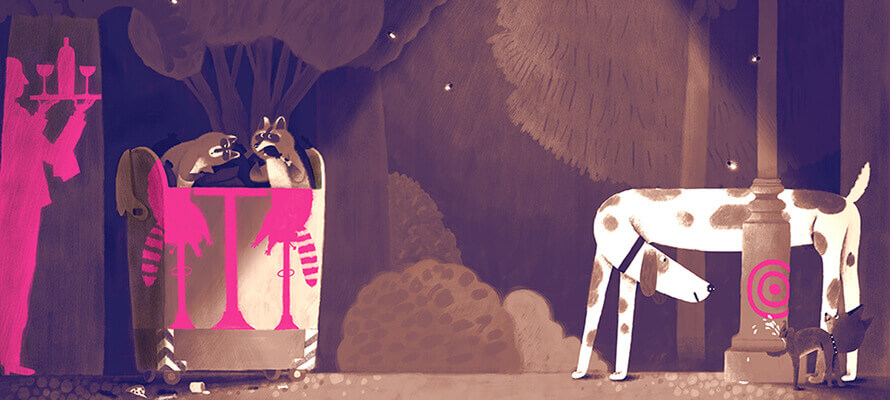
So not only fifth colour and converting solutions as part of the cover’s aesthetics, but as an integral aspect of the narrative. This trend is so significant that an entire exhibition with a talk was dedicated to the creative use of the fifth colour in the 2022 edition of the Bologna Children’s Book Fair. “Fluo Books”, produced by Accademia Drosselmeier and curated by Grazia Gotti and Petra Paoli, also had among its speakers Leonardo Aldegheri and Mirco Dionati of Grafiche AZ, explored the narrative potential of fluorescent inks. One of the books on show was “Anonymouse”, an illustrated book written by Vikki VanSickle and illustrated by Anna Pirolli, published initially by Tundra Books and in Italy by 24 Ore Cultura. Anna Pirolli says: “The contrast between the city’s lack of colour and Anonymouse’s street artworks is the story’s key. I immediately imagined the story with the fifth colour; I wanted to represent, on the one hand, the world of the city with its rules and its dull-coloured everyday life and, on the other hand, the liberating and disorienting breaking force of the works of art dedicated to all its non-human inhabitants. Initially, I proposed two extra colours in addition to the four-colour process, fuchsia and a bluette, but the design proposals also had to reckon with the publisher’s internal considerations on the project’s budget. Almost to the end of the job, I wasn’t sure if it could be done in those terms, so I worked on the boards in such a way that the contrast I had in mind could also be produced in four-colour: a black and white toned down to sepia on which the areas of the illustration that would use the fifth colour would be superimposed on a separate layer. If the need had arisen, we could have solved it with a contrast with a colour like red, but we would have lost something because the emotional meaning of the fluo is the backbone of the story. If on the covers there is more experimentation with materials and printing techniques, when it comes to the interiors, it must always be a decision that supports the story: it can’t be an aesthetic choice for its own sake.”
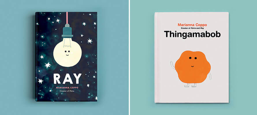
A similar principle animates the use of die-cuts, which, from being ever-present in children’s books, have also appeared in covers and album interiors for a wider audience. These range from intricate designs such as ” Ti aspetto. Jacominus Gainsborough” and “Il piccolo teatro di Rebecca” by Rebecca Dautremer to simple but cardinal forms of storytelling such as “Il Buco” by Øyvind Torseter. And in this case, too, the dialogue between publisher and author is fundamental, as Marianna Coppo, author of “Thingamabob”, explains: “It all started from the fact that the protagonist is, precisely, a “Thingamabob”: as in a contraption, an undefined thing for which there is no word, and which can be many things depending on the context. This is where the die-cutting of the cover comes in, acting as a container, a context and giving a shape to the protagonist. In the first version of the sketch I proposed, I had planned to wrap a full orange hardcover with a die-cut white cover from which the shape of Thingamabob would emerge. They liked the idea, but the dust jacket was too flimsy a solution for a book for readers between 3 and 7 years old. So we arrived at the solution of the hardback edition with a die-cut hardcover and orange endpapers. In the case of Thingamabob, in addition to die-cutting, we used Pantone orange for the main character, while for Ray – Lucio in the Italian edition – the light bulb on the cover is printed with phosphorescent ink. Tundra Books is a publishing house that is open to printing solutions to help the story, but more generally, it seems to me that there is more willingness on the part of publishers to consider converting not only on activity books but also on writing projects for a slightly more adult audience. Perhaps because, on the other hand, there is a greater awareness on the part of adults of the importance of illustrated books, and if adults are willing to invest in well-made books, publishing houses are more willing to support them.”
