
Interview to Chris Joscelyne, Butterfly Cannon’s marketing manager, to look at how the world of high-end packaging is changing
Independent and award-winning, Butterfly Cannon is a brand design agency specialising in brands that have big ambitions and target equally ambitious clients. From its headquarters in London, it works with both local and global clients, aiming to tell their stories in a powerful, beautiful way. In this interview, Chris Joscelyne, Butterfly Cannon’s marketing manager, offers us an insider’s look at how the world of high-end packaging is changing, especially concerning one now indispensable requirement: environmental and social sustainability.
By Michela Pibiri
From drinks to cosmetics, one element that distinguishes Butterfly Cannon from other major international agencies is your particular vocation for high-end products. But the world is changing rapidly before our eyes: so what is luxury today?
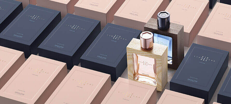
You only have to look at the plethora of luxury brands that have made the shift from olde worlde, highly embellished logos to clean and contemporary sans serif wordmarks to see that the world of luxury has been redefined, reinvigorated and democratised. Accelerated by the global pandemic we have all lived through, indulgent consumerism has been replaced by consciousness and conscience. People want less stuff and more substance. That’s not to say luxury consumers aren’t still seeking out rare indulgences. They just want them to stand for something. ‘Craft’ is an overused and de-valued term these days, but following this shift, there has been a (re)appreciation of the craft and skill involved in creating luxury products, with a corresponding awareness of the preciousness of resources. This has been reflected in the increase in mono-material design and an embracing of the particular qualities and quirks of a material – particularly renewable materials. Look no further than the Champagne house, Ruinart’s form-fitting ‘Second Skin’ case – made entirely from thermoformed pulped wood fibres and 100% recyclable with no plastic or glue.
What are the great challenges of brand communication today? What are your clients’ most pressing requests and how does Butterfly Cannon respond to them?
We live in an age of on-line shopping, hyper-personalisation and social media comms. With an undercurrent of anti-packaging sentiment. The biggest challenge for all brands is to stand out in this context and communicate to consumers in engaging, on-brand ways. Whilst of course being designed sustainably… A consistent, cross industry question is how to implement sustainable thinking in a way that is relevant to their brand. Brands are important to us as people, they have meaning to us and therefore need to reflect and lead what is happening in culture. Sustainability is now embedded in our culture and the dominating narrative is the need to act now to protect our planet. The aspirational brands we work know they have to reflect and even lead this shift. Additionally, as the world moves onward into a virtual existence it is increasingly important to consider how a brand can communicate harmoniously and powerfully across all channels.
Butterfly Cannon is a “sustainably focused” agency. What does it mean to be conscious designers?
As an agency specialising in aspirational brands, creating sustainable packaging that still delivers the sensorial, tactile and culturally relevant experiences expected by aspirational consumers, we are only too aware of the complexities of creating packaging that ‘ticks all the boxes.’ Our Conscious DesignTM process was an approach driven out of necessity – to help ourselves and our clients navigate the minefield of the ecological design landscape whilst still delivering distinctive brand experiences. Driven by a specialist in-house team, led by our sustainability manager, Conscious DesignTM brings clarity to the eco-confusion with a simple step-by-step process. Starting by clarifying the brand’s purpose, defining their sustainability goals and understanding the context within which they are operating, we use our proprietary Climatic TableTM to help brands prioritise which aspects of sustainability they should focus on – now and in the future – and develop a roadmap and creative design solutions to help them get there. This may stretch from using by-products from the supply chain within the packaging to reorganising and optimising packaging portfolios. The advice we give to all our clients is that they don’t need to have the perfect solution before acting. Find how you can make the biggest difference. Acknowledge the complexity. Set clear goals and create a roadmap to get there – even if this means admitting you are simply starting your journey. And don’t forget the role of consumers to help make it happen – getting them involved is not only critical but, done in the right way, is also an opportunity to bring them closer to your brand.
How important is print in your creative thinking? How do you choose the printing techniques and materials that best suit your projects?
With the move towards mono-materials and a move away from over embellishment and ‘bling’, print is an incredibly important part of our creative process and meeting the sensorial needs of the aspirational brands we work with. When choosing techniques and materials, there are no shortcuts – each project needs to be considered individually. But the one constant across them all is the need to look at and understand all the different aspects of the project as a holistic whole: What is the brand story? What are they trying to communicate? What is the design intent? What’s the end use, the volumes, cost of goods, production runs, sustainability goals etc? Every choice has a knock-on effect that needs to be considered.
What are the ingredients of a design that is effective and also surprising? Can you tell us about the most innovative and exciting projects – in all the sectors you deal with – that you’ve done with the use of printing and special materials (from paper to wood to…)?
It’s impossible to give a ‘recipe’ for a great design, but everything we do at Butterfly Cannon is rooted in our mantra of ‘Powerful Stories, Beautifully Told.’ We all have a story to tell. Connections are formed through stories shared. And when beautifully told, stories bring meaning, build memories, and create legends. A brand story is no different. Once you’ve cracked that, everything else falls into place, as these examples show:
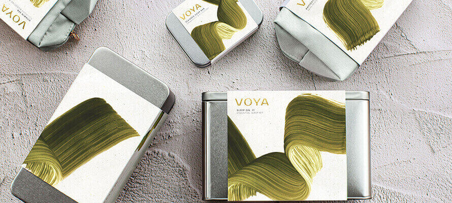
For our sustainable gift range for VOYA, an organic beauty brand that uses seaweed harvested off the West Coast of Ireland, we wrapped the collection’s reusable packaging in a removable printed sleeve featuring our campaign visual icon; a hand-painted brushstroke that flows like seaweed. To complement this, we specified Favini’s Shiro Alga Carta White. An uncoated FSC certified stock from renewable, carbon offset sources that incorporates flecks of unwanted aquatic plant matter – fittingly helping to protect fragile marine areas.

Creating the new-to-world, lower abv botanical spirit brand, TRØVE, “Fanatical about Flavour” became our brand story. From the maverick master distiller’s obsession with getting every last drop of flavour from his fruit and botanical combinations. On pack, hand-painted watercolour illustrations of fruit sliced up with graphical patterns create a collage of explosive taste that leaves no doubt about TRØVE’s maverick approach. Whilst the brand wordmark layers up the unconventional edginess with dramatically cut type, tactile varnish and offset gold foil key lines. In line with the natural but edgy ethos of the brand, we chose Fasson rNaturel Blanc paper for the label. FSC® certified, 100% recycled and able to take the unusual combination of finishes we threw at it.
Marking their first venture into local craft spirits, Diageo India came to Butterfly Cannon to kick-start a range of uniquely prestigious Indian spirits. We rooted our concept in the Indian Banyan Tree. It’s majestic canopy and far-reaching roots a befitting symbol for the unique spirit of the Indian visionaries the range was dedicated to. This informed our choice of materials for the outer packaging – printing onto thin wood veneer that required extensive testing to ensure the brand’s Indian folk art inspired motifs kept their vibrant colour. The end result transforming a standard whisky tube into something as inspiring and disruptive as the brand itself.
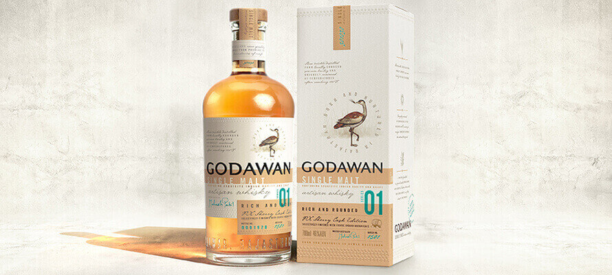
Godawan is Diageo’s first sustainable, artisan single malt whisky born and nurtured in Rajasthan, India. Creating the brand from the ground up, we worked with the brand team to ensure that there was a tangible commitment to both the land and people of Rajasthan – local ingredients, a water positive distillery, giving a platform to local artisans and every bottle of Godawan contributing to the conservation of its namesake – the Great Indian Bustard. In line with this spirit, we used our Conscious Design™ process to specify sustainable materials in line with its luxury credentials, such as Fedrigoni’s Materica Gesso for the label – an FSC certified stock with a percentage of recycled paper. We teamed this with a locally sourced FSC board for the secondary packaging to give the right balance of quality and localness.
With his luxury kombucha brand REAL, David Begg was on a mission to shake up preconceptions about going alcohol free. Visceral AND valuable, contemporary street art became our hook, with the bottle labels our canvas – each variant’s name and character articulated by a single brush stroke icon. REAL is a brand with something to say, so we used digital printing to interweave quickly updateable, topical messages that reflected the brand’s activist mentality, such as #ChampagneReinvented #BreaktheMould #SoberCurious…
Among your latest projects there is “Papil”, a new product created within the Make a Mark project with Avery Dennison, Estal and Kurz. Can you tell us more about this project and why sustainability is one of its highlights?
Make a Mark invited a selection of globally renowned agencies to create concepts around the themes of either sustainability, luxury or innovation. We chose to do all three!
Papil is a positive impact wellness aperitif. Its name coming from Papillon – French for butterfly and inspired by The Butterfly Effect – that something as small as the flutter of a butterfly’s wing can ultimately cause a typhoon halfway around the world. We wanted our flap of a butterfly’s wing is to ensure only positivity affects the world. Whether that be for our physical environment or our mental wellbeing.
Design inspired by nature is proven to positively affect a feeling of wellbeing. With smart technical engineering to ensure its commercially viable, our asymmetric bottle has the natural fluidity and sweeping strokes of a butterfly wing. Echoed in the flowing hand script of our logo and uplifting ‘smile’ highlighting product benefits. The label captures the shifting colours and textures in a butterfly wing through bespoke nano-embossing.
To maximise our positive impact on the planet, we used our Conscious DesignTM process to specify the most sustainable materials:
The bottle is formed from Estal Wild Glass. 100% recycled post-consumer waste glass, with beautiful, natural imperfections and a bluey-green hue that subtly shifts with each batch made. Too beautiful to discard, the bottle lives on as a stunning vase suited to natural flower arrangements.
The cap is made from Labrenta Sughera. Moulded from 100% recycled cork dust taken out of the waste stream using no glue. 100% food safe.
The label uses an Avery Dennison: Fasson MarbleBase stock. Made of 80% Calcium Carbonate to make safe an otherwise harmful by-product of the marble cutting industry.
To experience the full Butterfly Effect, consumers can scan the QR code on the cap to discover ingredient provenance, along with mood-elevating augmented reality experiences.
We hope Papil will push brands to reassess what’s possible. That when you design consciously you can create a product and brand that reaches all expectations; luxury, sensorial and positively sustainable.
What do you think about the Metaverse? How can the digital world improve brand effectiveness, and what challenges do you think the future holds for us?
It’s a really interesting one. It’s too early to say categorically the best way to meaningfully interact with the Metaverse, however the emerging scene around NFTs and how to translate digital art into a real-world physical experiences, such as packaging, is going to throw up some amazing opportunities and really interesting challenges. We’re currently working with one of our global brand partners on a collaboration with a multi-media artist studio to create a range of limited-edition designs. We’re talking with them about turning their original art into a series of NFTs and the ‘extras’ that can be added in this format, such as working sketches, behind the scenes information or one of kind experiences.
It’s undoubtedly going to be an incredibly exciting space to work in. But like any of the other channels a brand uses to communicate with its consumers, at its heart for us, it’s still going to be all about “Powerful Stories…Beautifully Told.”
Chris Joscelyne
Describing himself as a “a creative thinker and doer” Chris has over 19 years’ experience in the design industry working in multi-disciplinary design, innovation and management roles, with brands at both local and global levels. He has significant experience of creative strategy, leading teams, mentoring talent and helping communicate brands’ stories with brilliantly executed, original design ideas. Starting at Butterfly Cannon in 2013 as Account Director for Moët Hennessy, Chris has worked on brands including Hennessy, Glenmorangie, CÎROC, RedLeg Rum, Blackwoods Gin, Brugal Rum and Diageo India. Now Marketing Manager for Butterfly Cannon, he uses his design and company knowledge to spread Butterfly Cannon’s message of “Powerful Stories, Beautifully Told” and their specialism in aspirational beauty, drinks, food, wellness and wider lifestyle brands.
Butterfly Cannon
Butterfly Cannon is an independent, award-winning design agency dedicated to working with aspirational brands. Their clients include Johnnie Walker, Montezuma’s Chocolate, Farrow & Ball, Hennessy, Moet & Chandon, Tanqueray, Ciroc, No7, Bulleit, Glenmorangie, E & J Gallo and Twinings of London.
www.butterflycannon.com