
What are the standards to make a book accessible for those with special educational needs (SEN) or specific learning disorders (SLD)?
For many people, books are real ‘architectural barriers’. But if we all know that braille is the method of writing and reading for the blind and visually impaired, what happens when it is an e-book that needs to be read? And what are the standards to make a book inclusive, digital or physical, for those with special educational needs (SEN) or specific learning disorders (SLD)? From reflowable formats to the use of semantic tags, from the choice of font to the use of colour, here is what you need to know about accessible books.
By Lorenzo Capitani | On PRINTlovers 87
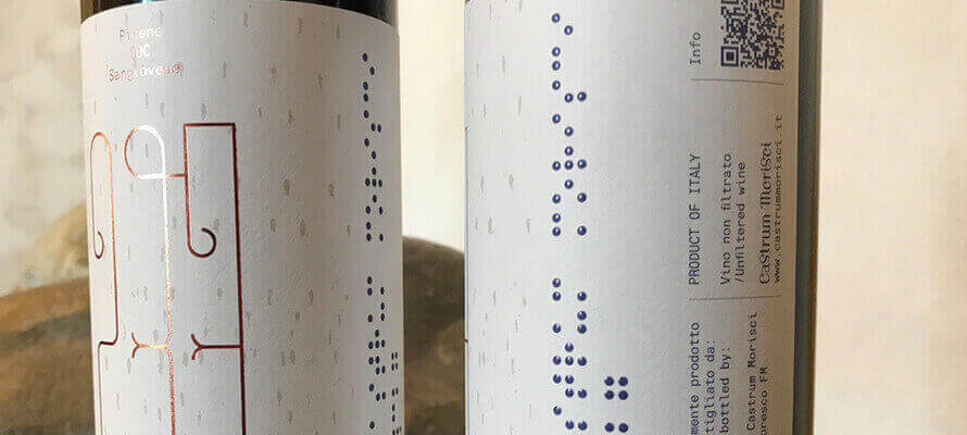
The idea for the tactile reading and writing method that bears his name came to Louis Braille in 1829, when he met an army engineer who had devised a system for reading messages in the darkness of the trenches. Braille, who had been blind since the age of three, devised an alphabet consisting of symbols made up of up to six dots arranged on a 3×2 matrix framed in a box approximately 7×4 mm in size. One of this system’s advantages was that it was easy to make: the dots could be easily engraved with an awl on thick sheets of paper. At that time, the blind read using the Haüy method, which used the same characters as those used for printing, highlighted by a copper wire placed on the opposite side of the sheet, over which the fingertip of the index finger was run. But this did not allow for writing, besides the fact that tactile reading of articulated signs was highly complex. Since then, Braille has become the standard and has expanded beyond the 64 characters possible with the basic matrix, covering punctuation, diacritical marks, mathematical, chemical and phonetic symbols, specific languages and even music. Braille is on medicine boxes, tactile signs at underground stops or in museums, packaging (e.g. Carrefour’s ‘Terre d’Italia’ line) and even the Lego Foundation has created Braille Bricks to teach children through play.
Braille, which is fundamental for the inclusion of blind and visually impaired people and is based on a tactile and material translation of the text, is not without its flaws. “Braille books and enlarged character books for people with severe visual impairment,” explains Cristina Mussinelli, Secretary-General of the LIA Foundation, “are difficult to find, bulky and heavy to carry around. They’re also expensive because they’re produced on request by specialised centres according to specific needs.” With the spread of the digital book and its digitisation, technology has reached a tipping point. If I have a digital text, I can transform and adapt it very easily, and so the possibilities of use multiply: I can convert it into audio, have it reproduced by a Braille display, and I can change the formal characteristics of the characters, the bodies, the line spacing so that it can be accessible and easily read even by those with visual
or learning difficulties.
The fluid text
At present, there are essentially two standards for digital books in the non-school publishing sector: mobi and epub. Mobi is Amazon’s proprietary format for Kindle, epub is the open standard for e-books and has become the primary format in digital publishing. The epub format has benefits mainly in terms of accessibility, although there are other formats, sometimes proprietary, which can be considered de facto ‘dialects’ of these two ‘languages’. They are still ‘reflowable’ formats, so to speak – liquid, capable of optimising the text according to the viewing device and reshaping it according to the user’s typographical settings and preferences. The basis of epub is XML, a mark-up language created by the World Wide Web Consortium (W3C) for the encoding of documents that can be easily read by humans and machines. To do this, tags are used to define the document’s structure and the way it is to be stored and transported. An epub can be considered as a site boxed in a specific format where the pages are files in HTML or XHTML format, the same format used for the web, while the layout of the book is determined by a style sheet in CSS format, a file that describes the graphic rendering. By its very nature, epub, in version 3, is the best format for representing digital content because it can be used optimally by all existing devices. It is no coincidence that as of 28 June 2021, Kindle will no longer support the mobi format and its derived formats PRC and AZK. It will only remain for fixed-layout e-books, which Amazon currently only accepts in the case of children’s books, comics (in KF8) and school or university textbooks in complex formats, including sheet music. By definition, theoretically, PDF would also be excluded from the formats suitable for an accessible digital book, precisely because of its fixed, print-oriented nature – there is no liquid text, and the geometry of the page does not adapt to the device or screen on which we are reading. But in reality, a PDF, if it is correctly formatted in the design phase, can be accessible: it is no coincidence that it is used in some schooling.
The accessible e-book
To be truly accessible, an e-book must possess certain characteristics that facilitate reading; in other words, as mentioned above, it must adapt to the device and the needs of the reader, allow the characters to be enlarged, and modify the colours and contrasts of the text and the background. Furthermore, each element must be appropriately marked to be identifiable by the device and therefore reproducible. Imagine having the classic Italian novel I Promessi Sposi (The Betrothed) in the edition we read at school with notes and drawings, but printed as a running text with no line or paragraph breaks, all in the same font and body, with no identification of notes and no titles: it would be unreadable. This is what a visually impaired person has with a text that is not properly accessible. For this reason, there must be a table of contents that is navigable and allows the reader to directly access all the chapters of the text through links; there must be titles, identified as such, to facilitate navigation, an analytical index that allows direct access, through fully linked internal references, to the indexed terms, linked notes and active web addresses to refer to the Internet for further information. Any tables must be navigable by rows and columns, and headings must be identified as such. Finally, non-textual contents such as photos, drawings, and graphics must have a talking description. By its very nature, epub allows publishing contents with a higher level of accessibility, thanks to the possibility of taking full advantage of the semantic tags of HTML5, the enrichment of the ARIA tags (which identify the various portions of text), and the possibility of declaring the level of accessibility of the file directly in the e-book’s metadata. In the context of implementing the European Accessibility Act, the European legislation for the accessibility of products and services launched in 2019, the adoption of the epub 3 format is strategic for publishers, content creators and, in general, for the entire publishing chain.
The culture of accessibility
The application of standards is not a constraint but translates into access to the text with assistive technologies and different reading options, above all audio, through the voice synthesis functions of various smartphones and tablets or PC – all devices that allow text-to-speech while respecting the rules of pronunciation and hyphenation of the language of the text. Programmes such as Google Play Books or macOS Books, in addition to visually customising the text and interacting with it, enable text-to-speech by adjusting the voice’s speed and allowing moving between titles, sections or links. The other significant advantage is direct reading in digital Braille: you no longer have to produce a Braille text but simply connect your reading device to a Braille display that translates words into real-time signs.
An accessible e-book has the advantage of being a better book for all readers in general, including publishers. And this is thanks to the LIA Foundation, which promotes book accessibility and helps and supports publishers to develop the right way to produce. “Producing accessible and more usable publications and digital platforms,” explains Cristina Mussinelli, “means not only taking into account the evolution of regulations but above all putting the user at the centre from a design, commercial and ethical point of view”. The winning idea is precisely that of proposing a production model known as born-accessible, in other words, continues Mussinelli, “introducing accessibility into traditional production processes so that books are accessible to everyone from the moment they are first published. This implies that it will not be necessary to create an accessible version afterwards, but that a single high-quality version will be published and put on the market right away,” without any re-working, in short, which would not guarantee full compatibility and the same publication time as a paper book. “LIA has been one of the main promoters of this concept and encourages all the Italian and international organisations with which it collaborates to work according to the same philosophy, accompanying them step by step on their path towards accessibility. Publishers can easily include accessibility in their production processes, without subsequent adaptations, by deriving it directly from the same files designed for printing,” says Mussinelli.
They have been doing this since 2014 at Rizzoli Education, which, with Mondadori Education, has made its entire schools catalogue accessible. If the issue is a hot one for e-books and non-fiction, it is even more so for school textbooks, “the layout of which is complex because,” as they explained to us at Mondadori Education and Rizzoli Education, “in the pagination, there is no linear and chain-linked relationship between the elements: it is necessary to make readable tables, charts, concept maps, summaries, iconographic paths, formulas, graphs, chronologies, translations, and footnotes.” They add, “We make a digital copy of every product in the catalogue precisely because we recognise that digital has an intrinsically inclusive characteristic. For us, the evolution of the editorial product does not stop with the digitisation of the content and its delivery on multiple channels but involves the design phase itself so that teaching methods and techniques – or rather learning contexts – are adopted that contribute to inclusive teaching.”
The solution found is what they call “unique native”, which makes the text ‘liquid’ from the start, tagging the contents directly in InDesign: each part can thus be identified and unpacked into portions that can be easily extracted into an XML and then processed to create a highly usable digital version. “The most important challenge for Mondadori Education and Rizzoli Education was to build a flow that provides layout rules that allow, with a reasonable effort, the extraction of an XML file from InDesign. This process involves many different people, from editors and graphic designers to programming and control, to the digital offices that take care of the infrastructure.” This means much faster and cheaper production methods than converting the same title into a digital version. “It is precisely a shared effort that has made a homogeneous creation process possible without upsetting consolidated flows. The XML processing is undoubtedly a work step that did not exist before, but it has been harmonised in the editorial calendar. In the first draft, we already insert the tags that will allow the automatic extraction of the XML, which is then converted into HTML to be used digitally.” The path was similar for Il Mulino, which made accessible not only books but also its educational platform Pandoracampus: in collaboration with LIA, in 2019 it started on the road of making web content accessible according to the guidelines published by W3C (WCAG 2.1 Level AA), including that a user can navigate the platform without using a mouse, the semantic identification of the parts of the web page, adequate colour contrast and the presence of alternative descriptions for all images and contents.
Highly readable books
But accessibility is not only a matter of digitisation. There is, in fact, a large universe of paper books for those with low vision, special educational needs (SEN) or specific learning disorders (SLD). To help and personalise their learning, highly readable books have been created: another situation that is becoming increasingly important in publishing. “These are books designed for those who have specific reading difficulties, dyslexia or other learning disorder,” clarifies Cristina Mussinelli. “Generally speaking, it is a text formatted in such a way as to facilitate reading by everyone, through the use of certain criteria in the layout, such as not justified texts and more ‘airy’ pages thanks to wider margins and increased line spacing. Some publishers in Italy specialise in this type of publication, with books or entire series dedicated to it.” For example, Mondadori Education and Rizzoli Education place alongside entirely SEN texts – in other words, “facilitated” versions with ad hoc layouts and highly readable and certified fonts, such as black and white – large portions of books ‘for all’ with ‘facilitated print’. This means the theory parts, exercises, maps, and summaries, “in addition to audible reading of many parts, including text-to-speech and integrated click & search dictionary. The accessibility of the text is also guaranteed by reading aloud (often the entire profile) that can be directly accessed from smartphones thanks to QR codes taking you to the digital part.”
Zanichelli does the same, providing in each volume digital tools such as dictionaries, voice synthesis (also with karaoke that highlights the exact word read), and audiobooks. Il Battello a Vapore, which has an entire series of books dedicated to high readability, has chosen not to produce texts with simplified content but books with graphic and layout characteristics that encourage readability and make them accessible to all young readers with SLN and SEN. This is what the Raffaello publishing house is doing with the “Parole Leggere” series and Uovonero with “Abbecedanze”. It also publishes the successful series of novels for children starring Hank Zipzer, a boy with dyslexia created by writer Lin Olivier and actor Henry Winkler, Fonzie from Happy Days, who also suffers from dyslexia. But there are also series dedicated to adults such as “Relax. Leggi senza fatica” from TEA or “Leggo facile” from Mondadori, to name just two.
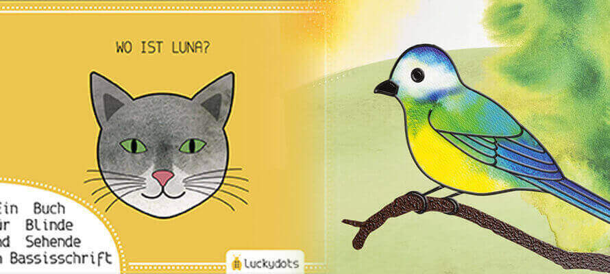
But what makes a printed book accessible? First of all, a whole series of typographical tricks such as spacing between words, letters and punctuation, wider line spacing and not justified text. In addition, paragraphs and chapters must be fragmented, with no carriage syllables to avoid broken words and margins specially designed not to overwhelm the page too much. “In Zanichelli,” says Massimo Evangelisti, the publishing manager who oversaw the ‘10 in legibility’ project (http://tiny.cc/wtovtz), “with the ChiaLab graphics studio and the Istituto Superiore per le Industrie Artistiche (ISIA) of Urbino, we have identified ten rules that can smooth out the obstacles of illegibility. For many people, books are real architectural barriers: illustrations, photos, and texts must be placed on the page in such a way as to make the reading path clear and linear, and the images must be close to the reference text. “Crowding should be avoided: each line should contain a maximum of 80 characters. The line spacing should increase in proportion to the font size, and there should be a paragraph indent for every paragraph to scan the text and indicate the beginning of a new part.” Then there is the use of colour. “Choosing a background,” continues Evangelisti, “which is too dark or too bright can affect the reading of the text, just as superimposing a text on an image can affect the reading of the text.” The substrate is also important, and thick ivory paper avoids the reflections of white paper and any transparencies. A fine example of a genuinely accessible book for everyone is the first children’s book, “Wo Ist Luna?” from the Luckydot project, created by the Austrian designer Anna Weinzettl and printed by Estermann Druck in collaboration with Muller-Martini. Weinzettl created a font that translates each character into its Braille counterpart, enabling blind and sighted people to read the same text together. She did the same with the images, making them raised so that they could be perceived by touch. To achieve the reliefs and Braille dots on the paper, a digital UV transparent varnish was used in register, and to maximise readability, the hardback book is a tout-carton that allows the pages to be opened as wide as possible. The book also has a digital audio part with animal cries.
The right font
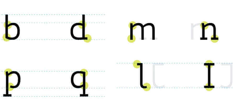
Finally, the typeface is of great importance. If you want to get an idea of how difficult it is for people with dyslexia to read, British designer Dan Britton has created an ‘upside-down’ font, or rather, a font with 40% of each letter missing. In truth, this font does not reproduce exactly what a person with dyslexia perceives, but it does give an idea of how slow and challenging reading can be. But the font alone is not enough: there is now a guide drawn up by the British Dyslexia Association that gathers together ideas for creating teaching materials to facilitate learning (http://tiny. cc/zsfvtz). It suggests, for instance, using sans serif fonts (such as Arial, Comic Sans, Verdana, Tahoma, Century Gothic, Trebuchet, Calibri or Open Sans), using bodies of at least 12-14 points with a line spacing of at least 35% longer, setting the space between words to at least 3.5 times the space between letters and avoiding underlining and the use of italics, preferring bold for emphasis.
But there are also fonts created ad hoc and certified: publishers such as Biancoenero Edizioni and Sinnos have created a specific font for high readability. The Biancoenero font of the publishing house of the same name was the first to be created in Italy for this purpose and is now used by Pearson, Giunti, Mondadori Education and Rizzoli Education, and La Scuola. Created by graphic designer Umberto Mischi, with the support of a team of psychologists, typographers and experts in learning disorders, it focuses mainly on the single letter, the difference between ascending and descending lines and the average width of the letters. According to Mondadori Education and Rizzoli Education, “Thanks to the unique design of each letter and the typographical devices used in the layout (body, line spacing, use of the flag), it provides excellent readability results.”
Leggimi! is the font created by Sinnos in 2006 and then adapted and updated in 2016 – again in collaboration with neuropsychiatrists, speech therapists and teachers – and is also used by Battello a Vapore. The fonts are characterised by uniform thickness and adequate spacing, and certain features that reduce confusion between certain letters. There is also EasyReading, a hybrid font made up of serif and sans serif letters. The serifs, in particular, have been created by placing specific orthogonal elongations at the ends of the letters, thus preventing confusion of those similar in shape, while the well-spaced characters avoid the perception of crowding. The typeface is used by Ancora, Panini, Edizioni Paoline Libri and RAI Libri, among others. Finally, we should also mention Dyslexie, the result of the work of a Dutchman who has dyslexia, in which each letter is unique and unambiguous, with a somewhat childish style, and OpenDyslexic, which is an opensource font, and therefore free to use.
Alternative image descriptions
Digital content increasingly conveys important meanings through images. But how does someone who cannot see ‘see’ an image? Through the alternative description of an image or photo. This is why it is essential, explains Mussinelli, that “All photos, illustrations and graphics in a digital document or website are accompanied by an alternative description that allows those with a visual impairment to understand the content. When images do not have an alternative description, they lose meaning, becoming silent for the visually impaired.
To write a good alternative description, it is necessary to follow some rules based on a taxonomy of categories classifying the different types of images and the actual description of the picture’s content. This activity is burdensome, especially for school texts where most of the iconography is not photos but drawings, illustrations, infographics, complex images, diagrams or schemes; for this reason, LIA has started a pilot project to automate descriptions based on Artificial Intelligence. Using services based on artificial neural networks and machine learning offered by Microsoft, Google, Amazon and Facebook, a tool has been developed that receives as input an epub file, extracts all the images and automatically creates the alternative description. Mondadori Education and Rizzoli Education have also started a similar experiment based on AI. “At the moment, the accessible version of the digital text contains the images strictly necessary for comprehension, but, as far as alternative descriptions are concerned, we have recently started experimenting with AI technologies to simplify the process so that any non-textual element of the book can be included”.
—
LIA Foundation –
Libri Italiani Accessibili
(Accessible Italian Books)
Begun in 2011 first as a project of the AIE (Italian Publishers’ Association) with the support of the Ministry of Cultural Heritage and Activities to promote the culture of accessibility in the publishing field and the creation of a catalogue of accessible books in Italy, in 2014 the LIA Foundation evolved into a non-profit organisation. In 2017, the UICI (Italian Union of the Blind and Visually Impaired) was added as an institutional member, followed in 2019 by the AID (Italian Dyslexia Association) and the ‘Regina Margherita’ Library for the Blind in Monza. The Foundation aims to allow all people with visual impairments or difficulty in reading printed publishing products to choose how, when and, above all, what to read, thus encouraging their social integration and active participation in the world of culture, school and work. Today the LIA Foundation offers consultancy and training services for companies that want to integrate digital accessibility into their production processes. It works to encourage the creation of a publishing ecosystem accessible to all, thus guaranteeing the possibility of reading a document, regardless of its type and context: e-books, balance sheets and annual reports, reports, but also websites, apps, digital platforms. Today, LIA has a catalogue of 26,000 titles certified as accessible. This number is constantly growing with new publishing releases, and it has many publishers, both large and small, as active participants (www.libriitalianiaccessibili.it).
