The happy designer's toolkit
From the creative idea to the print go-ahead, an overview of large and small design tools that make life easier for designers: plug-ins, libraries, configurators, up to the most advanced platforms for managing production workflow.
By Lorenzo Capitani | On PRINTlovers 86
In 1990, designer Massimo Vignelli produced a ‘Character sample book for photocomposition’ for Nava Milano. The title page reads in Akzidenz Grotesk: ‘our equipment allows photocomposition from size 5 to size 60’ in just 33 characters. Today, after little more than 30 years, more than 57,000 ready-to-use fonts are available on the dafont.com website alone, the new Apple operating system makes 572 fonts available, and any text editor allows an infinite number of combinations of bodies, line spacing, tracking and kerning... not to mention what can be done with the new Variable Fonts, which contain all the graphic variants of a font in a single file, including glyphs, borders, shadows and glows.
—
Without a doubt, everything has changed. Today, there are tools and technological possibilities available to creative people and designers that make everything easier and allow them to be limited only by their imagination. The Internet and the exchange of data and information in real-time are now taken for granted since they are so widespread in current working methods. Over the last year, we have also broken down the last physical barriers, making remote and mobile collaboration possible. Technology, even the most advanced, is at our fingertips. The digital divide is eroding faster and faster, and even the most conservative are turning to Industry 4.0, machine and system integration, the cloud and data analysis. However, it is not only advanced production systems that make the difference, those on the production lines or onboard the machines, but also a host of tools - large and small - that are easy to find, even just by Googling them, which are sometimes free of charge or made available by partners and suppliers. They range from plug-ins to online format converters, from libraries of brushes and templates to online tools for packaging renderings, right up to the most advanced platforms for collaboration, design, simulation and certification, all oriented towards production workflow: from the idea to the print go-ahead and beyond. Without claiming to be exhaustive, here is a selection.
—
FONTS
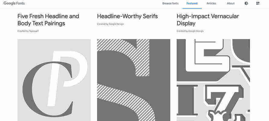
Let’s start with fonts, the mixed blessing of creatives, page designers, graphic designers and photo-lithographers. Some have to update them to manage the project, those who are always looking for new ones, those who have to disentangle themselves from the various TrueType, OpenType and post-script formats or those who find one that is perfect for the client but in the wrong format. Regardless of the giant strides graphic software has made in loading font, there is always the age-old problem of licences. Every graphic designer has immense libraries of fonts, which most of the time are not correctly licensed (a brief guide can be found on fontfabric.com at tiny.cc/3tpetz). So why not look for free ones? Google, for instance, at fonts.google.com, provides a lot of free ones, all ttf, but there’s also dafont.com, 1001fonts.com or fontsquirrel.com. All these sites, as well as allowing downloading, always have a good font map viewer and the possibility of uploading a customised text to judge the rendering before downloading. Another limitless source, ready to use and already licensed for personal and commercial purposes, is Adobe Fonts, which is included in the Creative Cloud subscription.
—
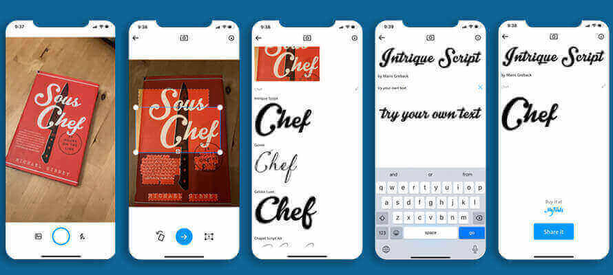
How many times have you come across a font and said to yourself: ‘that’s what I was looking for! Who knows what font it is?’ There are two solutions to this - one smarter than the other. WhatTheFont is an app for your smartphone and recognises a font directly from the photo of a piece of writing or text, as well as identifying similar alternatives and allowing you to share them. But there’s also WhatFont, an extension for the leading browsers that provides each text element’s name and characteristics on a website when activated. Already with the page inspection tools, you can consult the fonts contained, but you don’t know where they’re used.
If we have an old font, we want to change to TrueType or, even better, to OpenType; some sites allow relatively easy conversion to avoid compatibility problems. Usually, all you need to do is drag&drop and click on “convert”, but the pitfall of embeddable licences from the various foundries is just around the corner. The conversion may not always be successful, especially for glyphs. Among the sites offering this service are fontconverter.org, onlinefontconverter.com and transfonter.org, which convert the font and generate a pdf of a demo page CSS style for the web.
—
CONVERTERS
When it comes to converters, the web offers all kinds of converters, ranging from the more general ones that convert practically anything to the more specific ones. The first type is anyconv.com, which simply converts images, fonts, documents, archives, videos, and ebooks from one format to another without too many frills and too many options. Be careful, then, of the GIGO effect (garbage in, garbage out). More powerful is online-convert.com, which not only converts different image formats between each other (including raster and vector, and the new webp and wbmp) with a number of advanced settings on a par with graphic software, but also extracts text from pdfs, converts them to jpg or word, and has a very powerful OCR engine. Each conversion can be transferred to and from Google Drive, downloaded or shared via a QR code provided at the end of processing.
The same applies to editors such as resizeimage.net and img2go.com, which also allow you to edit images with basic operations such as compressing, cropping, resizing or such as picresize.com, which also works in batch. But there is also Adobe Photoshop Express, a simplified web version (photoshop.adobe.com) that is very powerful and suitable for editing images, correcting colour, resizing on the fly based on presets for the main channels - including printing - and with retouching tools such as removing the background or applying advanced filters: the same tools are also present in the app version.
Finally, rgb2cmyk.org and pdf2cmyk.com are also definitely worth saving in your favourites. The first converts online a jpg, png, tiff and gif image from RGB to CMYK by exporting it in tiff or jpg and applying, if desired, a colour profile - either standard or your own - by uploading it to the site. On the other hand, the second converts any pdf from RGB to CMYK, applying a 300 dpi compression of the images, so suitable for printing.
These are undoubtedly useful solutions, but they must be handled with care. They should only be used if no professional tools are available because colour rendering is a variable that must always be checked.
COLOUR
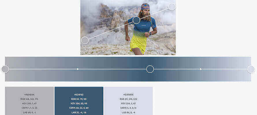
Colour, its rendering and management, is undoubtedly the crucial point at any print job stage, from conception to production, whatever its destination and purpose. Every graphics programme is equipped with sophisticated and appropriate tools, but there are certainly useful tools to consider. One of these is Adobe Color (color.adobe.com), a surprising web app that allows you to create themes and palettes starting from a colour wheel and test colour combinations in real-time. When you change one colour, the others automatically adjust accordingly for similar colours, monochromatic, triads, complementary, composite or by setting the values yourself. The two most interesting aspects of Adobe Color, however, are the possibility of having the colour values shown in hexadecimal converted immediately into RGB, LAB, CMYK, HSV and Pantone with absolute precision and the possibility of extracting a theme or a shade directly from an uploaded image: in this way it is much easier to create a coordinated image or to respect a client’s brand identity. These features are based on Adobe Sensei artificial intelligence technology, which works behind the scenes to find the most harmonious colour combinations. All the libraries created can be saved in Creative Cloud programmes. Finally, there is an accessibility tool that verifies that the chosen theme is suitable for those with colour perception problems. Adobe says: “For people with colour blindness, some combinations of hues and shades can be confusing, making these colours virtually indistinguishable. The purpose of accessible colour themes is not to make colours the same between normal and colour-blind vision but to identify problems to stay true to the original intent or discover new possibilities. If your original design requires five different colours to stand out, you need to ensure that all five colours are distinct. This is what we mean by a theme that people with colour blindness can use.
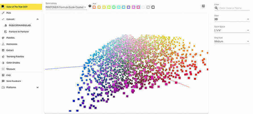
Similar, but based on Pantone colours, is Pantone Connect. It starts with a picker with which to clone one or more colours from the various Pantone libraries available (Formula Guide, Color Bridge, Metallics, Pastels...), build a palette, and from that extract others for similar, complementary and monochrome colour harmonies. Nerds will also appreciate the 3D simulation of Pantone libraries from which to choose. For each chosen colour, there is a correspondence in sRGB, hexadecimal and LAB, as well as the possibility to convert from one colour space to another or a Pantone colour according to the chosen library. And so it turns out that PANTONE 13-0647 Illuminating, colour of the year 2021, in RGB is 245, 223, 77, #F5DF4D in hexadecimal and 89, -3, 70 in LAB and corresponds to 113C in the Formula Guide Coated and is on page 74 of the Pantone guide. Pantone Connect also allows you to extract a palette from a photo and provides ready-to-use colour libraries created based on seasonal trends from major fashion events. There is also a plug-in version that integrates with Photoshop, InDesign and Illustrator, and an app that uses the camera to extract the palette and all its variants from a photo, providing matches and conversions for each colour.
Speaking of colour, there is always the age-old question of what to call a colour to understand each other and use a common language. Codes, which are unambiguous and universal, would be the best thing. This works with Pantone colours, but for the rest, we are among creative people, and imagination often gets the better of us, so for example, we find ourselves in the Babel of reds. This is why there is encycolorpedia.com, which lists an endless series of colours by name and values in the various colour spaces. In addition to the search function by name, colour, and composition, it is also interesting to search by URL of an image or by CSS of a site and brand, institution, flag, or sports team. And so you discover that the Amazon logo, for example, is composed of an orange they call vivid gamboge (which corresponds to #ff9900 or 255, 153, 0 in RGB) and which is the same as Lamborghini’s Ymir Orange, Subaru’s Carnival Orange, and Lancia’s Favorita Orange. At the same time, black is not black, but an extremely dark shade of red. In the tab for each colour, which is also visible on a black background, there are also correspondences in systems such as RAL or Toyo and the possibility of downloading the colour sample for Adobe, Gimp and Sketch. Finally, if you’re wondering whether the mythical Fogra39 profile is still valid or has been updated, you should know that it was in 2017 that ECI released Fogra59 (or eciCMYK_v2), a deliberately wider colour space than most previous output device-oriented colour spaces, which was created to be a pre-rasterisation interchange colour space. In short, it is not specific to one printing technology but can give a preview of what the final result will look like without necessarily losing colour information because it includes the CMYK space of offset, flexo, gravure, digital... Where can I find it? On fogra.org (shorturl.at/abpEG)
COLLABORATIVE PLATFORMS
IT nerds call it Content Orchestration, or the creation, collection, management and distribution of content in a structured and organised way. By now, connection with all players in the production chain is a must, and remote collaboration is in everyone’s DNA. But FTP, attachments and WeTransfer are no longer enough, and it is no coincidence that platforms such as DropBox have gone beyond pure data transfer and offer collaboration tools integrated with Office, GoogleDrive or Adobe CC. As powerful as it is, DropBox does not go beyond storing, exchanging, backing up and synchronising content. It’s certainly a lot for a flow on cloud 4.0, but the service’s target is so vast that the tools end up being too generic and the planning a bit too much project management with planning, tasks, to-do lists...
Adobe is also doing something: on 9 February, it activated the Invite to Edit function in Photoshop, Illustrator and Fresco. The file can be saved in the cloud, and a collaboration link is automatically sent.
But collaborative platforms aimed at graphic and editorial production are another thing altogether. They can act not only as content exchangers and archives but also as organisers and distributors, in short, as hubs for editorial material. This is an added value, especially if our flow is oriented towards so-called neutral content, whose final destination is not already defined but can easily be adapted to the various publication channels. An image can be printed in a catalogue, but it can also have content to be published, depending on the channels through which the client decides to communicate, whether digital or printed.
Woodwing Studio has evolved with this vocation over time. It started out as a publishing system and now stands as a multi-channel aggregator for content collection and distribution. It has numerous integrations with the most popular third-party production tools (Adobe CC), archiving and digital asset management (2Imagines), and publication to social media. But it is the integrations with specific tools for the graphics sector that make the difference: Woodwing speaks with Clarifai, Google Cloud Vision AI and Amazon Rekognition for AI-based image tagging, with Enfocus Switch for the automation of verification, transformation, production and certification of PDFs, with Claro by Elpical for the processing and automatic colouring of images, and also with Desk-Net for the management of editorial production calendars and SDL Trados, a platform for the management of translations and localised content. In short, a control panel from which to manage the entire workflow.
DAM
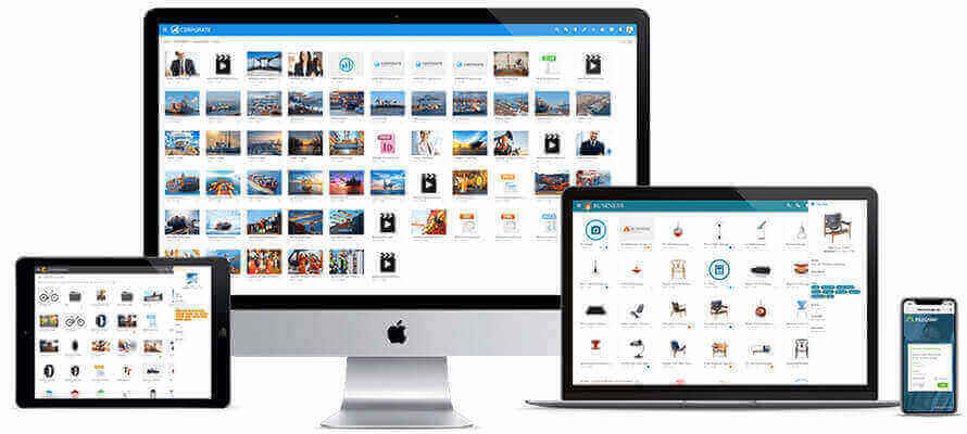
And at the heart of every workflow is the management of progress and completion of the various stages and the retrieval and management of assets, i.e. the collection, metadata, storage, and use of any digital content. The aim is to have a single point where everything is organised and can be searched for and used. It is no longer enough to have a shared disk on the network or a remotely available NAS: a centralised system is needed, where everything is available according to specific policies of visibility, use, publication and approval. And again, where assets can be aggregated into collections and folders, but above all where versioning and rendition are managed without unnecessary redundancy: from a master, I derive all the variants I need for the various uses, and the machine does this for me when needed. DAMs are perhaps the tools with the greatest availability of highly scalable solutions. Mind you, we’re not talking about DAMs for asset delivery, such as Adobe AEM or OpenText, which are more suitable as CMSs for websites, but about solutions such as Elvis DAM, PhotoShelter, FileCamp, Bynder, to name but a few. In other words, systems in which the asset management part is strong. This is a misunderstanding that can lead us to put a powerful delivery system in place, but where it can be complex to do trivial research. That’s also because the strength of a DAM lies in the combination of storage and database: it is based on the information linked to an asset that I store that I find content, only after which comes the ability to show previews, manage permissions, and automate conversions.
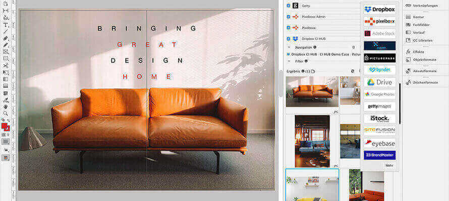
For a truly automated cycle, however, a DAM must also talk to other tools. Cl HUB Connector is interesting in this respect: “No more jumping between tools or windows to find the right resource,” says CI HUB CEO Andreas Michalski. “Just one connection to replace them all and have in one place all the content libraries that co-exist in the various corporate or customer repositories.” In practice, CI HUB adds a palette to the tools of the Adobe CC programmes that naturally integrate with many platforms, such as GoogleDrive, IStock, OneDrive, Behance, and allows users to search and filter content, text, and product information directly in them, complete with previews, tags and Exif metadata.
DIGITAL WORKFLOW
Working with a digital workflow has undoubted advantages and dramatically simplifies the work of creatives: “Go-to-market time is reduced, while only files that are approved will go into production,” emphasises Giovanni Vigone, Esko’s Regional Business Manager for Italy, Spain and Portugal. “In some cases, the printer is involved at an early stage to offer their experience in the creation phase: this would avoid getting the project approved and then realising that with certain types of print you would not get the result you expected,” continues Vigone. This is possible thanks to the three tools designed by Esko for the world of packaging design: Artioscad for structural design, Studio plug-in for Illustrator for 3D generation and WebCenter as a cloud tool for sharing projects via the web (both 2D and 3D), all three of which can be seamlessly integrated via the most common communication protocols with third-party ERP and MIS systems, so that the user has the perception of working in a single environment. Artioscad, in particular, is not just any old CAD but was born and developed around solving structural design issues. It has a myriad of cardboard and corrugated board types in its database, and during design it automatically takes into account the material being used, which affects cuts and folds. Besides, Esko’s system is straightforward to use in remote collaborations - which are becoming increasingly common - because it does not require the classic upload and download operations that require entering a user name and password, selecting the file and sending it. This is the ideal workflow, in the name of digitisation, automation, integration: despite the resistance of some companies or company departments, concludes Vigone, “it has been proven that digitised companies offer a better workplace, they can carry out more jobs in less time and reduce errors”.
RENDERING TOOLS
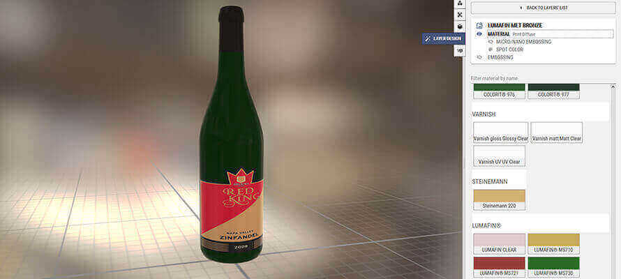
We have seen how the possibility of rendering a project visually in a virtual and 3D environment certainly helps and simplifies the production phases. Especially when it comes to packaging, having an object in your hands to evaluate makes all the difference; it’s better if it’s not blank but already contains the graphics and possibly the processing simulation. Packlick.com allows precisely this type of simulation, especially for glass container labels: once the graphics have been uploaded in pdf format and the online model chosen from an infinite number of possibilities, the support, printing and finishing parameters are set, and the order is placed. The system takes charge of the processing and quickly returns a link to download the extremely realistic render from various angles.
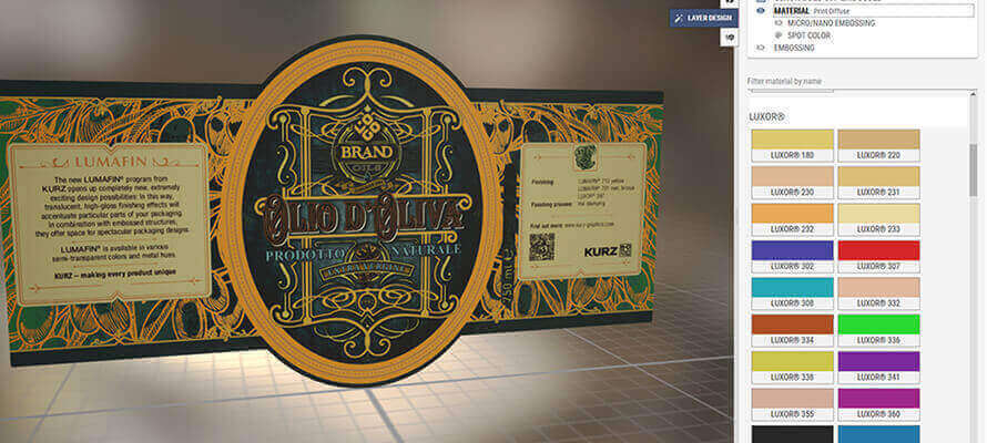
Kurz’s Dream Composer software is definitely geared towards making creatives aware of the result they are getting. This is not just a rendering system that simulates metallic effects but works directly with Kurz’s libraries: “For brand owners and agencies that have traditionally put our products up for tender for years, I think this is a major plus,” explains Alessandro Carnevale, Brand Ambassador for Luxoro, Kurz’s distributor in Italy. The software allows “the best possible digital rendering of all Kurz products (Luxor Alufin, Colorit and Lightline) for hot, cold and digital printing, including the special semi-transparent effects of Lumafin embellishment (new in Luxoro/Kurz).
In addition, relief plate processing, micro and nano-embossing effects derived from the use of H+M brass plates”. Dream Composer reads all the uploaded files’ levels and can act directly in a creative way and independently on each of them. “Dream Composer also contains the different references of the most important paper and cardboard manufacturers, the different gloss and matt varnish options, and the die shapes of the different types of packs, which allow you to simulate the small variations in the effect of the finishing as the production conditions change”. Sharing takes place in real-time by sharing a work link or downloading the finished product file in different formats. Finally, Dream Composer allows remote collaboration and the possibility of appreciating changes in real-time: “a decisive and time-saving aspect in the era of smart working, not to mention the savings compared to making multiple real mock-ups,” concludes Carnevale.
