Strategy - the extraordinary thinking behind label design
Materials, printing techniques, and, above all, strategy are the elements that allow a label to stand out in the sea of communication. We took stock of the sector in terms of design, substrates and processes with Maricetta Gianfalla from Alias (Palermo), Simonetta Doni from Doni & Associati (Florence), Zeno Bersanetti from NSG Design (Bergamo) and Giovanni Murgia from Redfish ADV (Sassari).
By Roberta Ragona | On PRINTlovers 105
What are the characteristics that make a label stand out at the moment? Is it possible to define the direction of the sector in terms of communication, sustainability of materials and processes, and market trends? Yes, if we start with the strategy before discussing materials and techniques, Simonetta Doni, founder of Doni & Associati, explains: “We are a studio specialised in taking care of the image of wineries. But an image that isn't connected to the company means little. We need to communicate to achieve our goal, which is to help the winery become known on the market with its values, ideals and objectives. The company should present itself with its own face, not a mask that works for everyone and that can be passed from face to face. It takes strong ideas and the sensitivity to put oneself at the service of what the company wants to express.”
Strategic thinking is also at the core of NSG Design’s work, as Art Director Zeno Bersanetti explains: “What characterises us as a studio is our long history, which began over 40 years ago when my parents, Giacomo Bersanetti and Chiara Veronelli, opened their first studio after training at the art academies of Bergamo, Milan, and Carrara. In its current form, NSG Design is a strategic design agency that distinguishes itself through its close relationships with clients, beginning with an intensive analysis phase and leading to the design process with clear communication objectives that guide the design action.”
Where stories are born
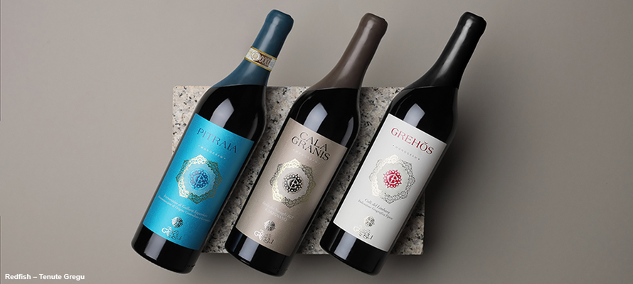
In a sector like wine, the stories are linked to the territory, as emphasised by Giovanni Murgia, CEO of Redfish ADV: “Since 2009, we have been dealing with food and wine communication. Wine is at the centre of our work. Here in Sardinia, that means talking about wineries with a strong link to their local area, often family-run, with several generations behind them and whose business significantly impacts the community.”
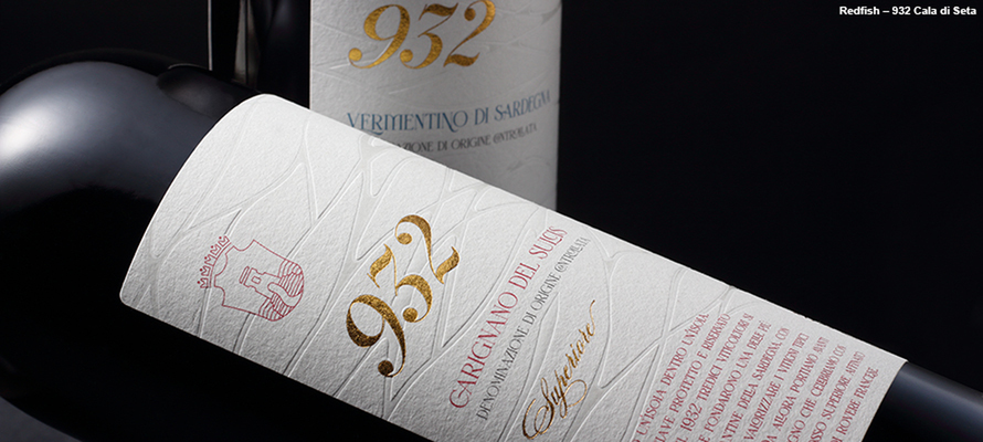
An example is the communication for 932, a Carignano del Sulcis Superiore from the Cantina di Calasetta. “The name recalls the year the agricultural cooperative was founded, 1932. The project brings together the stories of the company, the territory and the community that inhabits it. Using printing techniques such as debossing and polishing, we created an elegant design to evoke the heritage, but it was minimal and contemporary, with a good presence on the bottle. More than ever, the proactive connection between designer and printer is fundamental today.”
To tell stories that work, it's essential not only to know your own sector but also to gather suggestions from other areas, as Maricetta Gianfalla, CEO of Alias Communication and Design, reminds us: “Alias’ experience dates back to the end of the 1990s, with the idea of bringing a strategic approach that is exquisitely creative and graphic to design. This is reflected in the type of projects we work on with wineries, which are influenced by projects with other cultural organisations in the area, such as the Teatro dell'Opera in Palermo and the city's theatre. Over the years, we have collaborated with artists such as Milton Glaser, Emilio Tadini, and Lorenzo Mattotti. We have based our approach on the idea that if wine is the product of a territory's culture, its communication is enriched by the cultural tradition of the territory.”
Creative vivacity for new audiences
What elements today make a label stand out? Can we identify any new elements? Gianfalla continues: “It's a lively time for innovations available to designers in terms of materials and techniques. Micro-embossing and the latest generations of foil – including transparent foil with a pearlescent or diamond effect – allow for interesting effects without adding weight. It is essential to be in constant contact with foil suppliers, paper mills and printers. What is built up over the years is design experience and a network of stakeholders who are not just executors.”
Murgia emphasises the innovations resulting from targeting a new audience: “We are trying to appeal to a public - the new generations – who are less accustomed to wine consumption, so we draw on the visual languages of other areas: a graphic use of impactful fonts and colourful labels designed by contemporary illustrators. It's not just a consumer transition that depends solely on the packaging, but communication can facilitate it.”
Each distribution channel has its communication code. Or does it?
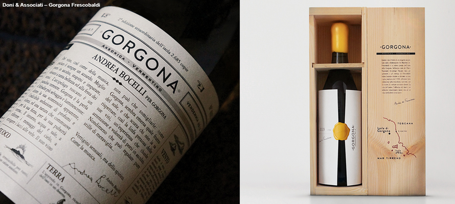
Different targets, but also channels: how does the designer's work change for a product intended for large-scale distribution? Simonetta Doni says: “The first consideration is, of course, the budget: for a mass-market product with millions of bottles, manual processing is unthinkable. You have to balance effectiveness with production costs. Projects with smaller runs open up a range of possibilities in terms of cost and the time that can be dedicated to individual processes.” Like the case of the communication project realised with Frescobaldi and the vineyard on the island of Gorgona: “Gorgona is a prison island in the Tuscan archipelago. The Frescobaldi winery was invited to participate in reactivating the vineyard on the island, and we took care of the labels and the communication. First came the Vermentino, then the red. The idea that guided us was that of the island and, therefore, of the message in a bottle that tells the island's story, of the prison as a place of atonement but rebirth and rehabilitation. We have put a story on the label that changes for each vintage, like an almanac: we are in the eleventh year. The bottle is wrapped in paper sealed with a yellow stamp that hides it just like Gorgona is hidden, but if you get close, you can discover what's inside.”
Gianfalla says, “The communication of the different distribution channels (large-scale retail, wine shops and Ho.Re.Ca) is converging in some respects. Rather, the need to give the sensation of value has grown in large-scale retail. We certainly need to be more striking. When the consumer finds themselves alone in front of the wine shelf, there will be no one to explain the company's philosophy, production choices and territory: the only part of the brand that can speak to them is the packaging, which must therefore be explicit and direct. The difference is the time dedicated to the choice and that one of the two is an accompanied experience.”
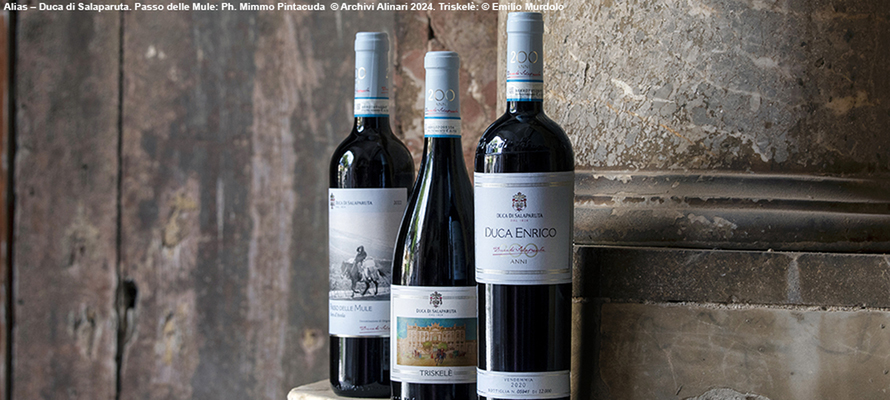
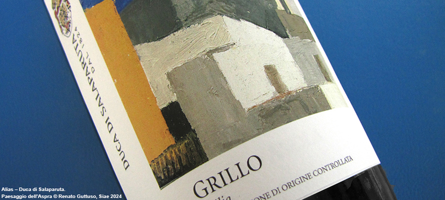
An example is the redesign project for Duca di Salaparuta: “We were commissioned to review the entire range of Duca di Salaparuta wines for the winery's 200th anniversary. For the top of the range labels – Duca Enrico and Bianca di Valguarnera – we did a very basic restyling: these bottles are designed for a consumer who knows wines, the winery, the varietals. All the bottles have a platinum foil border and are numbered. We established a colour palette starting from the historical colours and modernised them. A sky blue like the Aspra area, a tufa pink reminiscent of the colours of the local stone, then blood red for the signature of the Duke of Salaparuta, recalling his extraordinary and eclectic character. The interesting thing was to expand this search for historicity and territoriality to the whole range. We used the colour palette to identify the estates and dug into the cultural world of Bagheria to look for inspiration, a vast universe. We chose photos from the Alinari historical archive, black and white images from the 1960s by Mimmo Pintacuda. For the Triskelé monovarietal Nero d'Avola, we chose a painter of Sicilian carts, Emilio Murdolo. Finally, for the line of monovarietals, a painting by Renato Guttuso worked with paint reliefs to simulate brush strokes. The bottles speak the same language, but in different registers depending on where and how they are most likely to be found.”
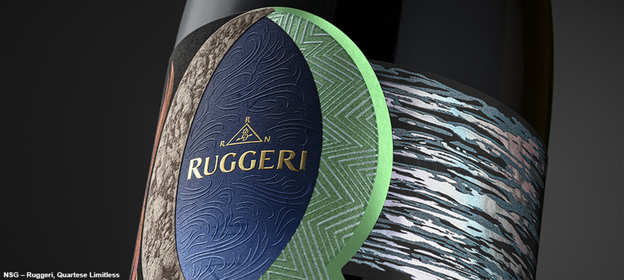
Bersanetti points out these are opportunities for purchase and consumption that influence design choices: “A wine intended for the Ho.Re.Ca channel can afford to make minimal choices - large spaces and small elements - because the education of the consumer is entrusted to the accompaniment of a professional, be it the sommelier or the wine shop. The bottle is part of the experience, and particular attention is paid to the sensory aspect: overlapping papers, three-dimensional processes, letterpress, and material effects. The moment of consumption is also important: if we are with friends, we are in a more open moment; we are more open to the experience in a synesthetic sense. We interact with packaging differently from when we go shopping with the anxiety of time and things we don't want to forget.” Nothing stops us from transferring innovations designed for one channel to another: “An example is the project we did for the Nino Negri winery, a beautiful union of historical and contemporary techniques. Initially, it was a limited edition that used the marbled paper technique. The series was so successful that the client wanted to produce it in series. Here, variable data printing came to our aid, allowing us to create a series of bottles that would never have the same design but without the costs and time of the artisan techniques. Timelines and budgets should not become compulsory to the creative's ability to respond with effective ideas. Another example guided by this philosophy is the labels for Sassorosso and the series on mountain vineyards. It's a project very close to my heart because it's a collaboration between my father and me, issued posthumously after he died in 2020. It's a work that strongly conveys the history of a territory from which a wine is born, replicating on paper the textures and rocky stratification of the mountain.”
Sustainability as a system
What characteristics should a label have to be considered sustainable? Bersanetti notes, “It is no longer a time when communication can be based on the sustainability of the label, except within a pathway that starts from the vineyard and involves the entire supply chain. There is a lot of innovation regarding materials and printing techniques: we have seen the arrival of recycled paper from the most diverse sources, such as grape skins, cuttings, and cotton processing waste. The aim is to obtain paper from each material that is special in terms of texture, consistency and visual appearance. As far as plastics are concerned, we are going beyond virgin plastics and, in the case of the polymers used in the foils, the reduction of the surface area of the foil without compromising quality.”
This is a systemic thought for Gianfalla: “The label works in synergy with the other primary and secondary packaging elements. Crealis comes to mind; they are working hard on a range of totally recyclable capsules. The part of the packaging where the most important changes are seen is glass; research is concentrated on lighter and more transportable bottles with the same performance. The single-material trend is that some brand elements can be moulded directly into the bottle or screen printed directly onto the glass, without a label.”
Considering the non-rational consumption factors too, Doni reminds us: “The psychological aspects of communication should not be underestimated. One example is the perception of value we mentioned earlier: on the one hand, people are looking for lighter bottles, but on the other hand, consumers often associate dark, thick glass with the idea of prestige. So, counterintuitively, the heavy bottle is chosen. An interesting aspect of how regulations can influence design, though, is capsules. Since information has moved to the label, the capsule has become a choice rather than a necessity. It can be omitted or replaced with a wax tablet on top of the cork: the surface is covered, the bottle opener can be inserted directly into the wax, and it is aesthetically pleasing. The absence of the capsule is not a lack, but a lightening.”
Digital wine
Working by subtraction, not only in terms of materials but also of means of communication. It's been a year of significant transformations in the relationship between printed communication and digital media. How does this affect labelling? Doni says: “One of the less obvious consequences of buying wine online on design depends on the device. There are two possibilities for a consumer accustomed to buying from a smartphone. If we have built a relationship of familiarity with the brand through direct experience – buying in a wine shop, tasting in a winery, drinking in a restaurant – we just need to hook ourselves to the memorability of the work done. If we have a consumer in front of us who doesn't know the product and has to decide based on the information on the screen, the product should be recognisable in a few centimetres.”
This brings us back to the importance of strategy, as Murgia emphasises: “In recent years, the race to go digital hasn't always been done in a reasoned way, with companies thinking about going online without thinking about the dedicated content. The risk is not exploiting the potential of the tools or even abandoning them because you don't see results. In 2009, I was among the first to outline to a client the insertion of a QR Code on a back label. But once you've inserted a QR Code, the next step deserves just as much attention: what do we want the consumer to do? What content will they find? Once again, the point isn't the tool, but content designed with clear priorities in mind.”
With a strong return to the physical, Gianfalla notes: “It's a phase of renewed centrality of direct and personal experience, of physical experiences such as invitations to wineries and tastings. On the labelling side, the trend towards QR Codes and NFC can be tools that support the consumer at the moment of choice, expanding the pool of information on a label without adding further elements that clutter up the design.”
Zeno Bersanetti concludes: “I think there is a great need for truth and concreteness. At a time when social media presents us not with a scarcity but an excess of information, filling a communication with meaning has a power that can penetrate the background noise.”
By Roberta Ragona | On PRINTlovers 105
What are the characteristics that make a label stand out at the moment? Is it possible to define the direction of the sector in terms of communication, sustainability of materials and processes, and market trends? Yes, if we start with the strategy before discussing materials and techniques, Simonetta Doni, founder of Doni & Associati, explains: “We are a studio specialised in taking care of the image of wineries. But an image that isn't connected to the company means little. We need to communicate to achieve our goal, which is to help the winery become known on the market with its values, ideals and objectives. The company should present itself with its own face, not a mask that works for everyone and that can be passed from face to face. It takes strong ideas and the sensitivity to put oneself at the service of what the company wants to express.”
Strategic thinking is also at the core of NSG Design’s work, as Art Director Zeno Bersanetti explains: “What characterises us as a studio is our long history, which began over 40 years ago when my parents, Giacomo Bersanetti and Chiara Veronelli, opened their first studio after training at the art academies of Bergamo, Milan, and Carrara. In its current form, NSG Design is a strategic design agency that distinguishes itself through its close relationships with clients, beginning with an intensive analysis phase and leading to the design process with clear communication objectives that guide the design action.”
Where stories are born
In a sector like wine, the stories are linked to the territory, as emphasised by Giovanni Murgia, CEO of Redfish ADV: “Since 2009, we have been dealing with food and wine communication. Wine is at the centre of our work. Here in Sardinia, that means talking about wineries with a strong link to their local area, often family-run, with several generations behind them and whose business significantly impacts the community.”
An example is the communication for 932, a Carignano del Sulcis Superiore from the Cantina di Calasetta. “The name recalls the year the agricultural cooperative was founded, 1932. The project brings together the stories of the company, the territory and the community that inhabits it. Using printing techniques such as debossing and polishing, we created an elegant design to evoke the heritage, but it was minimal and contemporary, with a good presence on the bottle. More than ever, the proactive connection between designer and printer is fundamental today.”
To tell stories that work, it's essential not only to know your own sector but also to gather suggestions from other areas, as Maricetta Gianfalla, CEO of Alias Communication and Design, reminds us: “Alias’ experience dates back to the end of the 1990s, with the idea of bringing a strategic approach that is exquisitely creative and graphic to design. This is reflected in the type of projects we work on with wineries, which are influenced by projects with other cultural organisations in the area, such as the Teatro dell'Opera in Palermo and the city's theatre. Over the years, we have collaborated with artists such as Milton Glaser, Emilio Tadini, and Lorenzo Mattotti. We have based our approach on the idea that if wine is the product of a territory's culture, its communication is enriched by the cultural tradition of the territory.”
Creative vivacity for new audiences
What elements today make a label stand out? Can we identify any new elements? Gianfalla continues: “It's a lively time for innovations available to designers in terms of materials and techniques. Micro-embossing and the latest generations of foil – including transparent foil with a pearlescent or diamond effect – allow for interesting effects without adding weight. It is essential to be in constant contact with foil suppliers, paper mills and printers. What is built up over the years is design experience and a network of stakeholders who are not just executors.”
Murgia emphasises the innovations resulting from targeting a new audience: “We are trying to appeal to a public - the new generations – who are less accustomed to wine consumption, so we draw on the visual languages of other areas: a graphic use of impactful fonts and colourful labels designed by contemporary illustrators. It's not just a consumer transition that depends solely on the packaging, but communication can facilitate it.”
Each distribution channel has its communication code. Or does it?
Different targets, but also channels: how does the designer's work change for a product intended for large-scale distribution? Simonetta Doni says: “The first consideration is, of course, the budget: for a mass-market product with millions of bottles, manual processing is unthinkable. You have to balance effectiveness with production costs. Projects with smaller runs open up a range of possibilities in terms of cost and the time that can be dedicated to individual processes.” Like the case of the communication project realised with Frescobaldi and the vineyard on the island of Gorgona: “Gorgona is a prison island in the Tuscan archipelago. The Frescobaldi winery was invited to participate in reactivating the vineyard on the island, and we took care of the labels and the communication. First came the Vermentino, then the red. The idea that guided us was that of the island and, therefore, of the message in a bottle that tells the island's story, of the prison as a place of atonement but rebirth and rehabilitation. We have put a story on the label that changes for each vintage, like an almanac: we are in the eleventh year. The bottle is wrapped in paper sealed with a yellow stamp that hides it just like Gorgona is hidden, but if you get close, you can discover what's inside.”
Gianfalla says, “The communication of the different distribution channels (large-scale retail, wine shops and Ho.Re.Ca) is converging in some respects. Rather, the need to give the sensation of value has grown in large-scale retail. We certainly need to be more striking. When the consumer finds themselves alone in front of the wine shelf, there will be no one to explain the company's philosophy, production choices and territory: the only part of the brand that can speak to them is the packaging, which must therefore be explicit and direct. The difference is the time dedicated to the choice and that one of the two is an accompanied experience.”
An example is the redesign project for Duca di Salaparuta: “We were commissioned to review the entire range of Duca di Salaparuta wines for the winery's 200th anniversary. For the top of the range labels – Duca Enrico and Bianca di Valguarnera – we did a very basic restyling: these bottles are designed for a consumer who knows wines, the winery, the varietals. All the bottles have a platinum foil border and are numbered. We established a colour palette starting from the historical colours and modernised them. A sky blue like the Aspra area, a tufa pink reminiscent of the colours of the local stone, then blood red for the signature of the Duke of Salaparuta, recalling his extraordinary and eclectic character. The interesting thing was to expand this search for historicity and territoriality to the whole range. We used the colour palette to identify the estates and dug into the cultural world of Bagheria to look for inspiration, a vast universe. We chose photos from the Alinari historical archive, black and white images from the 1960s by Mimmo Pintacuda. For the Triskelé monovarietal Nero d'Avola, we chose a painter of Sicilian carts, Emilio Murdolo. Finally, for the line of monovarietals, a painting by Renato Guttuso worked with paint reliefs to simulate brush strokes. The bottles speak the same language, but in different registers depending on where and how they are most likely to be found.”
Bersanetti points out these are opportunities for purchase and consumption that influence design choices: “A wine intended for the Ho.Re.Ca channel can afford to make minimal choices - large spaces and small elements - because the education of the consumer is entrusted to the accompaniment of a professional, be it the sommelier or the wine shop. The bottle is part of the experience, and particular attention is paid to the sensory aspect: overlapping papers, three-dimensional processes, letterpress, and material effects. The moment of consumption is also important: if we are with friends, we are in a more open moment; we are more open to the experience in a synesthetic sense. We interact with packaging differently from when we go shopping with the anxiety of time and things we don't want to forget.” Nothing stops us from transferring innovations designed for one channel to another: “An example is the project we did for the Nino Negri winery, a beautiful union of historical and contemporary techniques. Initially, it was a limited edition that used the marbled paper technique. The series was so successful that the client wanted to produce it in series. Here, variable data printing came to our aid, allowing us to create a series of bottles that would never have the same design but without the costs and time of the artisan techniques. Timelines and budgets should not become compulsory to the creative's ability to respond with effective ideas. Another example guided by this philosophy is the labels for Sassorosso and the series on mountain vineyards. It's a project very close to my heart because it's a collaboration between my father and me, issued posthumously after he died in 2020. It's a work that strongly conveys the history of a territory from which a wine is born, replicating on paper the textures and rocky stratification of the mountain.”
Sustainability as a system
What characteristics should a label have to be considered sustainable? Bersanetti notes, “It is no longer a time when communication can be based on the sustainability of the label, except within a pathway that starts from the vineyard and involves the entire supply chain. There is a lot of innovation regarding materials and printing techniques: we have seen the arrival of recycled paper from the most diverse sources, such as grape skins, cuttings, and cotton processing waste. The aim is to obtain paper from each material that is special in terms of texture, consistency and visual appearance. As far as plastics are concerned, we are going beyond virgin plastics and, in the case of the polymers used in the foils, the reduction of the surface area of the foil without compromising quality.”
This is a systemic thought for Gianfalla: “The label works in synergy with the other primary and secondary packaging elements. Crealis comes to mind; they are working hard on a range of totally recyclable capsules. The part of the packaging where the most important changes are seen is glass; research is concentrated on lighter and more transportable bottles with the same performance. The single-material trend is that some brand elements can be moulded directly into the bottle or screen printed directly onto the glass, without a label.”
Considering the non-rational consumption factors too, Doni reminds us: “The psychological aspects of communication should not be underestimated. One example is the perception of value we mentioned earlier: on the one hand, people are looking for lighter bottles, but on the other hand, consumers often associate dark, thick glass with the idea of prestige. So, counterintuitively, the heavy bottle is chosen. An interesting aspect of how regulations can influence design, though, is capsules. Since information has moved to the label, the capsule has become a choice rather than a necessity. It can be omitted or replaced with a wax tablet on top of the cork: the surface is covered, the bottle opener can be inserted directly into the wax, and it is aesthetically pleasing. The absence of the capsule is not a lack, but a lightening.”
Digital wine
Working by subtraction, not only in terms of materials but also of means of communication. It's been a year of significant transformations in the relationship between printed communication and digital media. How does this affect labelling? Doni says: “One of the less obvious consequences of buying wine online on design depends on the device. There are two possibilities for a consumer accustomed to buying from a smartphone. If we have built a relationship of familiarity with the brand through direct experience – buying in a wine shop, tasting in a winery, drinking in a restaurant – we just need to hook ourselves to the memorability of the work done. If we have a consumer in front of us who doesn't know the product and has to decide based on the information on the screen, the product should be recognisable in a few centimetres.”
This brings us back to the importance of strategy, as Murgia emphasises: “In recent years, the race to go digital hasn't always been done in a reasoned way, with companies thinking about going online without thinking about the dedicated content. The risk is not exploiting the potential of the tools or even abandoning them because you don't see results. In 2009, I was among the first to outline to a client the insertion of a QR Code on a back label. But once you've inserted a QR Code, the next step deserves just as much attention: what do we want the consumer to do? What content will they find? Once again, the point isn't the tool, but content designed with clear priorities in mind.”
With a strong return to the physical, Gianfalla notes: “It's a phase of renewed centrality of direct and personal experience, of physical experiences such as invitations to wineries and tastings. On the labelling side, the trend towards QR Codes and NFC can be tools that support the consumer at the moment of choice, expanding the pool of information on a label without adding further elements that clutter up the design.”
Zeno Bersanetti concludes: “I think there is a great need for truth and concreteness. At a time when social media presents us not with a scarcity but an excess of information, filling a communication with meaning has a power that can penetrate the background noise.”
18/04/2025


