Printing defects
Let’s run through the most common errors that can occur during the printing process in order to understand how we can avoid them in good time; and in order not to ruin a printed product or the rendering of a photo.
By Lorenzo Capitani | On PRINTlovers #72
Everyone commits errors. That’s why, as a Japanese proverb says, there’s a rubber for every pencil. But there’s error and error. Sometimes an error is an unexpressed possibility that still has to find its way, other times just an irreversible mistake. Even the complex world of printing is not exempt from this rule. Unfortunately mistakes are more frequent than the creations born by chance and one is more serious than another. While we’re waiting for some sort of fantastical error-destroying machine, let’s go over the most common ones together. Sometimes it doesn’t take much not to get things wrong!
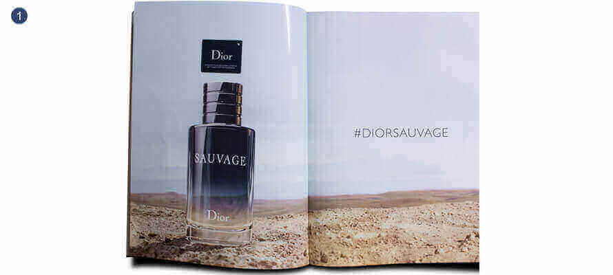
1 - Pendant
What it looks like: It’s not easy to get the ideal pendant, or in other words get two parts of a photo perfectly aligned if they’re on different pages. This crossing can happen in different points in the printed product and, apart from the centre of the gathering that belongs to the same sheet, it always brings about some pitfalls, especially if the two pages come from two different gatherings or, as almost always happens in advertising in magazines, between the inside front cover and the first inside page. In this case the problem is not only tied to the fact that the sheets are printed at different moments or the images can even be very distant on the same print sheet, but it also depends on the fact they sometimes have very different substrates, through paper grammage and finishing. In practice the type of section and the fall of the pages can make the difference and may ruin the rendering of a photo. Causes: In many cases, taking the colour may be complicated, if not impossible, and compromises will have to be made out of necessity. The pendant is not just problematic for the colouring but also for the binding both because an imperfect fastening highlights straight away any mistaken alignments and because if not well balanced it influences the legibility of the photos. Take into account that a photo crossing over and, all the more, a text like a banner headline, ends up necessarily in the fold and the printed product may not open completely as the pages go on, making reading difficult. What can I do?: Obviously you can’t ask to limit the pendants because they have a great impact graphically and it’s inconceivable to know how that photo will fall on the machine sheet. But something can be done at the planning stage. During impagination just conceive of the photo as two different halves and move each of the two at least 5 mm. towards the outside. This method will gain you a more natural legibility of the image. The expert’s opinion: As with colouring, the printer will certainly seek the best rendering but remember that in these cases the best solution is compromise.
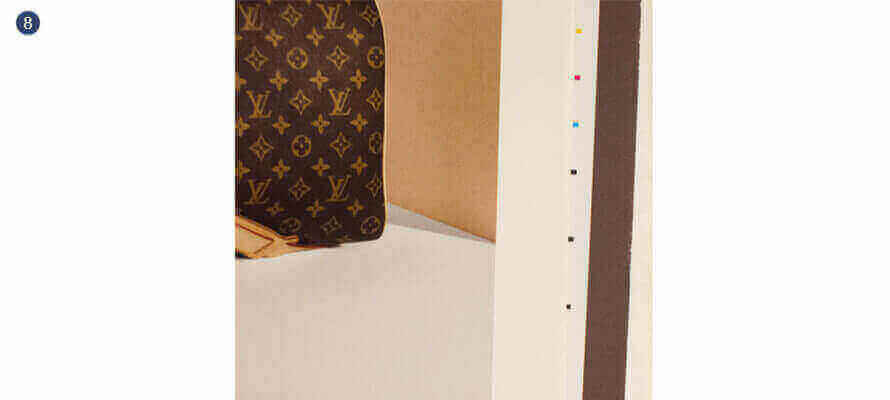
2 - Out of register
What it looks like: You know when you seem to be seeing double and you lift your head from the page and everything goes back into focus? There, that’s out of register. It’s a defect inevitable as it is frequent. You know everything that is printed is really made up of a thick framework of little coloured dots which the eye puts back together in one single image? This simple trick allows all the colours to be reproduced with just four inks, each with its own plate, printing them on the sheet one at a time, in succession and “perfectly” overlapping: in register, in fact. Cause: It seems easy but still today, despite the electronics on board cars that control everything and regulate everything, having a perfect register on an entire sheet is a Utopia: a lot depends on the printing conditions (very large sheets or rotary printing are the enemies of perfect register), on the machine’s regulations and on the substrate. Certainly there are margins but the out of register should be perceptible. The human eye can perceive a difference of register of 0.1 mm to 30 cm of distance. The regulation of the register is one of the initial phases of the printing process and precedes the colour regulation. The out of register should therefore not appear on so-called good sheets and it shouldn’t get to the finished printed product. But the ‘shouldn’t’ is necessary: all you need is a stoppage in the machine. It isn’t easy to say how many copies the defect will be on. It could be a few sheets that are still not perfect but considered good after going through the print run and so a restricted number; but it could also be an oversight by the operator and involve a good part of the print run. What can I do?: Printing in register is one of the basic supply conditions of a printed product and so it depends on the printer, but it is equally true that something can be done before. It’s undeniable that there are dangerous characters: very small coloured letters, for example below 7 pt font, or perforations on a full background, but even very thin coloured lines or frames, maybe curves. In all these cases getting the register on all the printed sheet is decidedly more arduous. The expert’s opinion: Pay attention to 4-colour black texts: they’re an error regardless of the register but they can turn out to be dramatic.
3 - Moiré
What it looks like: The term comes from the French word meaning a type of material, traditionally silk, with an iridescent effect that recalls the waves or water, obtained with an appropriate calendering in the finishing stage. If the moiré for materials like silk, brocade and satin is an indicator of preciousness, the same cannot be said for the printing world. This marbling appears like an iridescence of the print screen’s frame. On frames or textures altered geometries are manifested, which are irregular and unpleasant to the eye. Causes: The phenomenon is insidious and unpredictable and, what’s more, not that frequent even if the conditions exist that encourage it, and it appears as waves, small holes or concentric rings (called Newton’s rings), visible only when printed. The moiré derives from an interference defect between the frame of a character (e.g. the stripes of a shirt) and the slant of the print screen composing it. In practice, it happens when an already screened image is reproduced through screening. At the time of blue printing and analogical colour tests that were obtained from film assembly, it was easy to notice this problem before printing a sheet. But now everything is digital the multi-frequency screen in use conceals the problem. What can I do?: Rather than the printer at times it’s the graphic designer who can avoid the moiré by intervening on the most hazardous photos. How? By lightly blurring in post-production the channel of the image that writes more, especially the black which normally has a screen slant of 45°. In printing only the ruling of the plates or the shape of the dot can be changed. The expert’s opinion: The digital that uses a non-regular screen can be a help but it’s not a given that this technology can be used. All in all, if you have to print a catalogue of fabrics maybe it’s best to talk with the printer beforehand.
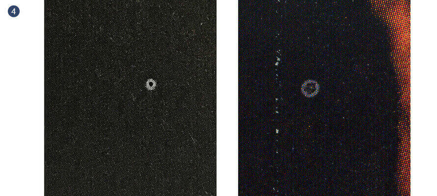
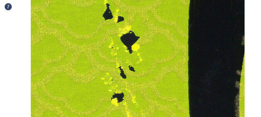
4 - Hickies
What they look like: They’re not the ones on a teenager’s neck and when they’re called that people in the industry laugh. Instead, they’re those little imperfections and coloured holes that pop out here and there on the pages of our printed product. It’s just as well to say it straight away: there isn’t a print run that sooner or later doesn’t get one. It’s a phenomenon inherent to printing processes. At times they have a dimension of a millimetre, and at others they appear like constellations of white spots where there’s more ink. Causes: Usually they form when some dirt enters the machine as dry ink film, particles of paper coating or dust; sticking to the matrices they create empty zones through the lack of one of the colours, or little white circles. In this case the hickie is certainly on the plate of the missing colour. The residue of paper due to the cutting of the sheets prior to printing can also be the cause, especially if the paper is very fibrous. What can I do?: As the Italian proverb says, “four eyes see better than two”: if you’re there to see the start up at the printer’s, once you’ve arranged the colouring with him - but before signing the good sheet - have a general glance and point out any hickies that might have escaped the operator. Later disputes will be avoided. The expert’s opinion: The defect is easily identifiable and just as easy to eliminate during the print run as long as the printer notices it by checking the sheet frequently. He doesn’t even have to stop the machine.
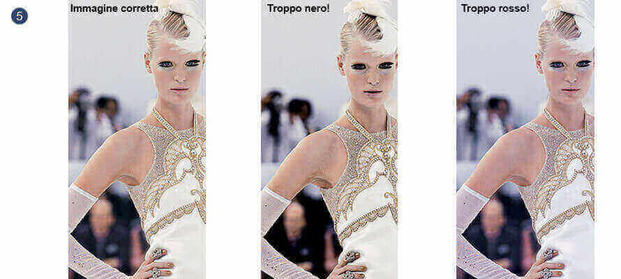
5 - Colouring error
What it looks like: “I thought this photo would come out differently”. That’s the error right there. Colour rendering, not only in printing, is a science based on controlled processes and accurate measurements. Of course there are a lot of variables in play and errors are just around the corner but all the procedures exist for working properly and putting the printer in a position to do so too. Perhaps the plates get put in the machine the wrong way round or the proper attention isn’t paid to correctly checking the machine, but most of the time behind a colouring error there’s prior bad colour management. Causes: The plates are marked carefully marked and checked several times before going into the machine and the printer, as well as his experience, has all the more or less refined aids to regulate the ink ducts. Plus: today the CTPs directly regulate the machines in order to get the right inking. “The sooner I print well, the sooner I finish and put a new job in the machine”. It’s on the job turnovers that you earn in printing. So what creates problems of colour rendering most of the times is poor conversions from RGB to CMYK, profiles used without any awareness, tests done on inappropriate or not profiled paper, not calibrated evaluations on the monitor or a bad photolitho. What can I do?: The first thing is not to expect the impossible. What you see on the monitor can’t always be reproduced in print. Don’t do it yourself if you don’t know what you’re doing. The colour tests aren’t an extra and aren’t a favour you’re doing the printer but a protection for you both. It’s better if you compare yours with the printer’s, even just a sample. Pay attention that they’re on a paper that simulates the finishing on what you’ll be printing. The expert’s opinion: Chromolithographers don’t make it up as they go along and everything you think of saving before can ruin the entire job after. And don’t evaluate the colours under the neon lights in the office: in calibrated light they’ll be very, very different.
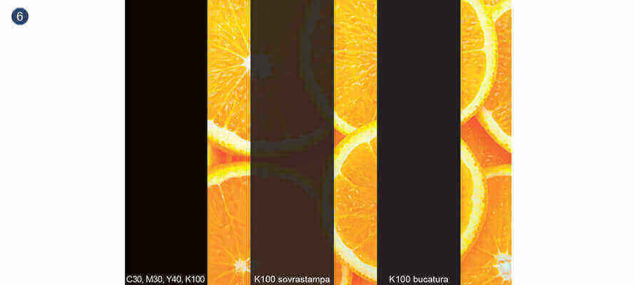
6 - Black error
[black only instead of 4-colour black]
What it looks like: Black in printing is a bit of a vague concept: there’s the one of only black ink, there’s the one plus cyan or magenta and there’s the black of 4-colour. And there isn’t one of them that works in every situation. You sometimes see 4-colour black texts split in two by the out of register; backgrounds full of only black that appear as a very dark grey or, worse, transparent if there’s an image underneath; or blocks of serif text typed in negative on nicely full black backgrounds but still coloured by the out of register rather than white. Causes: Black on its own is fine for texts and lines because a single ink, as loaded as it is, can’t manage to completely cover the screen underlying the other colours. The solution to the problem is called rich black (made up of all four colours) provided that you use it properly because although it certainly looks very full and uniform, it is open to the risk of out of register. What can I do?: Understanding how what you see on video is translated onto paper while it’s being impaginated is indispensable. We write in black and we use several inks for all the rest. Rich black can be obtained with different combinations: all graphic artists have their own. The most used are C30, M30, Y40, K100 or more, or C50, M30, Y30, K100: not much changes, just pay attention not to exaggerate with the coverage, which shouldn’t be above 310%. Careful with Photoshop whose black natively is made up of C75, M68, Y67, and K90, which is different from the native black of InCopy or Illustrator which is done using only black. The expert’s opinion: Remember that what you see on the monitor isn’t what you’ll print; to help yourselves, set up the programmes so they show the 100 K as a grey, while the 4-colour rich black is shown as black.
7 - Stripping of varnish, screen-printing, plastic
What it looks like: If just three ingredients separate a mayonnaise and ruin it, imagine what damage the numerous substances and chemical and physical transformations in the production of a printed product can do! Even if everything’s been tested, sometimes something goes wrong. For example, air bubbles might be created under a lamination, or it gets stripped. Or the varnish might go wrong by agglutinating, or else the screen-printing doesn’t stick and peels away and flakes immediately after drying. Causes: Most of the time it’s due to a superficial drying of the ink, to excessive haste in getting on with the next job, or to having used products that are not compatible with each other in the printing phase. In this case it’s very likely the phenomenon is widespread within the whole print run and can certainly give rise to disputes. What can I do?: Don’t expect unsustainable times. Paper is alive and goes through variations based on temperature and humidity (think about the stress on the paper as it goes into a 170° rotary printing oven and comes out of the machine a few moments later into room temperature). Add to this the chemical reactions of ink and varnish, of plastic glues or screen-printing ink. In short, every job has its own times. The expert’s opinion: Usually what worsens the situation is folding, creasing and packaging, which by stressing the paper destroy its fibres and weaken the hold of the plastic.
8 - Media wedges and visible cross marks
What it looks like: You know the flyers you get in the post box? There, those signs you find on the corners and in the fold and those coloured squares are all signs that are always there on any printed product, just that usually they stay outside the job and get eliminated in the cutting phase. The flyer is the only case in which they’re acceptable: it has to cost nothing and be printed at the speed of light. The cutting and folding signs, such as the overlaying cross marks and the media wedges, are needed as reference points for the various jobs in printing and print product set up phases. Sometimes though, because of a cutting error, mistaken or decentred, they become visible again. Causes: There are at least two reasons: on the one hand, a banal measuring error in the cutting, on the other, very small margins to insert them on the sheet and therefore very narrow tolerances. They’re never nice and they shouldn’t be in the print run: above all, the colour wedges aren’t put in. This is also because seeing them means the folding and cutting are mistaken and with them the bleeds of the photos will also be visible that get deliberately opened beyond the margin. What can I do?: In this case it’s all in the hands of the printer and the binder so the job needs to be engineered correctly. But in reality there is something we can do: if the format of our printed product is at risk because of our printer’s machines, it might be enough to give up a couple of millimetres, particularly in the height. The expert’s opinion: If we’re the ones buying the paper, let’s take nothing for granted and not make the printer work without any margins just to save a few euros.
And finally… Text errors
What it looks like: There’s a curious misprint - the only one in the whole volume in truth - in a version of the Bible printed in 1631. The compositor left a “not” in the drawer and the sixth commandment quoted in Deuteronomy 5:24 became “You must commit adultery”. But there isn’t a text that is exempt. It’s no coincidence that there proof readers. And don’t delude yourselves - the corrector in Word is not infallible, it actually adds entropy, even if it is useful for a first check. InDesign also has its spell checker and, something not everyone knows, the Hunspell dictionaries can be downloaded from the OpenOffice site. And then you read and reread, backwards too and syllable by syllable. But above all make yourselves read! The correction of drafts isn’t a superfluous step and the misprints are a symptom of little care for the text and your printed product. And what you don’t see, the reader certainly will.
The expert
Rino Ruscio, art director, graphic artist and consultant for Mondadori Libri and previously for Rizzoli Libri. He acts as an expert on behalf of the court of Milan and the Milan Chamber of Commerce. For him graphics, publishing and printing hold no secrets: he doesn’t remember how many covers have passed through his Mac. He is the author, among other things of numerous tutorials on Photoshop and InDesign.
12/02/2021


