In words and pictures
Talking about illustrated books means talking about a vast universe of products united by storytelling through images. What does this language imply for editorial design? We asked Agnese Pagliarini, art director who has worked with Minimum Fax and Quinto Quarto, Francesco Ceccarelli from Bunker, and Leonardo Sonnoli, founder of the studio of the same name.
By Roberta Ragona | On PRINTlovers 107
There are many ways to read, but there are books in which visual communication is an integral part of the text, making the reading experience synesthetic: illustrated books. These range from art monographs to museum catalogues, from photographic reportage to narrative through images, including cookery books, costume history and children's books. What does this predominant visual component mean in a publishing project?
The starting material
First of all, as Leonardo Sonnoli, founder of a studio specialising in cultural event communication and publishing projects on the visual arts, explains, it is the iconographic material that guides us. “The book projects at the heart of our work – photography, catalogues, art and design – should take two things into account. One is the source material: what images do we have, and what is the quality of the archive compared to the originals? The other is the cultural significance of the content, which suggests how to deal with the design: which artist or movement is it? What were its poetics? Research needs to be carried out on the corpus of materials with the volume’s editor. If we are working on a monograph of a contemporary artist, we look at all the publications, especially those directly supervised by the artist, which tell us what they thought of their own work. This research has a visual aspect: the fonts used, the bindings, the formats: everything ends up in the project data.”
In this type of work, the voice of the publishing house emerges not from a stylistic homogeneity across every text, but from a publishing philosophy, as Agnese Pagliarini confirms: “When designing a book series, the reader trusts the publisher, knowing that they will find a particular type of offering, and the graphics will help them recognise it. In the case of Minimum Fax, positioning makes the suggestion: going in an oblique direction, independent and parallel to no one else. In the case of illustrated books, on the other hand, the work is on the individual project in terms of format and materials. The publisher's voice has to emerge from the selection of titles and the design, the tangible sign of which is the logo: the Quinto Quarto logo conveys the idea of a breathing space between one signature and another, one four-page leaflet and another – the so-called ‘quinto quarto’ – which is also metaphorical, and an unusual but valuable raw material.”
Series and “podcasts on paper”
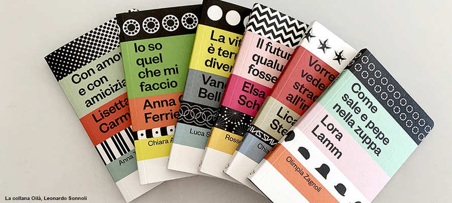
And when you’re designing a book series? Here too, it is the starting material that suggests the direction, as Sonnoli points out when talking about the “Oilà” project for Electa: “A series is more than the sum of its individual authors. The “Oilà” – stories of leading players of the creative Italian and international 20th century – have a recognisable format, which stems from an idea by the editor, Chiara Alessi: to make podcasts on paper, which take up the limited duration of podcasts, the episodes in dialogue with each other, the style of the story or the theme. So, a small book that can be skimmed, to carry around with you like your phone. Not an essay, but the seed of curiosity: at the end of each volume, there is a bibliography for further reading. Even the iconography is reduced, with only three photos that show the person rather than the character.”
“Additionally, due to their small format, the “Oilá” books should feature graphics that make a significant impact. It is a tribute to a series designed by Munari, the “centopagine Einaudi”, which features small books with coloured bands on the cover, different for each issue, and a distinct font for each title. In our case, there is one font on the cover and the characterisation – in addition to the colour – is provided by two bands of icons that create a visual alphabet. These are affordable books with distinctive features: rounded corners and black page edges.”
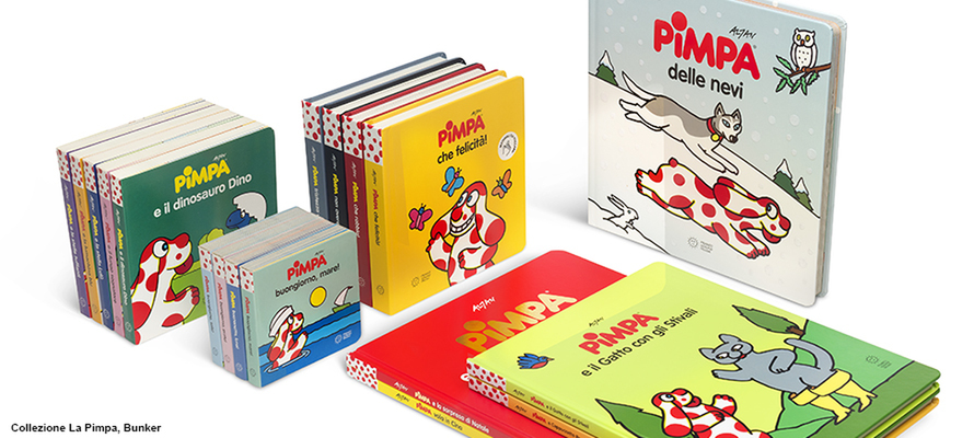
Bringing a classic illustrated book into the contemporary world is what Bunker also did for Franco Cosimo Panini on Pimpa, as Francesco Ceccarelli explains: “Vico Magistretti said that design comes from conversation: dialogue is needed to achieve a result. Creating a climate of openness is crucial for developing proposals that benefit the project. The case of Pimpa – which celebrated its 50th anniversary this year – is emblematic: it is an icon, but the books had a fragmented identity over the course of 50 years, with different formats, fonts and colours. After Altan's exhibition at MAXXI in Rome, we began working with the publisher to systematise the series, finding common threads: Pimpa reads, Pimpa travels, Pimpa colours. We chose a single typeface for all the books: VAG Rounded, a rounded sans serif font, historically used by Pimpa and recently republished and revised for accessibility. We created a font based on Altan's lettering, who also designed small icons to be placed on the back cover to indicate the series at a glance. We worked by topic and age group to make it easier to distinguish between author books and activity books. We redefined the palette based on Altan's colours, which are truly his own: he uses coloured brushes that are no longer in production, from which the palette for digital colouring was created, reducing the number of colours by working on contrasts and legibility. After this work, however, we noticed some minor flaws in the old logo, so we made a very respectful redesign proposal, which both the series editor and Altan accepted. This openness can only be achieved through dialogue.”
The voice of the book
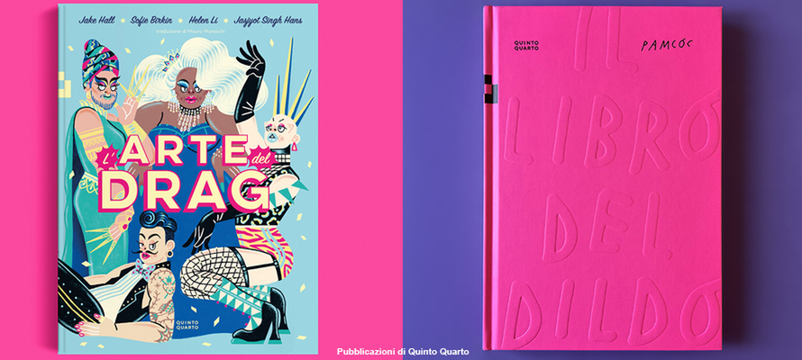
The designer's work, therefore, is at the service of the book’s voice, especially when working on a text in the proposal phase that should find its form in terms of materials and paper engineering. Agnese Pagliarini gives an example: “Often, in the case of illustrated books, the designer should help the author express their idea in the clearest and most expressive way possible. The “Libro del dildo” (Book of the Dildo) is a perfect example: Pamela Cocconi, PAMCOC, has a very recognisable style of highly contrasting black and white illustrations in which graphics and hand lettering are closely integrated. The role of the publishing house was to develop content and graphic analysis around her idea that would strengthen the project. We complemented the black and white with a cover that synesthetically evoked the content, made of cardboard covered with a very bright magenta soft-touch rubber coating, with the title embossed. All these elements immediately and precisely refer to an imaginary world, and also provided us with the accent colour used in the interior.”
This principle also applies to titles acquired abroad, which may need to be adapted to appeal to Italian readers. “When making an acquisition, you have to remain faithful to the original edition, finding solutions that work for your market. For “Arte Drag” with Quinto Quarto, we chose gold foil to evoke glitter, which is a fundamental part of drag iconography and maximalist aesthetics. The original edition had Japanese-style creasing. This is a valuable detail that is not always understood in the Italian market: to some readers, it evokes something broken. We also need to think about the cultural perception of adaptation.”
Design in dialogue with distribution channels
Listening is essential not only when designing, but also when working with various distribution channels, such as general bookstores, museum bookstores, or specialist bookstores. Leonardo Sonnoli, speaking about “Oilà”, emphasises the importance of dialogue between designers and publishers, including sales departments. Design choices – such as avoiding a slipcase for practical reasons or foregoing a display stand, which is usually unpopular with booksellers – arise precisely from this dialogue. No one can predict which cover will sell best, but active listening helps to find practical solutions.
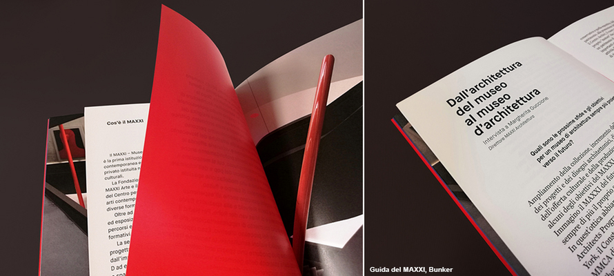
How does design change if the destination is a museum bookshop? Francesco Ceccarelli describes the graphic design for the MAXXI guides, conceived as pocket-sized, inexpensive volumes, but with careful details that express the rigour of the museum. The book, structured in sections – including a narrative introduction by Mauro Covacich, services (maps, libraries), and a focus on photography, art, and architecture – features a Bodonian binding, with a cloth spine and cardboard covers. To facilitate management in bookshops, the Italian and English editions have different coloured spines (red and blue), which are also reflected in the interior details. The service sections are printed on narrower pages to make them easier to find, while the main content uses a small font, inspired by museum captions. The same graphic principles were used for the edition dedicated to the MAXXI headquarters in L'Aquila, using yellow as the distinctive colour.
Agnese Pagliarini emphasises how much the production chain influences the design choices of a book. It is essential that the volume, even after passing through warehouses and logistics, arrives in bookshops in perfect condition, giving the reader the feeling of being the first to leaf through it. However, the increase in raw material costs has made ambitious projects such as Quinto Quarto's “Tempi di Recupero” (Recovery Times) more challenging to produce. The book is printed on paper made from agro-industrial by-products (hazelnuts, almonds, olives, corn) and embellished with gold foil on the cover “because the book is about recovery in the kitchen, which is not a poor art, but literally an ennobling one”.
For the love of collecting
When talking about the relationship between design, content and production aspects, there is one element that brings together art enthusiasts and lovers of genre fiction: collecting. Agnese Pagliarini notes: “The recent success of complex publishing projects, with page-edging, rounded corners, letterpress, embellishments and other fine details, is the result of the meeting between the world of booktokers and the public's interest in genre fiction, fantasy, sci-fi and romantasy. These are genres in which collecting often goes hand in hand with reading: it is an offering of added value - not just reading, but owning and displaying.”
Without losing sight of the function of enhancements, as Leonardo Sonnoli concludes: “The idea of enhancement is part of the design, but we must never forget what the elements of the book are for: the cover is there to cover, and therefore to protect, and the endpapers are there to protect the first page. They are literally packaging elements, created to preserve as much as possible of a fragile material, paper. The edging itself was once truly metallic to prevent insects from accessing the paper. Knowing the reasons why something was invented helps us to use it. This is why designers need to consult with those who print and produce.”
“Designers can be agents of innovation, experimenting with printing techniques and materials. This becomes even more relevant when working with materials that are not traditional in editorial design, such as the mirror plastic used by a conceptual artist in the 1960s who worked with mirrored surfaces, or the micro-corrugated cardboard on a text about an artist who worked with waste materials. Design should not be an insular discipline: the same materials and techniques in different applications can feed off each other.”
07/11/2025


