Design according to Harry Pearce
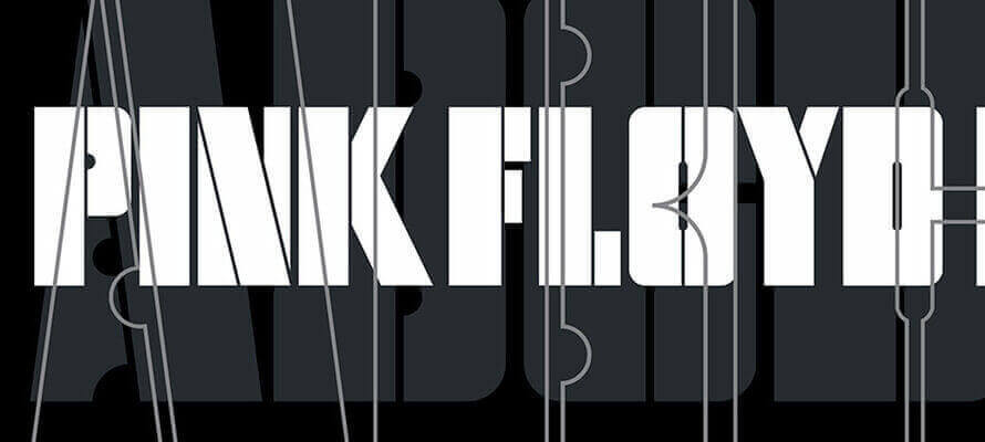
Internationally renowned designer, multi-disciplinary creative, and partner in the renowned Pentagram agency, Harry Pearce has an impressive portfolio of projects that focus on typography, printing and careful choice of materials. Many of them are dedicated to art, culture and not-for-profit: names such as Pink Floyd, Royal Academy of Arts and the UN may be enough, but there are many more, and all are excellent. In this exclusive interview, he tells us about his vision.
By Michela Pibiri | On PRINTlovers 87
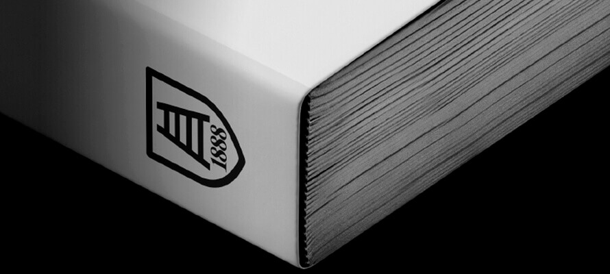
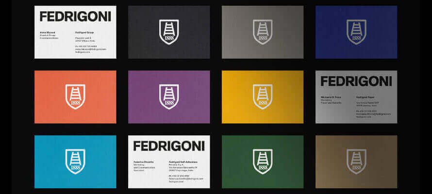
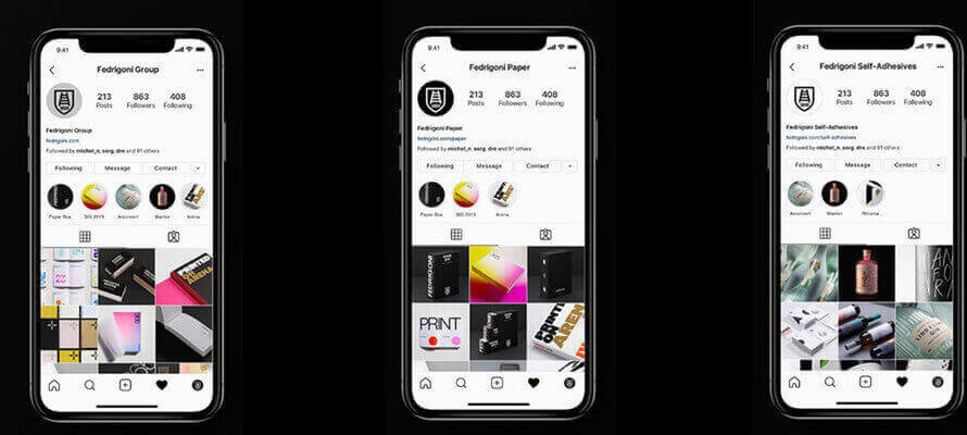
“Rem tene, verba sequentur” (literally “grasp the subject, the words will follow”) goes a famous sentence attributed to Cato the Elder. In four words that have come down to us through two millennia of history is the essence of good rhetoric: master the argument because the words will follow. The same maxim can be said to apply to good design today, especially in relation to a world as complex as ours: first master the idea, then think about the means of bringing it about - whether physically or digitally. This is the approach of Harry Pearce, English designer, artist and photographer, a partner in the international studio Pentagram since 2006 - a philosophy of life, even more than a professional setting. In the course of his career, he has worked all over the world on projects that differ significantly in terms of their objectives, type and size, with leading figures in the fields of art and culture, publishing, and luxury retailing. But he has worked enormously with the non-profit sector, also committing himself personally and pro bono in support of humanitarian causes. His latest projects include the rebranding of Fedrigoni, the historic Italian paper group which, following several acquisitions, has renewed and standardised its global identity: no small challenge, solved with extraordinary elegance and depth of thought.
What are the great challenges of brand communication today, and how does Pentagram respond to them?
Undoubtedly the greatest challenge is making any kind of impression in a world of complete overload. We are all bombarded from every angle by information, messages and communication. To a degree, much is worthless, yet it all just increases. We try at Pentagram always to create work of worth. Work that has a real purpose, that’s adding to our cultures and not depleting them. It’s actually a simple choice, but hard to maintain.
How important is print in your creative thinking? How do you choose the printing techniques and materials that best suit your projects?
Print has remained a constant and a very important part of most projects. Its role is simultaneously intertwined with the digital and the physical environment. In terms of my creative thinking, paper is vital. When I think and talk about projects, all the while I am sketching on paper. For me, it’s second nature. Sketching and sharing thoughts and ideas remains a physical process, and has always been the way for me. Any project that will manifest in the physical world we make in some form, most often in paper. This really is the only way to understand how it will actually function. Its scale, its materiality etc. Regarding choosing the paper, this is clearly governed by the project. For instance we have designed a great number of wine labels, and the paper specifications for such an item are governed by very particular constraints. For a book, it’s an entirely different set of choices and requirements. The choosing of materials and the printing techniques is like a beautiful dance between the different possibilities. The narrower the scope of choice can often mean the easier the project. Sometimes when the possibilities are limitless it can be so difficult to make the right decision. Our work is very broad in its application. We design for the smallest label right through to graphics on enormous buildings. The choices we have to make regarding print and materiality are profoundly different on every occasion. But finding the perfect paper, say by chance, can lead to a whole new inspiration and direction to a project.
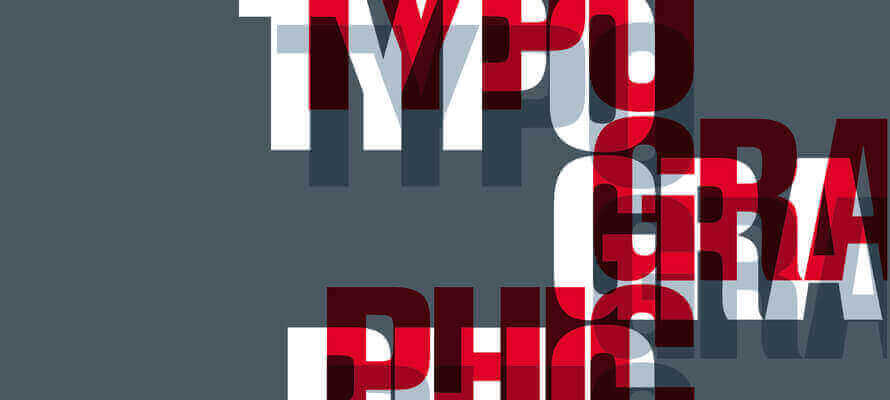
How important is type design to you, and what are the ingredients of an effective and surprising design?
Typography has always been at the heart of my work. It’s often the core of a system and identity that the rest builds from. With typography, so much can be expressed with so little. If a word is written, there is the shape, style and look of the word. Then there is the literal meaning of the word, and of course, there is the sound implied. A deep and vital energy can be contained in just a simple little piece of type. That, for me, has a sense of wonder and is beautifully surprising. Creating a unique font allows for a unique tonality and voice for any business. It’s satisfying to see this becoming an ever-present part of many new identities.
You also work a lot with the digital world, including augmented reality. What is your approach to digital, and how does it integrate into the physical experience of consumers?
Digital is, of course, integrated into most of our projects. However, I see the world as ideas. For me, it’s all about expression of ideas and form. No matter what the method is for replaying those ideas, we start way above the final methods of articulation. Find the idea and then the most appropriate way to bring it to life. At Pentagram, we are made up of individual partners. Each with their own particular approach or specialism. Often we come together to best answer briefs. For example, AI with sound, graphic design with architecture or product design, and so on. It’s about integration of different disciplines and approaches. I see everything living together, building on each other and expressing rich ideas collectively.
One of the elements that distinguish Pentagram from other major international agencies is your commitment to the world of culture: visual arts, performing arts, exhibitions, museums and foundations. These are activities that include digital, printed material, physical set-ups and immersive experiences. What are the peculiarities of this sector when it comes to communicating, and how can your approach be summarised?
What is so important to Pentagram is the broad platform that we inhabit. To be able to work between greatly varying subject matters, business and cultural types. To be able to grow and learn in doing so is such a privilege. Investing in art, culture and a lot of charitable work is the constant payback. Designing for the cultural sector often requires, as you rightly point out, being able to integrate many facets of an institution’s world. From the visual identity to the environmental space, from a tiny ticket, to a book, app or a building. Weaving this all together is so important in building a consistent narrative displayed to the world. When approaching this type of work, I hunt for the heart, the true centre, where the feeling is. No one project is the same, no one institution works like another. It’s always a fresh journey of discovery, to find the truest form of expression.
Among your latest projects, there is also the rebranding of Fedrigoni, a historic Italian paper group of global relevance. How did you approach this project, between heritage and the search for renewal?
This was a very sensitive project. Sensitive because of the great history behind the brand, and also it required several businesses to completely change their identities in the PSL division, aligning with the new Fedrigoni global structure. It’s a very brave change all round. Primarily the design approach was simplicity and finding the clearest and most sincere way to rebrand this complex and much-loved business. As you can see, typography was at the heart of the work. We used their history as a springboard to build this very modern identity. In all projects where companies have such a deep history, I find the past is always present. It’s a great source and educator when trying to understand how best to design authentically.
What is innovation for Pentagram?
Embracing constant change is the living idea of Pentagram. We continually innovate as we allow new partners to join us — their character and skills always change the business. This means new ideas and views at the table and fresh ways of working and making design. As the older partners retire, the younger generation keep the business in step with current times.
What challenges do you think the future will hold for us?
The great challenges I see for us all are the need to change the direction of our way of being, whether that’s our relationship with the planet or with each other. Human innovation is moving at such a rate and increasing constantly that for us all to stay in step gets forever more difficult. The fact that we have been so enormously destructive for so long and on so many fronts leaves a challenge of great enormity. I believe great change is our future, and our ability to adapt positively, I think, will be the key.
.png) Harry Pearce
Harry Pearce
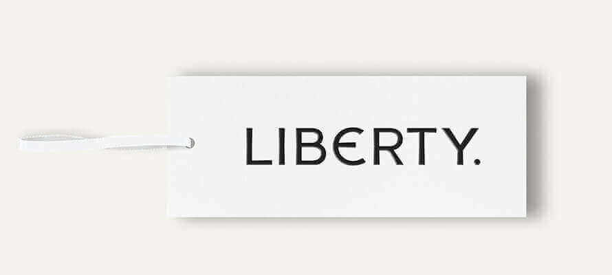
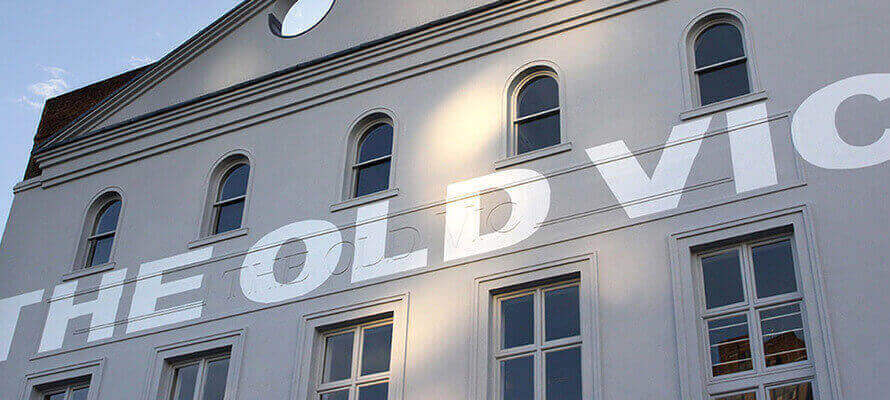
Harry Pearce is a graphic designer, artist and photographer. He studied at Canterbury College of Art. Before joining Pentagram as a partner in 2006, he co-founded and co-ran Lippa Pearce Design for 16 years. Pearce has worked around the world devising identities, installations, posters, packaging, books and talks for clients as diverse as Liberty, Thames & Hudson, the Royal Academy of Arts, Camden Art Centre, WITNESS, John Lewis, Waitrose, Abu Dhabi cultural quarter, Berry Bros & Rudd, Phaidon Press, Pink Floyd, Saks Fifth Avenue, Lloyd’s of London, Fedrigoni, PEN International, The Old Vic Theatre, Science Museum and the UN. For Ai Weiwei, Anish Kapoor and Anthony Gormley, he created identities for their major retrospectives at the RA.
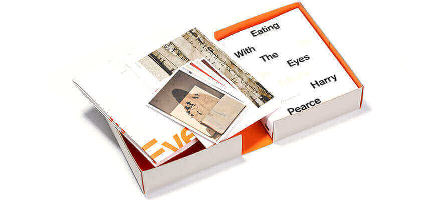
His work has been exhibited in New York, Paris, London, Toronto, Naples and in over 65 countries with the ‘Tolerance’ exhibition. Since 1993 he has been an active member of the advisory board For Witness, a human rights charity founded by Peter Gabriel. He is also a committed member of Alliance Graphique Internationale and has spoken at design conferences across the globe, including Australia, South Africa, New Zealand, the USA, India, Holland and Costa Rica. Pearce is the author of two books, Typographic Conundrums (published in 2009) and Eating With The Eyes (published in 2015).
About Pentagram
Pentagram is a multi-disciplinary, independently-owned design studio founded in 1972 by Alan Fletcher, Theo Crosby, Colin Forbes, Kenneth Grange, and Mervyn Kurlansky. We have offices in London, New York City, San Francisco, Berlin and Austin, Texas. Our 24 partners are all practising designers with their own teams, and they work both collaboratively (with other partners) and independently. Our work encompasses graphics and identity, products and packaging, exhibitions and installations, websites and digital experiences, advertising and communications, sound and motion. The structure of Pentagram is unique. We are the only major design studio where the owners of the business are the creators of the work and serve as the primary contact for every client. This reflects our conviction that great design cannot happen without passion, intelligence and — above all — personal commitment and is demonstrated by a portfolio that spans five decades, many industries, and clients of every size.
30/07/2021


