The shape of the book
Amid social marketing, Dark Academia aesthetics and deluxe packaging, Italian publishing is reacting to the decline in readers by focusing on the book as an object, because we read (and buy) with our eyes before we read with our minds.
By Lorenzo Capitani | On PRINTlovers 107
When, in the early 2010s, with the rise of digital technology, we discussed the end of paper or a redistribution of power and balance, we were wrong. We were short-sighted, unable to truly understand what was happening: after all, the first iPhone had only been unveiled in 2007 and seemed like the evolution of a nice iPod that could make phone calls, while the first Kindle came out in 2009 with ugly physical buttons for turning pages. At the time, we believed that the enemy of the paper book was its digital version; however, it was the smartphone and its complex ecosystem that, over the two years from 2015 to 2017, would become truly universal, definitively changing the game. We thought of a coexistence of media, whereas the content we would consume over the next ten years was changing radically.
Reading is a sacred act. It's like a prayer.
As Paul Auster wrote, “reading is like praying”, and so it takes time, concentration and the willingness to entrust ourselves to something that can make us feel good: reading, and the infinite worlds that spring from it, require effort on our part, while everything in a smartphone is there, accessible in an instant. That little slab of glass and rare earths contains our lives, our work, our memories, our passions, music, podcasts, videos, films, series, games, news and socialising – in short, everything. That's why we fill every spare moment bent over that screen, looking up every 15-30 seconds to the rhythm of the reel, with the same movement of the head as many farmyard birds. And the data confirms this: the Organisation for Economic Co-operation and Development has calculated that the truly self-directed free time of an average European, i.e. the time that each of us has at our disposal, is 3 hours per day, broken up into micro slots scattered throughout the day. And the time devoted to reading has fallen from 3 hours and 32 minutes per week in 2022 to 2 hours and 47 minutes, according to the AIE (Italian Publishers Association) Observatory's survey of Pepe Research data.
But amid many shadows, there is some light.
It is therefore not surprising that AIE's figures for the book market in Italy in the first four months of 2025, based on NielsenlQ-Gfk data, show a €16 million drop in sales compared to 2024 (which had already lost €15 million compared to 2023): this means almost a million fewer copies sold, despite the 5,308 publishers active in Italy in 2023. Only the children's and young adult sector is holding its own, which is surprising given the demographic trend, while fiction, historically strong, non-fiction and the comics and manga sector are losing ground. School and university textbooks are not faring any better: the former is beginning to feel the effects of the demographic decline, while the latter, under the blows of artificial intelligence, which is starting to “take the chair”, is down 12%.
The AIE data speaks for itself: publishing is suffering, but blaming this decline on “the sharp decrease in support mechamisms for demand”, such as the Culture Card and the Merit Card that replaced the 18app, as stated in the final press release of the Turin Book Fair, is to ignore that the problem is structural: what is missing is the reader, who does not read on paper or digitally.
Fortunately, publishers are more aware of this than institutions. They are adopting a more entrepreneurial approach, even if promotional formulas and a pricing policy that counter the trend of inflation do not seem to be yielding the desired results.
And so, by changing perspective, they are trying to invest in the book itself, enhancing its form, exalting it as if it were packaging, going beyond its cultural function. Walking through the stands at the Turin Book Fair or entering a bookshop, this approach is immediately apparent. Forgetting the numbers, looking at the quantity of books on the shelves and their appearance, one is led to believe that this book-object is in good health, especially in genres such as fiction, particularly fantasy and romance. After all, Vittorio Spinazzola wrote as early as 1995 in “L'immaginazione divertente” (The Entertaining Imagination): “Genre literature is by its very nature consolatory: it reassures because it repeats, and by repeating, it orders. Repetition is not trivialisation, but a promise kept. It is a ritual pleasure”.
The new dimension of social media
How far we are from 2021 when Paul Sahre, illustrator for the New York Times, said that “Amazon is changing cover design, not just in terms of proportions: they need to be readable on all screens, often in small sizes. In most cases, the subtleties of the physical book do not translate well into the digital world”. In the space of four years, the world has changed: if before we had to adapt to the two-dimensional virtual shop windows of e-commerce, today we have to adjust to another digital reality: social media, TikTok and Instagram above all, and it is precisely against this background that the exaltation of the three-dimensionality and physicality of the book can be explained.
It is a change of perspective, as we said, that has led publishers to pursue what readers are looking for, abdicating their role as cultural guides; after all, they are businesses and, as such, they have to make a profit and, therefore, social media is fine, just as it has worked well for other types of products. It is on social media that books are displayed, touched, turned over in the hands of influencers, described and commented on fetishistically by BookTokers, not only for their content, but above all for their form. It all began in 2020 with BookTok, a TikTok sub-community where reviews and recommendations are shared, and books, primarily young adult, fantasy, and romance genres, are discussed. In 2024, books promoted through BookTok sold 5.8 million copies in Italy, accounting for almost 6% of the total fiction and non-fiction market. Titles such as Erin Doom's “Tear Maker” and Colleen Hoover's “It Ends with Us”, after mediocre debuts, saw an exponential increase in sales following their rediscovery on these channels. And while the phenomenon is driving these genres, it is also progressively influencing reading trends and publishing marketing strategies for all publishers, not just mainstream ones.
Publishing houses are increasingly collaborating with BookTokers, elevating them to editors in the hope of finding the philosopher's stone, to unearth the next bestseller among the thousands of new releases. A post by @labibliotecadidaphne and @levv97, to name just a couple, is worth as much as a television appearance. And this is reflected in the form of the book.
Stop scrolling
Paradoxically, the book acquires physicality to be easily communicable digitally: to use a neologism, we could say that it has to be “Instagrammable”. Translated into concrete terms, to use the American expression: “bold colors, big typography, and a visual hook”, i.e. large, bold lettering, splashed across the cover in bright colours to capture the attention of users on social media, where images should stand out quickly to stop the scrolling. Covers with stylised illustrations and minimalist designs, with symbolic or abstract elements, evoke the content of the book, as in the case of Madeline Miller's “The Song of Achilles”, which uses mythological motifs to refer to the central theme of the novel. For books with darker or more introspective themes, a well-codified aesthetic called Dark Academia has emerged, a subgenre of fantasy originating from Donna Tartt's The Secret History. This aesthetic incorporates dark colour palettes, gothic elements, and references to English or American colleges, creating a vaguely intellectual and mysterious atmosphere.
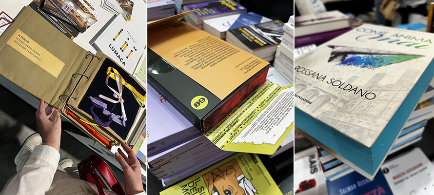
Beyond graphics, in response to the growing attention to book aesthetics, many publishers have introduced tactile elements and special details throughout the volume. Features such as coloured or decorated edges (sprayed edges), which are so fashionable today, as well as embossing and special finishes, have become commonplace, transforming books into collectables.
And here we come to a key point. Despite the common perception that Generation Z reads little or only digitally, it is young people between the ages of 16 and 25 who are re-evaluating the paper book as an aesthetic and emotional object, perhaps a collector's item, not just a vehicle for text. According to the 2024 Nielsen survey, 42% of readers under 30 buy books mainly for their beauty, cover quality and tactile feel, rather than for their content. Publishers are trying to respond to Gen Z's demand with Instagrammable editions, designed to be photographed and shared, meaning deluxe, illustrated, or sophisticated editions with bindings and packaging, including box sets, slipcases, and special papers, with covers enhanced by foil, embossing, and colour cuts. One outstanding example is Rebecca Yarros' “Fourth Wing” (Sperling & Kupfer), which sold thousands of copies thanks to a deluxe edition with black edges and interior illustrations. Mondadori's decision to release a special heritage edition of 20 titles, commemorating 60 years of the Oscars, can also be viewed in this light.
Marginalia mania
To understand the importance of social media, just look at the Nielsen BookScan and AIE data. This shows 72% of readers under 30 say they have bought a book after seeing it on Instagram or TikTok, and 47% of Italian publishers in the trade fiction segment evaluate the social media performance of the graphic product as early as the cover concept stage: art directors now take into account how the cover will look in photos and editors consider the book's recognisability, very often keeping the original title.
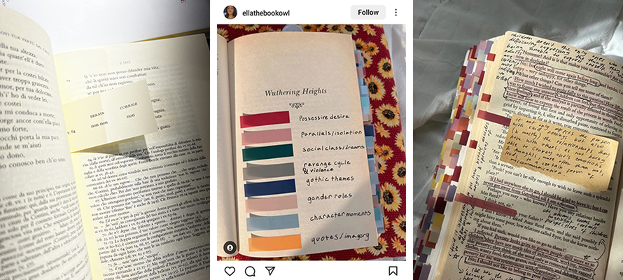
Books are becoming objects of sentimental and social value, often given as gifts or displayed as a sign of belonging to a community. The phenomenon of “annotated books” or “marginalia mania” has become trendy, in other words, the practice of making a book completely personal by annotating it, highlighting it and sticking stickers and post-it notes everywhere, classifying each part of the text into emotional categories (pink>love, blue>sadness, purple>plot twist), complete with online guides and tutorials on YouTube.
Some publishers are experimenting with “annotation-friendly” editions, featuring wide margins and white spaces for notes, as well as paper suitable for highlighters and writing with pens and pencils. These editions also include blank sections, such as drawable endpapers and blank pages, for note-taking. In practice, the book, much like series and sagas, becomes fandom merchandising, a tangible extension of that world. As British editor and art director Tom Sanderson explains, “the physicality of the book is an extension of the narrative world. It should feel like a portal, not just a container”.
Convincing the reader
But what is the approach of Italian publishers? They range from maximalist graphic overload with rich, multicoloured compositions and cumbersome lettering, with affected English fonts as in “Our Infinite Fates” by Laura Steven (Rizzoli), to the use of silhouettes and illustrations with contrasting colours and elements that evoke the atmosphere of the story, as in “Butterfly” by Marta Kaukonen (Longanesi) or in Rachel Gillig's “Two Twisted Crowns” (Giunti); but there is no shortage of photos, even edited ones, but almost always large, sometimes so large that they nearly make the author and title disappear, as in the Pensiero Libero series by Luiss University Press. There is also room for neo-retro graphics, with a slightly vintage feel, which create a sense of familiarity and induce nostalgia, as in “Wild Side. Spirito selvaggio” by Elsie Silver for Newton Compton.
Going into more detail, while the aesthetics of the book as an object are definitely shared among publishers, there is a gap between large and small publishers in how to interpret them; in general, we can talk about a handcrafted aesthetic: ranging from Rebecca Yarros's “Onyx Storm” (Sperling & Kupfer) to Elia Falliti's “Le allacciature”, a fabric book handmade by the author for Libri Tattili Illustrati. These are two sides of the same coin: on the one hand, industrial-scale craftsmanship and, on the other, the ostentatious care of the artisan; obviously, the main driver remains cost. The big players, benefiting from economies of scale, can afford the boom in spredges for hardcovers with dust jackets in the wake of the rise of the hashtag #spredges on BookTok, a technique that gives the illusion of miniatures painted on books in the 17th and 18th centuries. Small publishers seek a handcrafted look, with errata slips on gusseted cartouches, cloth bindings, illustrated endpapers, fine papers, and minimalist but powerful design with clean, legible sans-serif fonts and clear visual hierarchies.
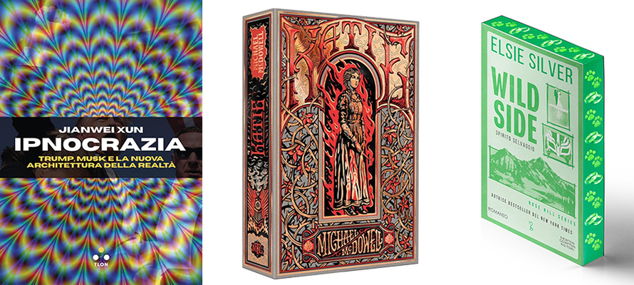
Balancing budget and design
Between the exclusive mass aesthetic and artisanal revivals are medium-sized publishers that adopt a visual language combining aesthetics and functionality. The covers follow the latest graphic design trends, such as dynamic minimalism, which combines the simplicity of essential design with fluid elements, asymmetries and visual contrasts to create clean but visually lively and engaging compositions, bold colour gradients, as in “Ipnocrazia” by Jianwei Xun (Tlon), 3D typography and dark mode to increase visual impact both in bookshops and online. For illustrations and patterns, on the other hand, irregular curves, fluid lines and nature-inspired structures are preferred, as in “Katie” by Michael McDowell (Neri Pozza) or “Godkiller” by Hannah Kaner (Mondadori). The use of AI is not frowned upon, and there is no false modesty about the fact that artificial intelligence has been used, as in “Il potere dei luoghi” by Marco Ardizzi (Egea). In terms of binding and materials, hardcovers without dust jackets or paperbacks with flaps, FSC-certified paper and eco-sustainable finishes are optimised, but customisation and refinement are also possible thanks to the offering of digital printing. The result is a well-crafted, recognisable publishing product that is consistent with new visual use habits and appeals to adults, as in Nicolò Zancan's “Sporca estate” for Capricorno.
Perhaps it is true that we read less, that our concentration wavers, that time slips away with each swipe. But in an increasingly fluid and dematerialised world, the book as an object, concrete, well-crafted and beautiful, makes sense. A book that can be touched, collected, photographed, annotated and shared is something that remains in our increasingly connected lives and in the sharing economy, where everything is a service and no longer a possession. And, in these inattentive times, that is no small thing. The value of the content remains to be considered, but that comes after the purchase of the book and is definitely more a matter for literary critics.
17/10/2025


