The LAB colour method

A small practical guide to discovering the LAB colour method, the most reliable method for describing colours but the least used because it is undoubtedly not very intuitive and not very well understood.
By Lorenzo Capitani | On PRINTlovers 99
Greyscale, RGB and CMYK: we know consciously when to use them, moving between one and the other easily, albeit with some approximations or oversimplifications. Instead, the LAB colour space appears there, mysterious, among the items in Photoshop's Method menu, and we don't really know what to do with it: if we apply it, nothing seems to happen. Yet, especially now that Adobe has removed the Pantone libraries from its programs, we discover that LAB should be the solution because it reliably defines a colour, but how? Why? And when does it come into play in our workflow? How does it work? After all, we haven't used it so far; why start now? So many questions, complicated by the fact that LAB is not so intuitive as a method and does not seem to be an alternative to other colour spaces.
Colour as an event
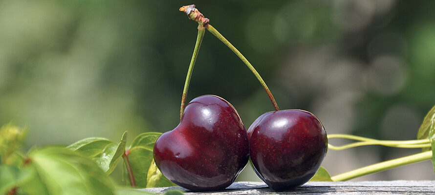
Let's start at the beginning. When we say that a cherry is red, we make an absolute statement that works in communication because, as an approximation, we take it for granted that everyone has experienced red and understands which hue we are referring to. Plato would say that the mechanism works because we refer to an immutable external model necessary to recognise things in the world and compare them with each other. However, we know from experience that for the same red cherry observed, that red changes not only according to the light but also to the observer's perception. In Real World Colour Management, the bible of colour management, Bruce Fraser writes, "Colour is an event that requires the concurrence of three elements: an object, a light source and an observer.” If even one of these three elements changes, the event we call colour is different, i.e. we see a different colour.
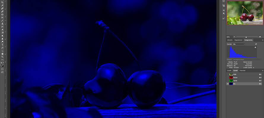
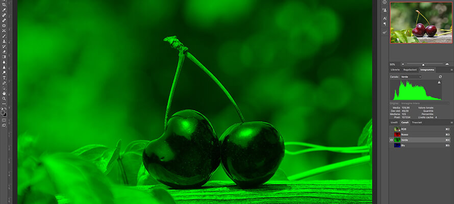
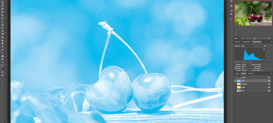
Leaving aside the CMYK method reserved for the reproduction of colours in print, with RGB we have become accustomed to measuring a pixel according to the three coordinates Red, Green and Blue, which can have colour values ranging from a minimum of 0 to a maximum of 255, from white to black, and to obtaining all 16,777,216 intermediate hues, summing up the different proportions. Yet more than this representation is needed because the colour spaces available for RGB come into play, which have different gamuts, i.e., different ranges of reproducible colours. It is quickly demonstrated: sampling any point in the image over cherries in RGB results in different colours depending on the colour space applied, sRGB or AdobeRGB: same values, visibly different colours. So the cherry is red, but which red?
The absolute value of a colour
To get the absolute coordinates of a colour and also get out of the ambiguity of always specifying the variant of RGB, there is a method - the CIELAB, created as a mathematical model in 1931 by the Commission Internationale de l'Eclarage. The power of this method is that, unlike RGB and CMYK, it is device-independent; in other words, it generates a consistent colour regardless of the peripheral device used to create or reproduce the image, be it a monitor, a scanner, a smartphone, a camera or a printing press: it simply describes objectively (mathematically, if you prefer) what colour we see under standard conditions. What's more, LAB, by definition, represents all the colours we can see through 3 coordinates, defined as L, a and b, or L*a*b (the asterisks serve to distinguish LAB colour space from other spaces with similar names such as HunterLab and ANLAB, and a and b do not mean anything, only indicate the two colour channels). To understand what LAB space looks like and what the three coordinates represent, we can use a metaphor: in LAB space, colours are defined according to brightness, hue and saturation values; let's imagine we are in a large room where there is a pole in the middle: at the bottom the pole is black, and at the top, it is white through all shades of grey: this is the brightness axis. As we move around the pole, we come across all the shades. The further we move away from the pole, the more intense the colours become, defining saturation (chroma). Combining these three elements results in the description of a colour.
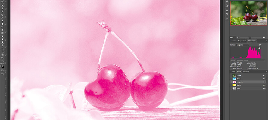
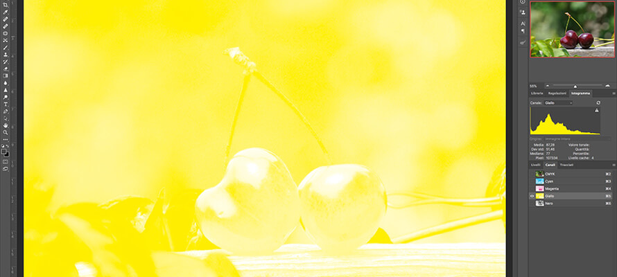
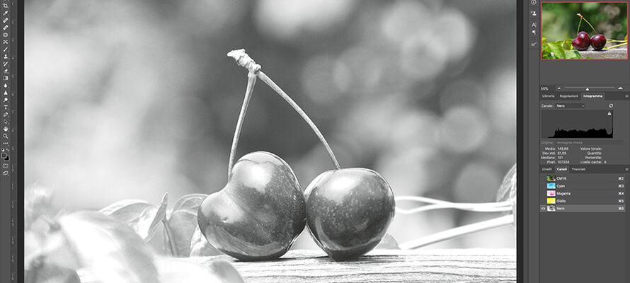
It is, therefore, a three-dimensional space revolving around the L-axis (Lightness) that only tells us how light or dark a colour is without giving us any information about the hue and saturation of the colour itself: this is why it would be better to call it Clarity instead of Lightness. Possible values range from 0 to 100, where L = 0 indicates the darkest possible colour (black) and L = 100, the lightest possible colour (white). On the other hand, the role of coordinates a and b is more complex because just as L describes clarity without any reference to hue or saturation, so do a and b, which describe hue and saturation without any reference to clarity. In LAB, the coordinates a = 0 and b = 0 give the condition of neutrality: a hue appears as soon as either value changes. The value of a indicates whether a colour tends towards green (with negative values from -1 to -128) or magenta (with positive values from 1 to 127). The same applies to b, which indicates whether a colour tends towards blue (negative values) or yellow (positive values). In practice, the greater the absolute value of coordinates a and b, the greater the saturation of the colour they define. As can be seen, LAB is the only colour space that can have negative values. In RGB, a negative value would not make sense because the values of each colour, Red, Green and Blue, range from 0, which corresponds to the absence of that colour, to 255, which is the maximum intensity that colour can have.
So, playing around comparing colours with Photoshop's Colour Selector, we find that White in LAB has co-ordinates L = 100, a = 0, b = 0, which corresponds to 255, 255, 255 in RGB in while Red in RGB has values 255, 0, 0 and in CIELAB is L = 63, a = 90, b = 78, Green L = 83, a = -128, b = 87 and Blue L = 30, a = 69, b = -114. Without getting too nerdy, it’s enough to say that two LAB colours differ from each other by a value called ∆E₀₀ (which you say ‘delta E 2000’), where ∆E₀₀ 1 is the minimum difference perceptible to a colour expert, while usually a colour difference of around 3 is perceived. These differences are measured instrumentally by a spectrophotometer.
Digital data
So far, the theory, but what are the practical applications of the LAB method? The elimination of the Pantone libraries from Adobe applications has led to a series of oversimplifications and ambiguities that do not make them a reliable system: from the use of the terms 'Pantone' and 'spot colour' as synonyms to the unreliability of Pantone swatches that change over time and contain typos or errors and paradoxes in the recipes with minute quantities of colours that are sometimes indistinguishable to the naked eye. All this makes it necessary to identify an unmistakable way to define a colour and communicate it by relying on digital data, i.e. its description in scientifically defined absolute values according to the CIELAB colour space. In practice, this involves taking the L*a*b coordinates of a given colour as a reference point. If I choose to use a certain spot colour and take as my reference, for example, Pantone 185 C as I see it on my Coated swatch (but it could be any colour on any object), I must first obtain its digital data by measuring that colour with a spectrophotometer, correctly set up: in this way, I get an objective measurement, which does not depend on the eye looking and the conditions of the swatch in use, or of the measured surface, but on detailed and precise spectral information. The measurement conditions used by the printing world are D50/2°/M2: D50 indicates the light source, where D stands for daylight and 50 for 5000 Kelvin (light temperature), 2° indicates the reading angle in degrees, the M value indicates to what extent to take into account the optical brighteners contained in the paper (M0, M1 and M2 are present in the digital data of the Pantone libraries, while Photoshop only uses the M2 value).
To see how measurement conditions affect colour data, just go to the Nix Color Sensor website, which manufactures spectrophotometers for the industry to read colour on any surface and enter three LAB values (e.g. 84/8/54) and see how, as the illuminant and reading angle change, the RGB and CMYK values change, while the colour remains the same: this means that if I don't match the values to the reading conditions, the yellow I read will be displayed or printed differently: e.g. 84/8/54 with D50/2° corresponds to RGB 246, 203, 105 and CMYK 3, 20, 69, 0; with D65/10° the RGB becomes 253, 202, 106 and CMYK 0, 22, 68, 0, with ∆E₀₀ 4 for RGB.
To create a basic colour sample for use in all spaces (spot colour, RGB and CMYK), start with the L*a*b values obtained from the measurement and convert them using Photoshop's Colour Selector. The collection of the colour values of a colour in the different spaces will become its identity card, which the measurement conditions must accompany. This is because starting from the digital L*a*b data and aligning the measurement conditions of the spectrophotometers of all the players in the chain, from the creative to the printer, it is possible to obtain an objective, precise, reliable and repeatable measurement over time, eliminating the subjective factor of the observer with the relative psychological component and the potential distortions due to the environmental lighting conditions.
The LAB as a working method
From a technical point of view, what we have described allows us, therefore, to continue to work according to our usual flow (as long as it is correct), limiting the use of LAB to colour reading, or we can go further and use it as a working colour method for retouching and colouring images.
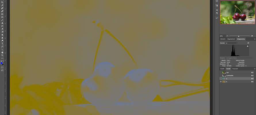
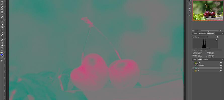
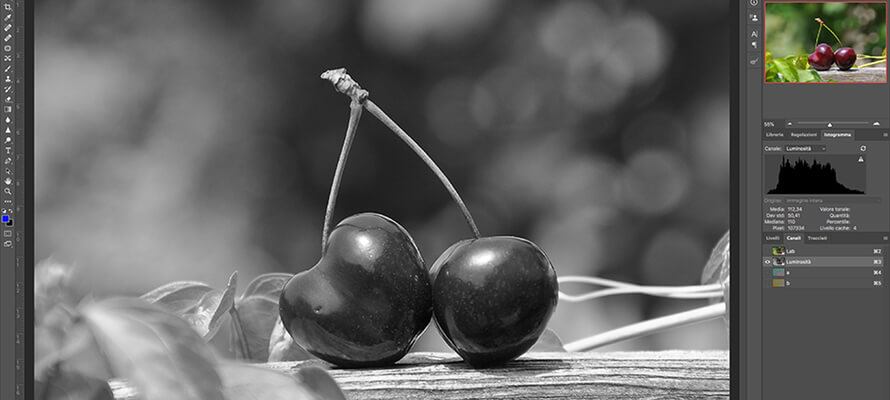
For the avoidance of doubt, we would like to emphasise that switching from any colour method to LAB does not entail any colour alteration, and the image will look the same: precisely because LAB contains all possible colours, no deterioration of image quality can occur since all colours are translated unaltered. Moreover, for Photoshop, LAB is a kind of native colour space: every time an image is converted from RGB to CMYK or vice versa, it passes through LAB in the background. Once the image has been converted, if we look at the Channels, we will have one channel without colour (L), plus two channels with a double colour combination (green+red for channel a and yellow+blue for channel b), both without contrast. Let’s go back: L determines the clarity, i.e. how light or dark the image is, while channel a is the colour balance between green and magenta, and channel b is the colour balance between blue and yellow. There is an imbalance at points where the channel is one colour or the other; at points where it appears medium grey, there is a balance between the two colours. As with any colour correction in Photoshop, there is no fixed formula because each image differs from the other, as is the taste of the person doing the work. However, work on curves or levels can be done in the same way as in RGB, with the difference that you are reasoning in terms of brightness and colour balance, exactly as LightRoom, Affinity, or CaptureOne would like you to.
Colour correction in LAB
An example of colour correction in LAB could be to adjust for channels a and b an input of the curve (left endpoint) between -100 and -90 and an output (right endpoint) between 100 and 90, balancing the colour imbalance of the first adjustment; then raise the midpoint of the curve of channel L without 'tearing' the whites. This intervention acts on the clarity of the image in the same way as a Curve adjustment in RGB, but the effect is much finer, and the image takes on more definition. This is because in RGB, you can act on the brightness of the channels, but by affecting the image's colour and not independently of it as in LAB.
An excellent practical application of how in LAB with Curves you can recover an extremely flat landscape photo very well is in Colin Smith's video for PhotoshopCAFE ( ). Colin starts by converting the image from RGB to LAB and then creates a Curves adjustment layer where he modifies a and b colours without affecting brightness. Since the rocks are redder than the vegetation, he creates two masks to selectively intervene on both a and b balances and Brightness, which he adjusts with the Hand tool by inserting anchor points in the areas where he wants to intervene punctually. At the end, the image is passed to RGB and, from there, to subsequent processing, including printing.
To get used to thinking about LAB colours and how they affect each other, there is a small diagram that defines the area of a colour as a function of the coordinates a and b:
with a > 0 and b > 0 -> red/orange
with a < 0 and b > 0 -> green/yellow
with a < 0 and b < 0 -> cyan
with a > 0 and b < 0 -> violet
LAB in the wine cellar
The demonstration that colour is not just a problem in our industry and that LAB is a valid method of colour description comes from a world far removed from graphics and printing: oenology. One of the criteria for evaluating wine is its colour, which, not only for connoisseurs, is one of the first perceived characteristics, capable of decisively influencing even the purchase choices of simple consumers and being a quality control parameter for producers. This is why the OIV, the International Organisation of Vine and Wine, replaced the 'classic' method, based on the measurement of absorbance at three wavelengths, with the CIELAB method back in 2006. The methods are exactly that of our world: objectively analysing the colour of the wine, comparing it with a reference model to be used at all stages of production and ageing to control the product.
01/12/2023


