The golden age of illustration
The relationship between illustration and printed communication is a story of ebbs and flows. Recently, it has come back into vogue, exiting the publishing field to occupy the spaces of packaging, advertising and visual communication. We talked about it with Ale Giorgini, Francesco Poroli, Riccardo Guasco and Emanuele Basso, who have directed and illustrated campaigns for important national and international brands.
By Roberta Ragona | On PRINTLovers 89
Illustrated communication is a cyclical phenomenon in the history of image, coinciding with major changes in society and in printing technologies, in which the way we communicate, the media we use and the people we address change. The first large-scale example was in the 19th century, with the emergence of an advertising industry that required larger-scale printing processes with greater visual impact than publishing output. This was the time of the large colour chromolithographs of the advertising posters of Eugène Grasset, Alphonse Mucha and Toulouse-Lautrec. And of the Arts and Crafts Movement, which, in response to the changes of the Industrial Revolution, proposed a fusion of art and industry in which the useful was beautiful, and the beautiful was useful; an important role was also played by printed illustration, which we would now call surface design. In the early 20th century, the phenomenon reappeared: the popular illustrated press exploded, leading to an even greater permeability between the fine arts and the commercial arts in terms of authors and expressive language used, now familiar to the public’s eyes. This periodic return to illustration in brand communication responds to a need for synthesis and storytelling that few other media possess. In the last decade, we have found ourselves in what many consider to be the golden age of illustration. A combination of factors has contributed to this phenomenon: from a generation of authors and artists with a strong awareness of the potential of the medium and tools for critical reflection of their work to greater awareness on the part of communication professionals regarding the use of this language, especially when used in effective combination with graphics, stationery and motion design.
Changing audiences, changing brands
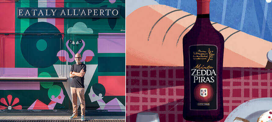
The return to the use of illustration also has to do with a change in the public, as Ale Giorgini, illustrator and creative director of the Grani D’Autore Barilla project, points out. “Illustration in the publishing sector has always had its own specific role that has never been questioned. Conversely, one of the reasons for this rediscovery in the packaging and communication sector is the need for brands to come into contact with an astute consumer, constantly immersed in a flow of information and content. They have all the tools to evaluate which product they think is best, so they need to be involved in a more narrative way. We are talking about a public that builds its own schedule of information and entertainment, which must therefore be met on that same terrain.” This is a communication method that has been built up over time, as Riccardo Guasco, who recently carried out projects for Esselunga and San Carlo, among others, says. “In the early years, companies experimented with web and social communication, the most immediate testing ground. The positive feedback opened up the field to increasingly bold projects with limited editions and targeted campaigns. If, on the one hand, there is Mondrian and, on the other, the famous L’Oréal packaging, illustration is somewhere between these two communicative extremes: it draws attention to the product by giving it an authorial voice. This ability to take stimuli from the most diverse fields - from art to pop culture - and rework them into a personal language is what makes illustration a remarkably flexible tool among those available to a creative agency, as Emanuele Basso, creative director of The6th, points out. “In the case of the Zedda Piras campaign, commissioned by Wunderman Thompson, we had references, but we also thought of the style of the Orgosolo murals with their figures broken up into geometric shapes, a somewhat Cubist style, with flat colour fields but material and rough. The illustrators who worked on the campaign were also inspired for some shots by sequences from Breaking Bad, an unexpected source given the serene tone of the animation, but one that suggested interesting solutions. Once the storyboard was approved, one of the illustrators took care of the characters and another the landscapes, in a continuous dialogue and exchange of brushes and palettes to harmonise the style and atmosphere. The animator then intervened on this illustration work because this is also an interesting aspect: the possibility of continuing the story with other means and methods.” The rediscovery of illustration has also led to a maturation on the part of brands, which have refined their ability to recognise and search for the right style for their tone of voice, working directly with the authors. Francesco Poroli, who curated the Eataly all’Aperto project for Illustri, notes, “Another big change in recent years is that it used to be agencies that proposed the inclusion of illustrations in their communication strategy, but now it is increasingly the brands themselves. I think this is a sign of maturity and confidence in the illustrator’s ability to communicate across the board. Illustration can visualise and tell stories in a democratic way, with a language that can be understood by any age group and type of audience without the need for translation.” Infinitely big, infinitely small But how does an illustrator fit into the variety of print applications of brand communication? If the same illustration goes from the infinitely small of packaging to the infinitely large of wide-format signage, all the way to wrapping for buses or, as in the case of Eataly, outdoor kiosks, and if everything is printed with different techniques on different media, how does one manage the workflow? For Giorgini, it’s definitely a team sport. “I find projects where you press down on the accelerator of creativity in terms of material and printing technique exciting. A few years ago, I designed a sleeve for the limited edition of a wine from the Banfi cellars that completely covered the bottle. For this year’s limited edition though, we are considering silk screen printing directly on the glass. During the design phase, I created the illustration with a deformation in perspective to follow the shape of the bottle so that once it was applied to the surface, the image could be read correctly. It’s a job that goes hand in hand with those who have expertise in the technical aspect of printing and materials; it’s difficult for an illustrator to be up to date on what the latest printing technologies are – it’s always a dialogue with other professionals. Some time ago, I was struggling with how to print personalised pizza boxes, and I discovered the existence of a digital printer for the direct marking of 3-D objects. Without a chance conversation with a person who deals with printing, I’d never have discovered a technology that opened up a world of possible solutions for me”. As is often the case, when faced with such a wide variety of substrates and types, you have to think in strategic terms, as Poroli recalls. “Working mainly in vector graphics for digital printing, the workflow doesn’t change particularly on a technical level; it’s more a reflection on how the content will be used. Illustrating for a 3x4 cm Campari stamp or a 14 metre Eataly kiosk is different, especially in terms of its use. What level of detail can I allow myself? A stamp is a small space, but it’ll be closely observed, whereas the kiosk is a large space that has to provide interesting visual stimuli but will not be observed in detail like a work of art: it’s part of an overall experience of the space it’s in”. The solution may be to see the illustration as part of the ecosystem dialoguing with the rest and incorporate this thinking into the process. Says Guasco, “Lately, I like to work in a modular way, inserting the elements of illustration within an organic flow, which allows me to go from 6x3 metres to a postage stamp with an image that continues to function effectively. For a restaurant in Romagna, I created an illustration that recalls the iconic elements of the area, broken down into its construction elements to make coasters, images of the menu and other communication elements. To work in this way, you have to listen carefully and not limit yourself to when the brief takes place: it’s a conversation. The project for San Carlo, for example, came out of feedback from several focus groups and tests carried out on the international market, which showed that San Carlo’s packaging communication - with its elegant, clean and graphic approach - was not equally effective in all markets. So the brand decided to create a packaging series with a richer style but in line with its own communication and chose illustration. From there, an extremely detailed agency work started, with precise references. As they’re mainly addressed to the foreign market, each packaging tells the story of the product in its peculiarities and different cities to evoke the Italian lifestyle. This work also features the modular composition I mentioned earlier, which the brand and the agency had seen in a previous job for Campari and had found suitable for their own packaging too.”
Immersive experiences
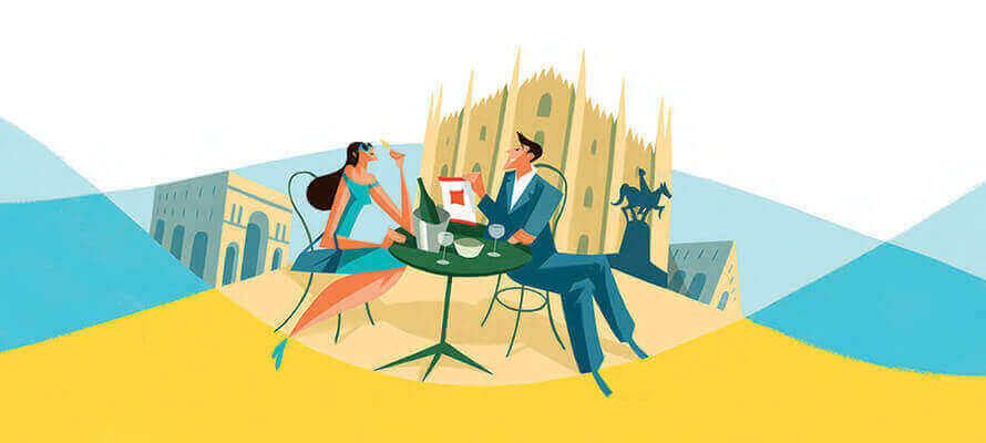
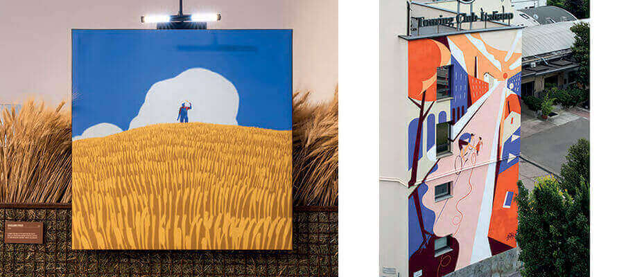
The Grani D’Autore Barilla project also came out of the dialogue between the client, the agency and the illustrators. It has expanded into different media from an initial central nucleus, adapting to continuously changing circumstances, as Ale Giorgini tells us. “When Barilla started communicating its Manifesto del Grano Duro Italiano, Omnicom PR Group Italia contacted me to develop a project that would help spread a ‘policy document’ to a wider public. Ten points outlining the production approach and the decision to use only 100% durum wheat produced in ten specific zones of Italy, and what actions Barilla intended to take to enhance the area and the communities; for each of these points, ten illustrators from the different production areas were involved. The illustrations were also used on the packaging of some of Barilla’s most iconic formats, on a series of limited-edition dishes and on traditional merchandising media, such as shopping bags and diaries. The packaging also hides extra content in augmented reality: by framing the packaging with your smartphone, you can see the illustrations come to life. This was supposed to be followed by a series of local events, but the pandemic got in the way, and we re-imagined them in a different form. First a free exhibition, outdoors and open to everyone at BAM - Biblioteca degli Alberi in Milan - even when there was the red zone of the pandemic; then at the Triennale di Milano, as soon as the museums reopened, curated by myself and Maria Vittoria Baravelli in an installation created by Il Prisma with an immersive experience, in which the illustrations were surrounded by videos of the ‘making of ’ described by the illustrators themselves and by animations in augmented reality.” The live component is also at the heart of the Eataly all’Aperto events with Illustri: “The project derived from the request to tell the story of the moment when we open ourselves up to others, being together and re-appropriating an urban space to make it convivial,” says Poroli. “Starting with a shortlist of names, we arrived at four different graphic styles and approaches: Elisa Macellari’s, Ilaria Faccioli’s, Luca Font’s and mine. The only requirement was that the proposals for the wrap-up of the kiosk and the paper placemats of the bistro be in harmony in terms of colour and content with the general graphics of the Eataly summer. I asked for a wider view: I wanted Milan to be in it, and in addition to the theme of conviviality and sustainability to convey the message that Milan is a city that includes you if you want to be included. I thought of Milton Glaser and proposed a typographic work that runs along the four sides of the kiosk: from I Love New York to Milano Loves You. Each change of the kiosk is accompanied by a live opening moment, which is the heart of the idea dialoguing with the space. In the case of Luca Font, the kiosk graphics are complete except for the windows, which were then painted live during the evening.”
Return to space - physical and digital
Thinking about the near future of illustration for communication, there are not only new technologies: the dialogue with the area and the space inhabited by people is one of the most exciting variations, according to Guasco. “A signal that seems very interesting to me is that of urban art walls. It is a phenomenon that mixes many stimuli from different worlds, from graffiti art to public art to mural art, and even re-appropriating a mode of communication - that of large wall paintings - which was typical of advertising at the beginning of the 20th century. It was and is a use of the space of the city that stimulates more thoughtful communication. A huge limitation of digital is its speed, whereas the wall stays there for a long time, which makes people engage differently. I happened to reproduce a cover made for the Touring Club on the wall of their new headquarters, and in the week I spent working on the scaffolding, I saw the interest and curiosity of the people in the neighbourhood. They were interested and curious; they wanted to understand the reasons for the design and the choices because they would be seeing it much more often than me. It was going to be part of their days.” And it’s this possibility of dialogue between different media that is one of the most interesting aspects, according to Emanuele Basso. “At the moment, companies have a lot to say, and illustration allows us to continue a dialogue that starts with packaging and moves on to animations and micro- animations: not only commercials but also animated gifs and loops, up to augmented reality. The latter is still in an experimental phase, but the time will come when the friction will be less, and we will find a use that we’ll feel is a natural continuation. It is not something that is added but the continuation of a discourse. In this, digital devices are a fundamental means; they’ve encouraged dialogue and different places for communication, from the printing of the pack to use on social networks. It’s a way of not letting the story end.”
EMANUELE BASSO
Creative director, his career began at McCann Erickson. It continued with the foundation of Tita, an agency whose intelligent use of crafting, illustration and manual techniques immediately set it apart on the communication scene. This expressive research continued with the founding of The 6th Creative Studio. Their unmistakable campaigns have given voice to clients from all sectors, from Fernet Branca (commissioned by Yam112003) to Zedda Piras (Wunderman Thompson), Tonno Mare Aperto and even Fondazione Feltrinelli, Mondadori Libri e CTA – Centro Teatro Attivo.
ALE GIORGINI
Illustrator and art director, his work has appeared in innumerable national and international media, from the Boston Globe to Chicago Magazine, as well as Corriere della Sera, Il Sole 24 Ore and L’Espresso. He has worked for major international brands such as Disney and Armani, ESA (European Space Agency) and Barilla. His work has been included several times in the Annual of the Society of Illustrators. He has received awards such as the Good Design Award of the Chicago Museum of Design. He is one of the founders of Magnifico Illustrators Agency and teaches - among others - at IED, Idea Academy and Scuola Internazionale di Comics.
RICCARDO GUASCO
Internationally renowned illustrator, his work is appreciated across the board by the publishing industry (Mondadori, Topipittori and Carthusia, among others), by all the major media and audio-visual companies (from RAI to the New Yorker), by many international brands, such as Ferrari and Longines, and by Third Sector organisations such as Greenpeace, FAO and Emergency. His work has been included several times in the Annual of the AI, the Autori di Immagini Association, and the Society of Illustrators of New York.
FRANCESCO POROLI
Illustrator and art director, his work has appeared in all the major media - from the New York Times to the Daily Telegraph, Wired, Corriere della Sera and Il Sole 24 Ore - for major international brands, from Facebook to Campari, Apple and the NBA. His work has been included several times in the Annual of the Society of Illustrators and the Society of Publication Designers. He is one of the founders of Illustri and teaches - among others - at Domus Academy and IED Milan.


