The chocolate factory
Venchi’s story seems like a fairy tale: it began over 140 years ago in Cuneo, in the shop of a young chocolatier who was determined to make his gianduiotti and pralines – wrapped like jewellery – the most elegant in Piedmont. Today Silviano Venchi’s dream is an undisputable symbol of Italian artisanship in the world, and continues to distinguish itself for the quality of its ingredients, its commitment to tradition and the style of its packaging, designed to stimulate the senses and make a lasting impression.
By Achille Perego | On PRINT #80
Venchi’s is a sweet and rich story that started in 1878 and celebrated its 140th anniversary in 2018. It is a love story based in Piedmont, the land of not only hazelnut and chocolate, but also of historical printing presses and paper mills, which have played key roles in the production of tins and cardboard boxes for the company’s products.
Since the very start, Venchi has thought about packaging carefully, as the first way in which to present the Made in Italy qualities of their products. Gio Martorana, the creative mind of the company, explains: «The packaging for Venchi products gives them authenticity, personality, and style. The recipes are created in line with the company values: cheerfulness, truth, deliciousness».
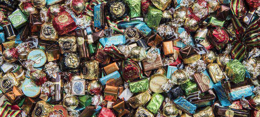
The packaging for every campaign is produced firstly in-house, but also in collaboration with graphic designers, artists and young talents. The design of both primary and secondary packaging enables Venchi to stand out while maintaining distinctive elements such as ribbons, tags, and golden stickers. This is how Venchi produces packaging designed to have a strong visual impact and to last in time, in the same way as this chocolate “factory” has.
The story begins with Silviano Venchi, who at the age of 16 started creating chocolates in his shop in Cuneo. Very quickly, his patisserie became the best known in the city, loved for the extraordinary quality of its ingredients and its unmatched ability to present the products as if they were jewellery.
The year the company was official born, Venchi launched the Gianduiotto 1878, of which at least 32% is IGP Piedmont hazelnuts. It is now an iconic product and it symbolises the brand’s ability to reinvent itself while maintaining its strong bond to Piedmontese tradition.
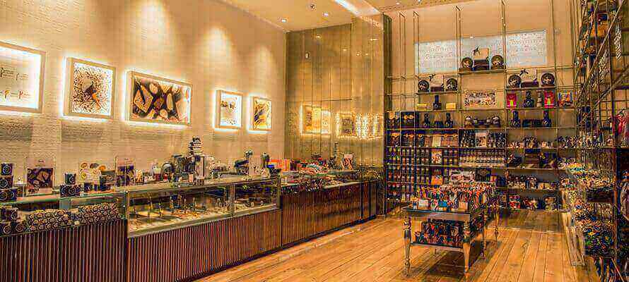
Today Venchi is recognised internationally: there are over 350 chocolate recipes and 90 ice cream flavours, the brand is present in over 70 countries and cities such as London, Hong Kong, Dubai and New York, and has over a hundred flagship stores across the world. Over the past few years the chocolate market has decreased, but Venchi has continued to grow, going from a revenue of 63 million euros in 2016 to an estimated 100 million in 2018. They have a thousand employees across the world and over 100 (mainly women) in the factory in Castelletto Stura, Cuneo. Venchi is experiencing a real renaissance, after the collapse in 1978, thanks to three young entrepreneurs who took over the brand and the ancient recipe book at the end of 1997. These entrepreneurs were Daniele Ferrero, the largest shareholder (27%) and the company’s CEO; Pietro Boroli (De Agostini) with 12%; and Gian Battista Mantelli, who has another 12% and whose granddad had founded another small confectionery company in Cuneo, Cuba, known for rum-filled chocolates.
Until 2007, says Ferrero «we were working to create a medium-sized company: our revenue was 30 million euros, and 95% of it was made in Italy. Then we realised that to continue growing we would have had to change our business model and create our own sales channel». The winning idea was to imitate luxury brand and open flagship stores that represented «the quintessence of Made in Italy products. With an addition: on top of chocolate, the shops also sell artisanal ice cream, in order to extend the seasonality of products and to add another typically Italian element, which is recognised internationally».
Venchi has developed not only through its international expansion, the presence of its shops in train stations, airports and even cruises (for example, the Msc Seaside), but also through innovation. In the past Venchi has anticipated the trends for dark chocolate and for “free from” marketing (free from gluten, saturated fats, additives, artificial flavourings), and a few years ago the company started collaborating with the Universities of Rome, Piacenza and Perugia to develop chocolate that better manages blood sugar levels, is easier to digest, and has more anti-oxidants. «Without forgetting the origins, the passion for products, who – says Ferrero – have a story to tell. In our recipes, aside from cocoa beans, we only use Italian ingredients: Piedmontese hazelnuts, Sicilian pistachios, almonds from Puglia, and extra-virgin olive oil».
The same interplay of tradition, quality, and innovation has always been present in the brand’s packaging as well. Gio Martorana tells us that the graphic design of each packaging «is defined and embellished depending on the channel they are meant for. We choose the best suited suppliers and printers for each campaign».
Venchi doesn’t like to reveal the names of the printers in charge of their boxes, tins, jars, and primary papers and films wrapped around the chocolate, but each one is chosen as the best one to bring together in each individual campaign chocolate and packaging, from cardboard displays to shop design to B2B catalogues, particularly the annual ones printed in thousands of copies around Christmas and Easter.
Paper and cardboard for packaging are being replaced, as Venchi’s creative director tells us, by FSC materials. The plastic materials used by the company are recycled (BTL) and they are gradually being replaced. At the moment, the company is transitioning towards using exclusively compostable materials for F&B in its shops. They already use recycled plastic for cutlery, cups, ice cream tubs, and the packaging for Easter eggs. This is not an easy transition, considering how important packaging, and especially primary packaging, is for food safety, and how certain printing processes and inks can reduce the eco-compatibility of recycled and FSC-certified paper and cardboard.
«For example – says Martorana – bio-films for the conservation of chocolate still need to be invented, and generally bio-plastic is not safe to come into direct contact with food yet. Furthermore, the packaging for chocolate must include by law a series of information for the consumer (labels), which occupy a large amount of space on the printed product. So we’re trying to find a balance between all these requirements».
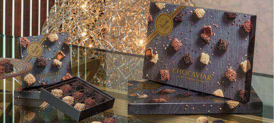
Balance, not luxury at all costs, distinguishes Venchi packaging, which reinvents itself every year. For example, the colours change for the Easter and Christmas collections. However, the packaging also remains faithful to some key elements: for example, brown as the brand corporate colour, and gold as the distinctive colour for the classic Gianduiotto. Enhancements, embossing and special papers which produce unusual tactile effects are used for premium lines, which are distributed not only in flagship stores, but also in multi-brand channels such as patisseries, wine shops, bars and fine food shops.
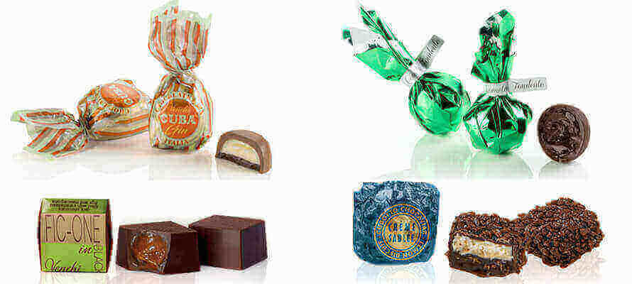
At Venchi there is also room for innovation, as the packaging for the new product Green Comet demonstrates. The product is a vegan and slightly sweeter version of the famous recipe Cuor di Cacao 75%, with a 56% shell and a fondant filling made with 60% olive oil. The packaging is a beautiful metallic green that fits in with the other Christmas colours: for 2019, these are red, blue and white with winter landscapes.
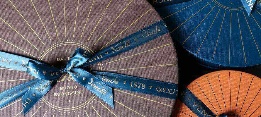
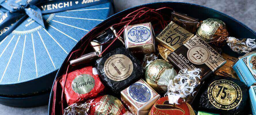
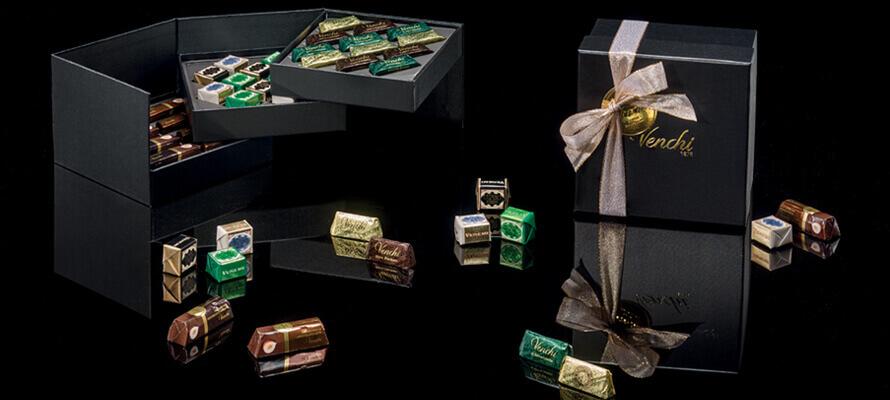
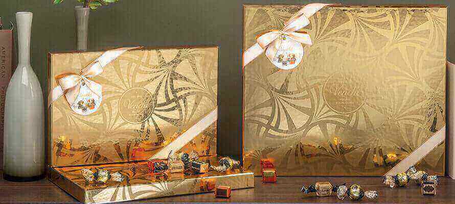
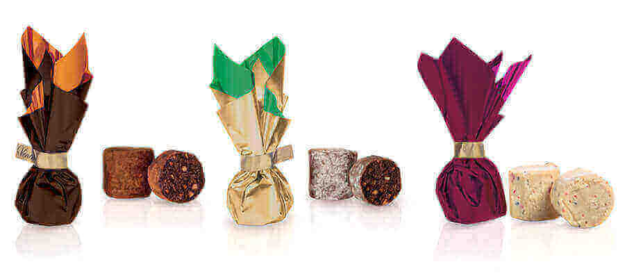
As Martorana concludes, a few years ago the graphic design and colours of the brand were revisited. Orange and petrol blue were successfully added to the traditional brown, and quickly became recognisable internationally. The innovation started a few years ago for the packaging of high-end products to be sold in the new distributive channels and in the new flagship stores abroad. The logo was re-designed, and enclosed in a circle that represents the sensoriality, roundness and smoothness of chocolate. There is a nod to the history of the company in the year of its establishment (1878) and the ice cream scoop. The historical and unique tins are the colour of a young copper (nearly a rose gold), which is achieved through lamination and references the tradition of Italian artisanship, and have a vintage-looking lid. The boxes containing assortments of chocolates are available in different sizes. The decorative band that separates the bottom from the lid is entirely heat-laminated in copper. However, once the box is closed, a single, elegant pattern line is revealed. The other boxes of the line, round or square, are made with Malmero Tourbe paper by Gruppo Cordenons.
As far as the gianduiotti are concerned, alongside the traditional brown and gold packaging, Venchi has added the gianduiotto-bag: a shopping bag full of joy (the new philosophy for Venchi packaging), which gives the buyer the opportunity to take home a giant chocolate on top of the regular ones.
Venchi’s is a sweet and rich story that started in 1878 and celebrated its 140th anniversary in 2018. It is a love story based in Piedmont, the land of not only hazelnut and chocolate, but also of historical printing presses and paper mills, which have played key roles in the production of tins and cardboard boxes for the company’s products.
Since the very start, Venchi has thought about packaging carefully, as the first way in which to present the Made in Italy qualities of their products. Gio Martorana, the creative mind of the company, explains: «The packaging for Venchi products gives them authenticity, personality, and style. The recipes are created in line with the company values: cheerfulness, truth, deliciousness».
The packaging for every campaign is produced firstly in-house, but also in collaboration with graphic designers, artists and young talents. The design of both primary and secondary packaging enables Venchi to stand out while maintaining distinctive elements such as ribbons, tags, and golden stickers. This is how Venchi produces packaging designed to have a strong visual impact and to last in time, in the same way as this chocolate “factory” has.
The story begins with Silviano Venchi, who at the age of 16 started creating chocolates in his shop in Cuneo. Very quickly, his patisserie became the best known in the city, loved for the extraordinary quality of its ingredients and its unmatched ability to present the products as if they were jewellery.
The year the company was official born, Venchi launched the Gianduiotto 1878, of which at least 32% is IGP Piedmont hazelnuts. It is now an iconic product and it symbolises the brand’s ability to reinvent itself while maintaining its strong bond to Piedmontese tradition.
Today Venchi is recognised internationally: there are over 350 chocolate recipes and 90 ice cream flavours, the brand is present in over 70 countries and cities such as London, Hong Kong, Dubai and New York, and has over a hundred flagship stores across the world. Over the past few years the chocolate market has decreased, but Venchi has continued to grow, going from a revenue of 63 million euros in 2016 to an estimated 100 million in 2018. They have a thousand employees across the world and over 100 (mainly women) in the factory in Castelletto Stura, Cuneo. Venchi is experiencing a real renaissance, after the collapse in 1978, thanks to three young entrepreneurs who took over the brand and the ancient recipe book at the end of 1997. These entrepreneurs were Daniele Ferrero, the largest shareholder (27%) and the company’s CEO; Pietro Boroli (De Agostini) with 12%; and Gian Battista Mantelli, who has another 12% and whose granddad had founded another small confectionery company in Cuneo, Cuba, known for rum-filled chocolates.
Until 2007, says Ferrero «we were working to create a medium-sized company: our revenue was 30 million euros, and 95% of it was made in Italy. Then we realised that to continue growing we would have had to change our business model and create our own sales channel». The winning idea was to imitate luxury brand and open flagship stores that represented «the quintessence of Made in Italy products. With an addition: on top of chocolate, the shops also sell artisanal ice cream, in order to extend the seasonality of products and to add another typically Italian element, which is recognised internationally».
Venchi has developed not only through its international expansion, the presence of its shops in train stations, airports and even cruises (for example, the Msc Seaside), but also through innovation. In the past Venchi has anticipated the trends for dark chocolate and for “free from” marketing (free from gluten, saturated fats, additives, artificial flavourings), and a few years ago the company started collaborating with the Universities of Rome, Piacenza and Perugia to develop chocolate that better manages blood sugar levels, is easier to digest, and has more anti-oxidants. «Without forgetting the origins, the passion for products, who – says Ferrero – have a story to tell. In our recipes, aside from cocoa beans, we only use Italian ingredients: Piedmontese hazelnuts, Sicilian pistachios, almonds from Puglia, and extra-virgin olive oil».
The same interplay of tradition, quality, and innovation has always been present in the brand’s packaging as well. Gio Martorana tells us that the graphic design of each packaging «is defined and embellished depending on the channel they are meant for. We choose the best suited suppliers and printers for each campaign».
Venchi doesn’t like to reveal the names of the printers in charge of their boxes, tins, jars, and primary papers and films wrapped around the chocolate, but each one is chosen as the best one to bring together in each individual campaign chocolate and packaging, from cardboard displays to shop design to B2B catalogues, particularly the annual ones printed in thousands of copies around Christmas and Easter.
Paper and cardboard for packaging are being replaced, as Venchi’s creative director tells us, by FSC materials. The plastic materials used by the company are recycled (BTL) and they are gradually being replaced. At the moment, the company is transitioning towards using exclusively compostable materials for F&B in its shops. They already use recycled plastic for cutlery, cups, ice cream tubs, and the packaging for Easter eggs. This is not an easy transition, considering how important packaging, and especially primary packaging, is for food safety, and how certain printing processes and inks can reduce the eco-compatibility of recycled and FSC-certified paper and cardboard.
«For example – says Martorana – bio-films for the conservation of chocolate still need to be invented, and generally bio-plastic is not safe to come into direct contact with food yet. Furthermore, the packaging for chocolate must include by law a series of information for the consumer (labels), which occupy a large amount of space on the printed product. So we’re trying to find a balance between all these requirements».
Balance, not luxury at all costs, distinguishes Venchi packaging, which reinvents itself every year. For example, the colours change for the Easter and Christmas collections. However, the packaging also remains faithful to some key elements: for example, brown as the brand corporate colour, and gold as the distinctive colour for the classic Gianduiotto. Enhancements, embossing and special papers which produce unusual tactile effects are used for premium lines, which are distributed not only in flagship stores, but also in multi-brand channels such as patisseries, wine shops, bars and fine food shops.
At Venchi there is also room for innovation, as the packaging for the new product Green Comet demonstrates. The product is a vegan and slightly sweeter version of the famous recipe Cuor di Cacao 75%, with a 56% shell and a fondant filling made with 60% olive oil. The packaging is a beautiful metallic green that fits in with the other Christmas colours: for 2019, these are red, blue and white with winter landscapes.
As Martorana concludes, a few years ago the graphic design and colours of the brand were revisited. Orange and petrol blue were successfully added to the traditional brown, and quickly became recognisable internationally. The innovation started a few years ago for the packaging of high-end products to be sold in the new distributive channels and in the new flagship stores abroad. The logo was re-designed, and enclosed in a circle that represents the sensoriality, roundness and smoothness of chocolate. There is a nod to the history of the company in the year of its establishment (1878) and the ice cream scoop. The historical and unique tins are the colour of a young copper (nearly a rose gold), which is achieved through lamination and references the tradition of Italian artisanship, and have a vintage-looking lid. The boxes containing assortments of chocolates are available in different sizes. The decorative band that separates the bottom from the lid is entirely heat-laminated in copper. However, once the box is closed, a single, elegant pattern line is revealed. The other boxes of the line, round or square, are made with Malmero Tourbe paper by Gruppo Cordenons.
As far as the gianduiotti are concerned, alongside the traditional brown and gold packaging, Venchi has added the gianduiotto-bag: a shopping bag full of joy (the new philosophy for Venchi packaging), which gives the buyer the opportunity to take home a giant chocolate on top of the regular ones.
25/09/2020


