Taschen. From book to cult object
It is an iconic name in global publishing, but above all, it's a revolution. TASCHEN is the publishing house that has made art and visual culture accessible without ever compromising on quality or fearing experimentation. And it’s no coincidence that, in its bold approach to design, it looks to Italy as a benchmark for printing and binding excellence. Telling us all about it is Nora Dohrmann, who has worked as an editor at TASCHEN for many years.
By Michela Pibiri | On PRINTlovers 107
Perhaps it needs no introduction, because sooner or later, each of us has come across a TASCHEN book. Maybe a small one, a thematic compendium or an artist monograph. Or perhaps a large, monumental volume—breathtaking and unforgettable for its content, printing quality, and cover.
This distinctive presence, so easily recognizable for its quality and style, has an unexpected backstory. It began 45 years ago with a comic book store and was driven by the extraordinary strategic and entrepreneurial vision of Benedikt and Marlene Taschen—the founder and his daughter, now the determined and innovative CEO.
A vision full of passion that has made it possible to combine accessibility with obsessive attention to detail, reaching art and visual culture enthusiasts all over the world.
But how is it possible to maintain such diversity and editorial quality while positioning across distant markets—reaching both the general public and the most specialized niches, balancing popularization with cult status?
Nora Dohrmann, a longtime editor at the publishing house, tells us everything—also looking at today’s challenges and those of the future.
Taschen is now considered the most important global publisher of art books. How did this reality come to life, and how has it evolved over time in relation to the tastes and trends of the contemporary cultural landscape?
At just 18 years old, Benedikt Taschen opened a comic book store in Cologne. With a deep passion for visual culture and a sharp instinct for what audiences wanted, but couldn’t yet find, he quickly built up an art book publishing house and transformed the market for illustrated books. In 1984, he purchased 40,000 remainder copies of a Magritte monograph at a trade fair in the US, reselling them at an affordable price in Europe—an early and defining example of his conviction that art books should be both beautiful and accessible.
Throughout the 1980s and ’90s, Benedikt built TASCHEN into a global publishing house celebrated for its bold, multilingual approach and for challenging the conventions of the industry. He introduced high-quality monographs at democratic prices and later published monumental titles such as Newton’s SUMO, Muhammad Ali’s GOAT and Annie Leibovitz. Measuring 50 x 70 cm, Newton's SUMO is an audacious blend of scale, craftsmanship, and cultural ambition that revolutionized the art book format altogether.
Today, Benedikt Taschen and his eldest daughter, Marlene, jointly run the publishing house. Marlene joined TASCHEN full time in 2011 and leads significant operational and structural developments as CEO since 2017, including the expansion of international offices and retail locations collaborating with artists and designers such as Marc Newson and Jorge Pardo, and strengthening the company’s digital strategy with regard to e-commerce and marketing teams. Marlene has also driven new publishing initiatives, notably with significant artists such as Ai Weiwei and prestigious brands like Ferrari, expanding into categories including sustainability, children’s books and culinary arts, limited-edition artist collaborations, and commissioning titles with figures such as Virgil Abloh, Mary McCartney, and The Gourmand.
Marlene and Benedikt have a natural sense of business that is both strong and daring. Rather than following external trends, they ground TASCHEN's program in their never-ending curiosity and deep understanding of art and culture. Their interest in a subject and their deeply personal relationships with artists as well as the team working on a book are at the core of each publication.
Taschen continues to invest in physical books in an increasingly digital world. What value does the physical book experience bring to people’s lives? Who are your readers today, and how do you approach the interaction between print and digital formats?
At TASCHEN, we are driven by the experience of art and culture through the physical aspects of a book. We believe in craftsmanship and the quality of print and paper for storytelling. Our readers are book lovers who delve deeply into subjects by leafing through our carefully curated pages.
We continually invest in our craft by developing new formats and designs, testing materials and printing techniques to create books that reflect the brilliance of art. While we embrace the digital world as a tool for communication and inspiration, we deeply believe in the enduring value of the printed book as a physical, aesthetic, and meaningful object.
Your catalog is extensive not only in terms of the variety of titles and topics covered, but also in the types of publications — ranging from formats that democratize access to art, to luxury limited editions such as coffee table books. How do you manage the design of these different formats, and how do these choices contribute to the storytelling of the content?
TASCHEN’s catalog is divided into two programs: original publications and a backlist of reprints and re-editions of existing books.
Over the years, we have developed series and formats, that align well with our production line. At the beginning of each project, we evaluate a book’s subject and material to determine if it fits into one of our established formats or if we should create a new one.
We collaborate with in-house designers and art directors, as well as external graphic designers. Both Benedikt and Marlene are known for their personal involvement in each book they publish. They work closely with the artists, authors, editors, and designers to meticulously curate every page of a book.
Material selection, printing techniques, covers, binding, and attention to detail are all identity-defining elements of your volumes, especially when it comes to high-end editions. What approach guides these production decisions, and how do you select your suppliers?
Our original publications are mostly produced in Italy, where we benefit from an excellent range of local printers and binders. Additionally, TASCHEN operates a bookbindery near Milan to uphold the highest standards and to expand into new formats.
The program of our backlist is larger and more flexible, with shorter production times. To achieve this, we partner with a wider range of international suppliers, including printers in Bosnia, Italy, and China, who can all skillfully handle large volumes.
Two separate in-house teams oversee the production of TASCHEN’s frontlist and backlist titles. While the editorial and design teams work from LA, New York and Cologne, the production teams work out of TASCHEN’s headquarters in Cologne and the Milan bindery. Like our curation and design process, the production is driven by a commitment to long-lasting partnerships with our suppliers. Frequent visits to our production facilities and press passing facilitate close collaboration.
You often produce “monumental” volumes — also in terms of weight and size. How do you balance aesthetic impact with production and distribution functionality? Is there a specific volume where the production experimentation required unconventional solutions, perhaps pushing technical boundaries to achieve something extraordinary?
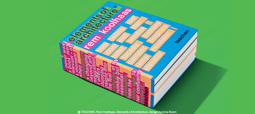
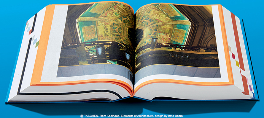
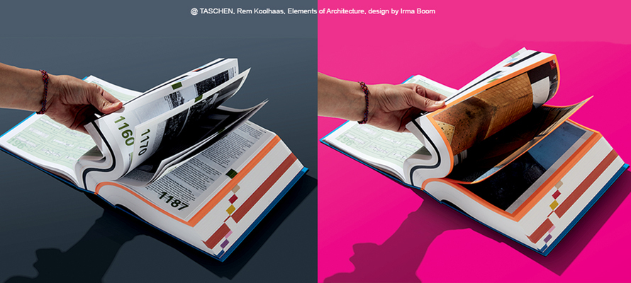
We specialize in large formats, and with the help of our Milan bindery, we can cater to the needs of every single large publication while establishing routines. However, we are always excited when a book requires special treatment that pushes the boundaries of printing and binding. We work closely with designers and production teams to develope new techniques. To pick one example of an interesting solution to a binding problem, graphic designer Irma Boom, famous for her artistic and almost sculptural approach to books, designed Rem Koolhaas’s publication Element of Architecture. The book explores fundamental components of building, such as windows, stairs, façades, and balconies. Despite its relatively small format of 20 x 25.5 cm, the book is 2528 pages strong, and we had to find a way for the thick and small book to open smoothly. Irma Boom came up with the idea of splitting the spine. Instead of one continuous piece of cardboard, the flat spine is made of two pieces. When opened, the spine creases in the middle, allowing the book to lie flat and the pages to open completely.
Another example involves a creative use of printing colors. For the book Information Graphics, the design team planned to use fluorescent colors extensively. Five neon colors were supposed to visually divide the chapters. This meant that the book needed to be printed with five spot colors, which would result in high printing costs. To make printing feasible, we divided the chapters into even signatures according to the printing sheets, with each using only one spot color. Although five spot colors appear in the book, it could be printed as if using only one. This workaround was highly effective, and the next two books in the series used the same principle, resulting in visually striking publications with up to six spot colors that cost no more to produce than books with fewer spot colors.
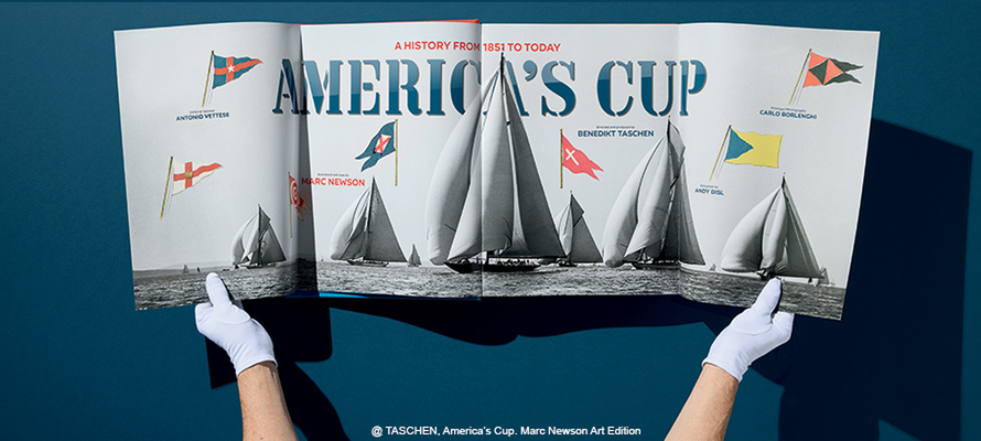
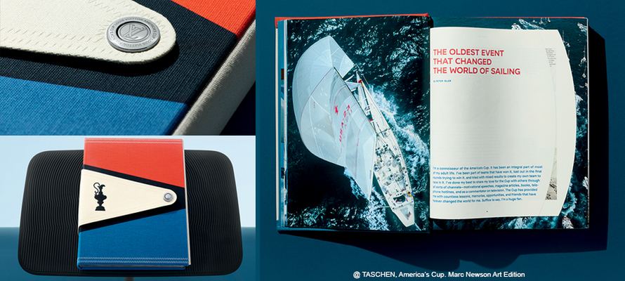
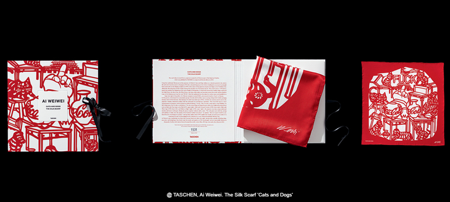
Part of the TASCHEN program are our special Collector’s Editions. In addition to being large-format, these editions come with special artworks, book stands, and clamshell boxes. Each Collector’s Edition requires unique production solutions, such as extraordinary pre-press work to restore original comic drawings by Stan Lee to their former glory and beyond in our Marvel Series and weaving and silk-screening Ai Weiwei’s series of three silk scarves. Recently we collaborated with Louis Vuitton and designer Marc Newson to produce a case crafted from cotton sailcloth, and a carbon fiber bookstand that resembles the keel of a sailboat for a publication on the America's Cup regatta. For these publications, our production team has to think outside the box and sometimes venture beyond the world of book printing.
How is sustainability — from materials to supply chains — influencing your choices, and what challenges do you foresee for Taschen and for the high-end publishing sector in the coming years?
In addition to prioritizing FSC and PEFC-certified products, reducing plastic use, optimizing logistics, and seeking climate-friendly production partners, our most significant contribution to sustainability is our collaboration with the Instituto Terra reforestation program in Minas Gerais, Brazil, founded by Lélia Wanick Salgado and Sebastião Salgado. TASCHEN is honored to have been a part of the organization’s efforts for many years, and to have published crucial photographic collections with the Salgados’ including Exodus, Genesis, and Amazônia, an urgent celebration of the rainforest’s indigenous cultures as well as its endangered beauty.
The Instituto Terra organization was founded in 1998 on land belonging to the Salgado family. Once a cattle ranch carved out of the Atlantic Forest, the property had become arid and infertile, with dried-up rivers and little vegetation besides shrubbery. For over 20 years, Lélia and Sebastião Salgado have reforested the valley with the species that once flourished there. Since then, a miraculous transformation has taken place. Each year, we offset our annual carbon emissions with carbon credits at the Instituto Terra.
07/11/2025


