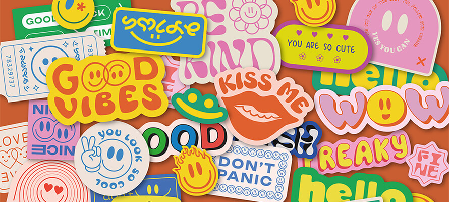
Stickers!
They are simple solutions for all communication needs, even the most complex ones. From transfers to outdoor customisation via marketing, today's stickers are more attractive than ever. We are told about the latest trends in design, materials, printing and finishing by Elisabetta Brambilla of Eurolabel, Ettore Colico of Seilaser, Luca Lorenzoni of Sticker Mule and Francesco Bongiorni and Giulia Hartz, illustrators.
By Roberta Ragona | On PRINTlovers 99
To communicate, to intrigue, to personalise: stickers are a versatile and easily accessible communication tool used across the board by start-ups, established brands and niche businesses. But what is the 'state of the art' of this essential yet ingenious tool? How many of the innovations that have affected the label production sector have extended into this field?
Functional adhesive substrates for different needs
Starting with the materials, the product of choice is still one, explains Elisabetta Brambilla, President of Eurolabel and Chairman of GIPEA, the Italian Label Manufacturers Group: "While paper remains the most widely used material for labels, as far as adhesives are concerned, for most uses that need mechanical resistance to atmospheric agents and scratches, we rely mainly on films, including polypropylene: it still has a fundamental advantage in terms of water and weather resistance over the available alternatives. You still hear 'vinyl' used colloquially, but in reality, PVC is a material that - at least within the European Community - is no longer used, except for applications with no technological alternative. This is certainly not the case with adhesives, where the range of materials is vast. The same applies to the solvent ink that used to be used for printing on vinyl: now, a large part of sticker printing is done with inkjet technology.”
But the world of adhesives goes far beyond stickers and labels: the range of possible materials and applications has widened considerably, as Ettore Colico, Converting Director of Seilaser, a company specialising in cutting and marking based on laser technology, points out: "Even looking at the more particular substrates we work with, from the point of view of aesthetic yield and texture, polyurethane is an excellent alternative to leather: it works better with the laser, the cut is quicker and cleaner on synthetic leather than natural leather, which tends to carbonize. Then there are the innovative substrates, such as reflective materials used, for example, in sportswear and safety: from a processing point of view, they are all examples of stickers and labelling. The choice of material has to do with the function of use: I won't use a polypropylene sticker for a T-shirt but a thermo-transfer so that what previously had to be sewn on can be applied with adhesive materials with a real saving in terms of time."
Beyond the brand: Patreon, Belmond and Dynamo the Good Company
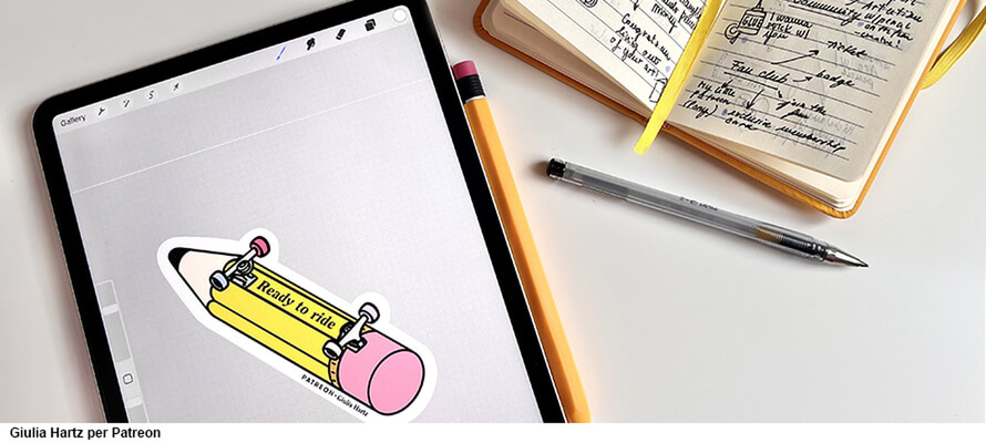
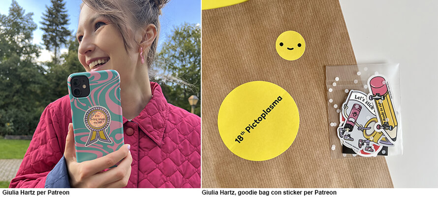
When it comes to promotional stickers, you can no longer be content with simply printing a logo: you need a design capable of intriguing and captivating. Giulia Hartz, an Italian illustrator who lives and works in Berlin, tells us about the work she did for Patreon in 2022: "If you want to produce something that people want to use to personalise their everyday objects - like their laptop, their phone or their water bottle - the time when it was enough to print your logo on pvc I think is past, at least as far as industry events are concerned, where the creative community is very active. This is the kind of work I did for Patreon - a platform where creatives are supported by their fans through forms of content subscription - for the 2022 Pictoplasma. Pictoplasma is a festival of character design and visual communication held in Berlin, which Patreon sponsors. Having to create stickers to be included in the event's goodie bag, we worked together on designs that conveyed the brand's values creatively through illustrations and graphics appealing to an audience of fans and professionals. During the design phase and when discussing the brief, I had brought along their material samples because I immediately imagined the images on a holographic and glitter background: they have that wow effect that can work as a conversation starter.”
The function of igniting the spark of curiosity and starting a conversation is a task that printed stickers share with the digital stickers we increasingly use in social communication, including brand communication. Giulia Hartz continues: "The strength of the sticker is that you have to express a concept so succinctly and clearly that even with just one less element, the message conveyed is no longer the same. It is an exercise in synthesis, effectiveness and incisiveness: the same is true for digital stickers, possibly even more amplified because the surface available to communicate is even smaller and often used inside a phone."
According to Francesco Bongiorni, the difference between the two is, above all, time: "The dialogue between digital and physical exists: the difference I see is that digital is fast, it feeds continuously on new content, while a printed image is made to be looked at for a longer time: since it is designed to personalise an object - such as a suitcase that will accompany us on our travels for several years - it is as an image in which to find reasons of visual interest that last longer than the scrolling time.”
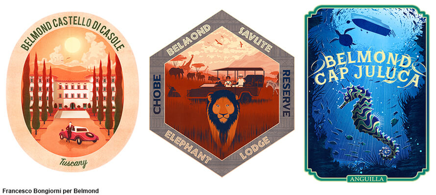
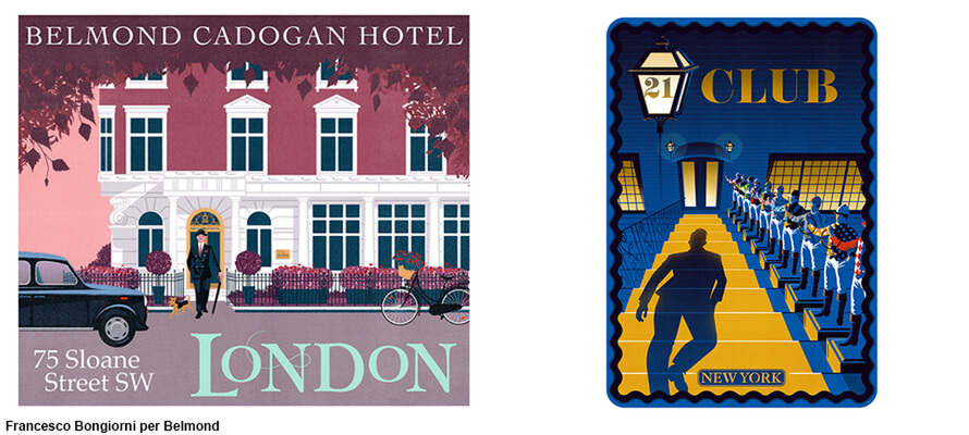
The suitcase example is no coincidence: the aesthetic of travel stickers is back in vogue. This trend combines personalisation and the desire to carry tangible memories of your experiences. Brands such as Samsonite and Rimowa have for some time now been marketing stickers dedicated to the cities of the world to personalise their travel sets, but the aesthetics of turn-of-the-century travel stickers is what inspired the campaign of the luxury hotel chain Belmond, illustrated by Francesco Bongiorni himself: "I was asked, together with other artists, to create illustrations that recalled the aesthetics of the travel stickers for luggage in vogue in the early to mid-20th century. It was referring to a travel aesthetic that could be found in the posters of holiday resorts until the 1960s. The stickers were used for functional and aesthetic reasons, to indicate where the luggage was headed and as a reminder of a place and an experience. In a way, they were the physical testimony of this experience.” Stickers that - like the choice of paper, ribbons and finishes for the packaging - are part of a coordinated image project where everything must contribute to suggest the idea of a high-end experience. Hence, the illustration images, but also the die-cuts: "The shapes arose organically during the design phase of the illustration as an integral part of the design, as did the fonts and typography, which contribute to evoking an atmosphere. The shapes of the stickers were die-cut to recall typical objects or elements of places. For example, the shape of train windows on the Giant Causeway railway line for the Belmond Grand Hibernian in Ireland or the shapes of Khmer architecture for the Belmond La Résidence d'Angkor in Cambodia. Not only hotels then, but more generally the experiences that were possible to live in those places.” The stickers were made with several uses in mind: on the one hand, to be part of the welcome packs for guests of the facilities, and on the other hand, in the communication of the facilities themselves, on the website, promotional materials and in social and ad campaigns".
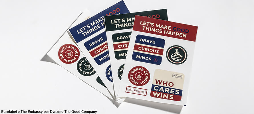
The stickers designed by The Embassy agency and produced by Eurolabel for Dynamo The Good Company as part of the 2022 edition of the Brand Revolution workshop have a promotional function to create a sense of community. Dynamo The Good Company, an outdoor clothing brand originating from the experience of Dynamo Camp, firmly believes that spreading good can change the world, bringing together people who share the same values. During Brand Revolution, The Embassy created some tools to ‘facilitate the spread of good’: an e-commerce box welcoming new members of the community and concretely representing the change that things done well can bring to the world through reuse; a customised fabric label for each garment and accessory; and stickers - a special 'Guerrilla Goodness' tool designed to recognise and spread goodness with a hint of cheerfulness. Stickers, therefore, were, in this case, not mere collateral elements to increase brand visibility. Eurolabel produced several sets of digitally printed sheet stickers on white PP. The pre-cut sheets contain stickers in different shapes with different messages.
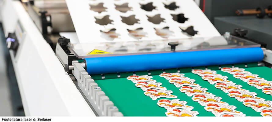
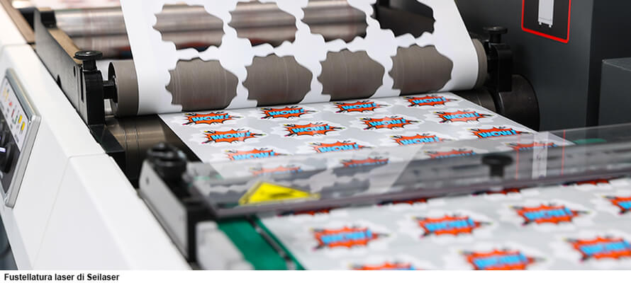
A question of die-cutting...
Speaking of die-cutting, Ettore Colico explains the advantages that can be achieved through laser processing to reduce the impact of production: "The laser cutting technique can be exploited both as an opportunity for efficient use of materials and reduction of waste, as well as for consumables. Using laser cutting reduces machining waste materials: the production, storage and disposal of dies, typically made of birch wood with a shear iron or metal blade, is avoided. Then, there is no energy and material transport cost because the dies are fully digital, and all modifications and optimisations can be made on the machine file. The storage cost is also significantly reduced: it is particularly significant for large formats, in which large die-cuts need square meterage dedicated exclusively to cataloguing and archiving. It is a digital technology that does not require consumables and, therefore, allows for much more agile optimisation at all processing stages.”
... and digital printing
Digital printing techniques also make it possible to reduce minimum order quantities, with a view to efficiency that benefits customers but also allows them to work with an eye on sustainability, as Luca Lorenzoni, Sales & Marketing manager for Italy at Sticker Mule, an American company that produces and sells customised stickers and other brand communication products such as pins, magnets, labels and envelopes, points out: "When we talk about sustainability we have to consider the entire product cycle: making a long-lasting product that lasts longer - in terms of mechanical resistance, colour brilliance, adhesion - is a responsible choice. Working with low minimum order quantities allows you to produce only what you need. Our production methods allow us to simultaneously web print different orders to minimise inefficiencies and waste. We have local teams to optimise processes and machines: it is a strategic choice for the company but has a positive impact. And staying on the subject of product longevity, a key aspect is the choice of adhesive: "Since ours is a product that resists light and weather very well and maintains adhesion over the long term, one of our main targets in addition to tech companies is sports and outdoor activities. The adhesives must be effective and long-lasting: precisely because producing adhesives is a simple and effective way of communicating without affecting the budget too much, it is never advisable to cut back on the quality of the end product to save money. If the result is poor, it conveys a poor-quality image of the brand, achieving the opposite of the desired result.
The potential of glassine
When it comes to reducing the waste materials produced by processing, there is a space for printing that can be exploited creatively, as Elisabetta Brambilla says: "Compared to when working on labels, in the case of stickers glassine is a material that is not processed directly but goes into the hands of the customer. In this sense, it can become an attractive additional space for brand communication. Instead of leaving the back of stickers blank, why not exploit it? You can include important information about your company on the back of a sticker. Another way to use this white space creatively is to insert a QR code that lands on multimedia content, such as a presentation video or landing page.”
For example, this is what Stickerapp does, for which Giulia Hartz created a sticker sheet showing the potential of neon pink ink: "I designed a sheet of Valentine's Day-themed stickers on behalf of Stickerapp. These were promotional sheets that customers found within their order: each sticker sheet is designed to communicate some news, whether about materials or processing. In this case, it was the fifth colour printing with neon inks, specifically the new neon pink. On the back of the sheet is information about the artist who created the graphics, a short text explaining the material or technique and a call to action with a QR code that links to more information on their website. It's a way to make clever use of a space that would otherwise be just a consumable."
In addition to the fifth colour and special processing, the technique that promises to give free rein to the design imagination is explained to us by Ettore Colico: "At the moment, one of the most interesting innovations is the pre-spaced. It does not consist of a single-piece adhesive label or several labels to be placed manually, but of several labels that are placed together, with a structure that keeps them in register. This technique can be applied to various uses, from clothing to outdoor to packaging to interior design. It allows significant savings in person-hours because it does not require the long hand-finishing that more complex designs used to require to be laid out, with a reduction in costs that opens up the possibilities of imagining complex and structured designs even for smaller businesses with ambitious ideas. In addition, it can be applied to all materials, from paper to polyurethane to textiles: the possibilities for design are endless.”
10/11/2023


