Maps. The world on paper
Despite being a subject that has never ceased to fascinate and inspire artists, graphic designers and designers, in recent years maps have increasingly made their way into the imagery of graphic design and packaging. We will talk about it with the founders of Luckies of London, Famille Summerbelle, Beautiful Mess Studio and the curator of the 2020 edition of Atlas of Design.
By Roberta Ragona | On PRINTlovers #83
“A map provides no answers. It only suggests where to look: Discover this, put one thing in relation to another, orient yourself, begin here. Sometimes a map speaks in terms of physical geography, but just as often it muses on the jagged terrain of the heart, the distant vistas of memory, or the fantastic landscapes of dreams.”
This is how Miles Harvey sums up the dual nature of maps in The Island of Lost Maps, a 2001 essay telling the story of America’s most famous map thief Gilbert Bland: a scientific tool for describing the world and a visual narrative space between the imagined and the real.
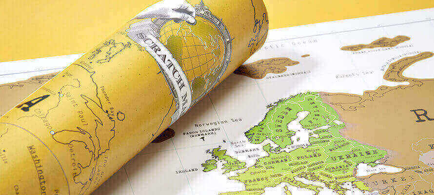
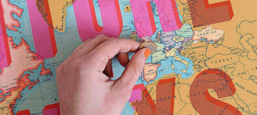
There are many reasons for the great return of maps. On the one hand, there is the importance that travel has taken on in society as consumption of identity, which defines your personality. It is to satisfy these desires that products have come into being like Luckies of London’s Scratch Map, a happy design intuition imitated all over the world and a playful way to remember and celebrate your adventures by scratching away a surface layer of print to discover the graphics below. Precisely this “identity” aspect of the journey is at the heart of the first artist’s Scratch Map, created for Luckies by Dave Buonaguidi, an artist of distant Italian origins whose sharp and irreverent posters are also on display at the Victoria & Albert Museum in London and the Mart museum in Rovereto. Luckies’ Callum Collie says, “Travelling has become much more accessible in recent years and has become a passion for an entirely new audience. People define themselves through their travels in the same way they used to with music, sport or literature. They want to invest in their own interests and communicate them, so there are more and more products and brands that respond to this kind of demand.”
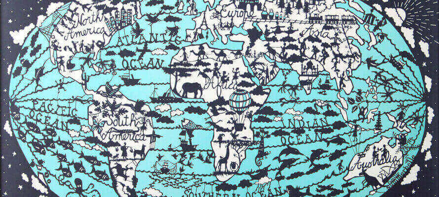
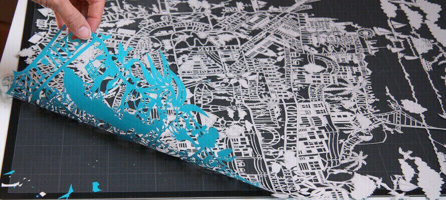
On the other hand, in design and brand communication, the map has always been a recognisable symbol of the territory. In an interconnected world, geographical identity represents the values and skills behind the creation of a product, and this emotional bond makes maps a powerful storytelling tool. Julie Marabelle knows this very well. She is an illustrator, surface designer and co-founder of Famille Summerbelle, a brand of accessories and interior decoration whose flagship design is the silhouette of carved maps. The prototypes are cut out by hand by the artist and then reproduced by laser cutting on Mohawk 240 g pulp dyed paper, or screen-printed in brilliant colours on Mohawk Superfine paper. The company prefers the use of renewable materials such as bamboo fibre and FSC certified Scandinavian birch wood for its products. Graphics that are not reproduced in-house are produced by a network of trusted printers within the European Union and the UK, using non-toxic water-based inks. Marabelle says, “There’s a sense of belonging to a place and a community when you look at an illustrated map of your city or neighbourhood: you don’t just recognise monuments, you recognise landmarks such as the café where you go for coffee on your way to work. An illustrated map allows you to dwell on tiny details or focus on the big picture: it tells a story.”
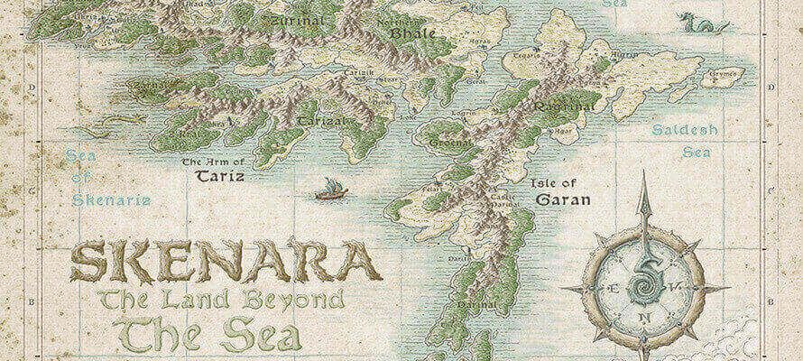
The narrative value of maps does not only concern authorial interpretations but is inherent to cartographic work in general. Atlas of Design, a project of NACIS, the North American Cartographic Information Society, is dedicated to this aspect. Now at its fifth edition, it is a collection of the best examples of cartographic design taken from the most diverse fields of use, from teaching and dissemination of information through art, design and advertising. Vanessa Knoppke-Wetzel, cartographer, analyst and designer who is one of the four editors overseeing the 2020 edition of the Atlas, said the following while talking about how a successfully produced map sometimes tells a story through the map data and design. “A well-made map will help a reader immediately understand what the map is showing, regardless of how complicated the data or map topic is. If the reader understands what “the story” behind the map is, they in fact often don’t even realise they are looking at a map: they have “read the story” instead, and just are remembering the information that the map was trying to tell them, rather than the map itself. When this happens, it means a cartographer has done a good job, but this is the funny thing since, as in all cases of good design, the well-designed object becomes invisible.”
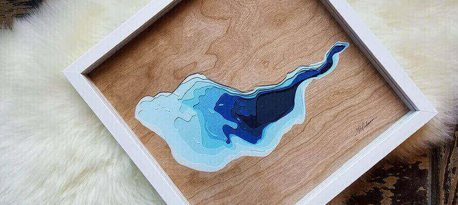
Behind the use of maps as a subject then there is often a desire to tell a personal story and a desire to bring the external world we experience or imagine into our daily life. Gail Bacosa-Puhawan is a Canadian multi-disciplinary artist and the mind behind Beautiful Mess Studio, in which she creates “portraits” of lakes representing the different bathymetric depths with the use of laser-cut coloured cards, and explains the emotional relationship that links the map to the depicted place. “Maps bring the outside world to those who look at them, without leaving the boundaries of their own home. The map is a memory of where you have been and can evoke the same joy as when you were there. Sometimes it represents the dream of places that people would like to explore, and in this sense, it is like reading a book: it is an instrument of escape.”
The contrast between the visual language of scientific data and the warmth of the materials creates unexpected and pleasant results, in which paper is often the central figure, with its infinite possibilities of texture and thickness. Gail Bacosa-Puhawan also says, “Paper has a silent power. It is an easily accessible material, it has its own delicate beauty, but its strength is often underestimated. For my maps of the lakes, paper was the logical choice to produce the layering effects I was looking for because of its strength and lightness.”
In other cases, it is the concept that drives the search for the perfect material. This is the case with scratch foil, as Luckies’ Callum Collie tells us. “It was the product that prompted the search for the right material. Initially, we thought of sticky flags to stick on the countries we visited, but the design team was looking for something more unusual and exciting. After several weeks of searching and a chance encounter with the scratch foil on another project, we opted for what seemed like the perfect choice. Scratching and discovering what’s underneath is much more rewarding than sticking a sticker. A good product doesn’t need too much explanation to be used, and the Scratch Map is an example: you can understand how to use it and what it does just by name or by a single image.” “We use a rub-remove latex on all our maps,” continues Collie, “in a formulation that we have perfected with our printer over the years to make sure it was easy to remove without damaging the maps and that it didn’t dry out too quickly. Some layers of latex tend to dry out in just over a year, making it difficult to scratch them off, but ours last much longer. We rely on different printers in the UK and Asia to make different maps for different markets.”
In the formation of this imagery, we cannot overlook the importance of the apps and social networks we interact with on a daily basis. They have not only changed the way we travel, but they have also made tools that were previously the prerogative of insiders available and familiar to the general public. The more quantitative aspect of design, such as maps, infographics and visual recording, has become an everyday language, thanks to the apps that keep track of our activities, from travel to sport. Vanessa Knoppke-Wetzel, from Atlas of Design, also says, “I think a lot of people don’t realise how often they interact with maps in everyday life and on social networks. On Instagram, for example, posting stories using geotags is a way of mapping your world.”
Julie Marabelle notes, “Social media plays a key role in where people look for inspiration or share their travel experiences. We feel more connected when someone shares their personal experiences, whether it’s a place they visited or something they ate in a small restaurant in a faraway country. We tend to capture every moment of the journey with the cameras on our phones. Then we share them almost instantly with our audience. But in the same way, nothing can replace the actual act of travelling, having your own adventures, meeting new people and having an experience that involves all the senses.”
In this relationship between the world and its representation, maps are also a tool to travel through time. They not only tell you where you are and where you have been but above all broaden the horizon of possibilities of where you will go in the future, opening the space of the possible to the ability to imagine a world different from the here and now.
22/01/2021


