Inside the packaging workshop
Creativity alone is not enough to transform paper and cardboard, or even plastics and composite materials, into packaging. It requires the maximum integration between design, printing and other industrial processes, orchestrated in a precise sequence that transforms good ideas into good packaging.
by Lorenzo Capitani | On PRINTlovers 106
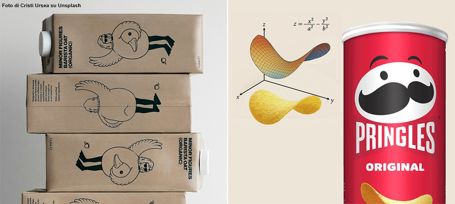
A hyperbolic paraboloid: this is the mathematical shape of a Pringles tube. In the early 1960s, Procter & Gamble wanted to produce new crisps with the same shape, so it exploited a structure already known in architecture that would ensure the crisps were highly resistant. However, suitable packaging was needed.
The solution came in 1966 from chemical engineer Fredric J. Baur, who created a sealed, vacuum-packed tube closed by a metal cap at the bottom and a plastic cap at the top. This is how the iconic design of the Tetra Pak tube we know today was born. 100% recyclable and recognised by everyone, the container is perfectly ergonomic, provides excellent protection for fragile products such as crisps, and is resealable, stackable, and easy to store and transport. In short, it is the ideal container. Probably no other packaging encapsulates the essence of paper converting as much as that 25.5x8.5 cm tube, which is not just “making a box”, but study, design, knowledge of the product, its life and logistics, its consumers, reuse and disposal. Today, this industry is worth almost 9,971 million in turnover in Italy alone and employs more than 62,000 people.
Good design
Just look around to realise that we are surrounded by paper products, cases, die-cut boxes, folding or marmot boxes, caskets, wrap-around boxes, cartons, briefcases, bricks, honeycombs, baskets... Creativity is not enough to transform paper, cardboard, or even plastics and composite materials into packaging. It requires the maximum integration of design, printing and other industrial processes to be orchestrated in a precise sequence that transforms good ideas into good packaging. We have all struggled with packaging or ruined a resealable box because it was unclear how to open it. Beyond the frustration that a complicated opening can cause, in general, the communicative aspect of packaging, since it’s a powerful tool, can cause severe damage, even compromising a brand's reputation if not handled with care. This is what happened in 2009 when Tropicana juices, owned by PepsiCo, completely changed their carton, which was no longer “recognised” by consumers: in two months, sales fell by 20% with a loss of $30 million. Even more serious were the consequences of the graphic and structural design error of the Tylénol PM box. This mild over-the-counter sleeping pill was almost identical to that of Tylénol Extra Strength, a powerful painkiller, with the risk of confusing the two products. So, how do you design good packaging that is not just a nice concept but is also suitable for communicating, protecting, preserving, being opened, perhaps resealed, reused and disposed of?
No one throws away Apple boxes
According to research by the Medium website, an Apple box passes every trend and remains the favourite packaging of consumers, now that it is minimalist, just as it was when it was much more colourful. Packaging is more than just a protective shell: it is an extension of the product experience and the brand itself. According to a joint study by the universities of Texas, Illinois and Georgia, a minimalist approach is appealing because we associate simple packaging with the idea that the products inside are essential, and therefore more concrete and “pure”. However, this is not always the case: consumer opinion changes and minimalism is perceived as unreassuring when it comes to private label products. In short, there is no rule. Because packaging is a message, and like all messages, it is relative because it comprises senders, recipients and means. Today, attention to aesthetics has become extreme. Even before being a container, packaging conveys a message about the product's positioning and the brand's attention to the consumer. However, it must be technically flawless to be used on automated packaging systems, ensuring adequate performance on production lines.
Points of view
In this balancing act between creativity, functionality and sustainability, the first problem to deal with is the variety of solutions offered by paper converting: in seeking novelty or originality, there is a risk of losing sight of the primary focus, namely the product, its nature and how it should reach the consumer. For this reason, when approaching a project, the first thing to do is to consider four main points of view: that of the company that owns the product brand, that of marketing, that of the paper converter, and that of the designer.
Let's start with the last one. A good designer, who is different from a creative person, should have sufficient knowledge of paper converting and all the necessary information about the product. Take, for example, a case for capsule supplements: the contents may be sensitive to humidity, light or temperature changes, travel long distances, be displayed in pharmacies or supermarkets or purchased online, with different communication requirements. The packaging must be easy to open and close, contain a leaflet and guarantee the integrity of the blister pack. It must also bear precise wording, communicate trust and quality, be familiar and reassuring, and differ from the competition.
Then there is the point of view of the company that knows the product, the market, the industry sector and its logistics, and for which that pack represents both the container and the visual identity of its brand. The challenge lies in finding the most suitable solution in terms of communication (i.e. the marketing point of view), performance, ergonomics of use, production economy and, today, finally, disposal.
This is where the point of view of the paper converter comes into play; they are the best allies in packaging design because they are the most experienced in technologies, materials and technical solutions. Usually, the starting point is the product that should be contained in the case/display. Next, the quantities, finishes, and type of packaging used are evaluated. In the case of MOCA (Materials and Objects in Contact with Food) primary packaging, regulatory aspects must also be carefully considered. Experience is invaluable in defining the right solution, concerning spending ability. Packaging has an impact on the final price of a product. A package for pasta for large-scale distribution is one thing, and a perfume case is another. If there are economies to be respected (and there always are) or productivity constraints on the packaging lines, production “wins” over marketing. In the vast majority of cases, the work involves compromise and balance, harmonising aesthetics, communication and production rigour.
From idea to paper
For an idea to become a pack, it must pass through an executive file, which arrives at the paper converting stage and undergoes scrupulous verification. It is not just a question of how to lay out the graphic elements or give the allowances, but also of incorporating the die-cutting and folding lines, the varnishes with the reserves for glueing, and the other finishes provided in a separate layer. This is the time to check that the project can be produced with the planned machinery and materials and that it will work once it is made, taking into account tolerances and deformations, as well as mechanical and thermal stress.
This is where the technical department comes into play. It is the meeting point between creativity and engineering, where the brand's intentions are translated into feasible paper converting solutions. The technical team analyses every aspect and validates or outlines alternatives: type of board, weight, type of opening and closure, interlocking joints, glue points, mechanical tolerances, impact of printing and finishes. In practice, the anatomy of the packaging is constructed. The first key choices are often made here: an interlocking joint instead of a glue point can make all the difference in the automatic assembly phase; a window can make the product visible, but it can weaken the structure. We work on the details, looking for new solutions or applying tried and tested ones. Take the iconic Pastiglie Leone box. It is seemingly simple but results from a perfect balance between retro aesthetics and production functionality. Compact, made of foldable cardboard with a flap opening, it is designed to be assembled automatically with millimetric precision. The closure is glue-free to facilitate reuse and disposal. The structure must guarantee protection from moisture and crumbling. At the same time, the choice of opaque, rough paper is decorative because it recalls the brand's herbal tradition, but is also suitable for automatic lines and holds hot printing perfectly.
Once the structure has been validated and the design adapted to production requirements, we move on to the prototype. The mock-up, which is as close as possible to the real thing, including the finishing touches, is an indispensable testing tool. This sort of 3D blueprint is used to evaluate the aesthetic result, to check how the graphics look (moving away from the simulations of rendering software or the two-dimensionality of the vector), the structural integrity, the ergonomics of use, the machinability and, in many cases, even the response at the point of sale. On that sample, the green light will be given for production.
The key role of colour
Unless the substrate needs to be prepared, as in the case of laminates, it is with printing that the pack begins to take shape with colours, graphics, lettering, logos, textures and information. The technology depends on the choices made, and the choices depend on the technologies available to optimise everything, including yield, time, costs and sustainability. Staying in the world of paper, offset, flexo or digital? It depends on the print run, the type of substrate and the degree of customisation required. Offset is the standard for high quality on flat cardboard: it guarantees definition and colour consistency, which is ideal for cosmetic or food packaging. Flexo is used more on corrugated cardboard and in large volumes, while digital, as in commercial printing, is suitable for short runs, extensive customisation or testing. Then there are the finishes: glossy or matt varnishes, embossing, screen printing, hot stamping and soft-touch lamination. Each choice has an aesthetic impact on the result, as well as on compatibility with subsequent processing and product insertion stages, yields, and final resistance. A UV varnish can enhance a detail, but can create problems when folding; a metallic foil adds value, but requires extreme precision in registration. Everything has to be thought out in advance and depends on the budget and downstream requirements, explains Nicola Prevedello, sales director at Logo SpA. Paper converters have diversified equipment optimised for the required quantities and processes, ensuring maximum cost optimisation.
A key aspect is colour management because it is necessary to ensure correct adherence to colourimetric standards on different substrates and printing technologies. We therefore work with colour proofs, ICC profiles, digital colour data for individual colours, i.e. their description in absolute values according to the Lab (or CIELAB) colour space, and simulations on real substrates. Visual identity is everything; the wrong colour can cause an entire order to be rejected, but it is also necessary to optimise the use of colours by exploiting the so-called grey component replacement (GCR): since certain combinations of CMY can be considered grey, they can be partially or wholly replaced with black. However, you can also use spot colours or alternative formulations: for example, brown C31 M61 Y73 K58 has an alternative formulation without cyan (M48 Y62 K72) corresponding to Pantone 161. Fewer colours mean fewer plates, less ink, lower costs, greater printability and shorter drying times.
Die cutting, glue and a keen eye
After printing, the process's most physical and mechanical phase begins: a sheet, often made of paper or card, is transformed from flat to three-dimensional. To do this, die cutting is almost always required, a process in which the contours of the pack are cut and the folds are pressed. This is where openings, tabs, windows, grooves, joints, half cuts and knurling are created. Every millimetre is calculated, but any variation in thickness, material or humidity can change the behaviour of the cardboard. In addition, deformations must be calculated, stress points and material combinations, surface tensions of the substrates, and even the season must be considered. As a rule, reference is made to the specifications of the material manufacturers and production tests are often carried out to determine whether the results meet expectations. Today's paper converting industry is a world in which the combinations of materials and processes are almost endless, so field testing remains the only valid means of verification. In laminated packaging, such as cardboard and corrugated cardboard, it is advisable to use lamination (or plastic coating) on thicker materials to prevent breakage at critical points. Alternatively, uncovered flutes can be used instead of microflutes, which are more flexible and soft, thus improving hold at critical points.
If the packaging is to be delivered to the customer closed, the paper converter moves on to glueing, often carried out on high-speed automatic lines called fold-and-glue, where each fold must match the other and the glue must adhere only where needed. Once again, good design is essential, not only for the choice of glue, but above all for the choice of adhesion points and areas to be left free of print and varnish to promote rapid adhesion.
Quality control remains a strategic step throughout this process, not only downstream but also integrated into every phase. Technology, including artificial intelligence, certainly helps a great deal today: from automatic vision systems that detect micro-defects to final manual testing, the pack is checked, tested, sometimes disassembled and reassembled. This is because there is still an essential human component: the production of cardboard and similar packaging remains a world with different stages linked to the ability of human beings to do an excellent job. Careful design and control at every stage are still the best guarantee of arriving at the destination with a quality product. In many ways, paper converting remains a craft, where care and experience make all the difference. That is why we do all our work in-house, from printing to laminating, die-cutting to glueing, including all finishing and manual packaging for the most unusual or complex requirements.
In short, if, as JoAnn Hines, known as The Packaging Diva, writes, “packaging is a silent salesperson. It speaks without saying a word, but only if it has been designed to do so”, paper converting is the art that transforms sheets into shapes, ideas into objects, brands into experiences.
by Lorenzo Capitani | On PRINTlovers 106
A hyperbolic paraboloid: this is the mathematical shape of a Pringles tube. In the early 1960s, Procter & Gamble wanted to produce new crisps with the same shape, so it exploited a structure already known in architecture that would ensure the crisps were highly resistant. However, suitable packaging was needed.
The solution came in 1966 from chemical engineer Fredric J. Baur, who created a sealed, vacuum-packed tube closed by a metal cap at the bottom and a plastic cap at the top. This is how the iconic design of the Tetra Pak tube we know today was born. 100% recyclable and recognised by everyone, the container is perfectly ergonomic, provides excellent protection for fragile products such as crisps, and is resealable, stackable, and easy to store and transport. In short, it is the ideal container. Probably no other packaging encapsulates the essence of paper converting as much as that 25.5x8.5 cm tube, which is not just “making a box”, but study, design, knowledge of the product, its life and logistics, its consumers, reuse and disposal. Today, this industry is worth almost 9,971 million in turnover in Italy alone and employs more than 62,000 people.
Good design
Just look around to realise that we are surrounded by paper products, cases, die-cut boxes, folding or marmot boxes, caskets, wrap-around boxes, cartons, briefcases, bricks, honeycombs, baskets... Creativity is not enough to transform paper, cardboard, or even plastics and composite materials into packaging. It requires the maximum integration of design, printing and other industrial processes to be orchestrated in a precise sequence that transforms good ideas into good packaging. We have all struggled with packaging or ruined a resealable box because it was unclear how to open it. Beyond the frustration that a complicated opening can cause, in general, the communicative aspect of packaging, since it’s a powerful tool, can cause severe damage, even compromising a brand's reputation if not handled with care. This is what happened in 2009 when Tropicana juices, owned by PepsiCo, completely changed their carton, which was no longer “recognised” by consumers: in two months, sales fell by 20% with a loss of $30 million. Even more serious were the consequences of the graphic and structural design error of the Tylénol PM box. This mild over-the-counter sleeping pill was almost identical to that of Tylénol Extra Strength, a powerful painkiller, with the risk of confusing the two products. So, how do you design good packaging that is not just a nice concept but is also suitable for communicating, protecting, preserving, being opened, perhaps resealed, reused and disposed of?
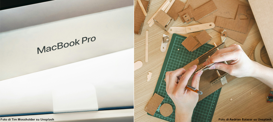
No one throws away Apple boxes
According to research by the Medium website, an Apple box passes every trend and remains the favourite packaging of consumers, now that it is minimalist, just as it was when it was much more colourful. Packaging is more than just a protective shell: it is an extension of the product experience and the brand itself. According to a joint study by the universities of Texas, Illinois and Georgia, a minimalist approach is appealing because we associate simple packaging with the idea that the products inside are essential, and therefore more concrete and “pure”. However, this is not always the case: consumer opinion changes and minimalism is perceived as unreassuring when it comes to private label products. In short, there is no rule. Because packaging is a message, and like all messages, it is relative because it comprises senders, recipients and means. Today, attention to aesthetics has become extreme. Even before being a container, packaging conveys a message about the product's positioning and the brand's attention to the consumer. However, it must be technically flawless to be used on automated packaging systems, ensuring adequate performance on production lines.
Points of view
In this balancing act between creativity, functionality and sustainability, the first problem to deal with is the variety of solutions offered by paper converting: in seeking novelty or originality, there is a risk of losing sight of the primary focus, namely the product, its nature and how it should reach the consumer. For this reason, when approaching a project, the first thing to do is to consider four main points of view: that of the company that owns the product brand, that of marketing, that of the paper converter, and that of the designer.
Let's start with the last one. A good designer, who is different from a creative person, should have sufficient knowledge of paper converting and all the necessary information about the product. Take, for example, a case for capsule supplements: the contents may be sensitive to humidity, light or temperature changes, travel long distances, be displayed in pharmacies or supermarkets or purchased online, with different communication requirements. The packaging must be easy to open and close, contain a leaflet and guarantee the integrity of the blister pack. It must also bear precise wording, communicate trust and quality, be familiar and reassuring, and differ from the competition.
Then there is the point of view of the company that knows the product, the market, the industry sector and its logistics, and for which that pack represents both the container and the visual identity of its brand. The challenge lies in finding the most suitable solution in terms of communication (i.e. the marketing point of view), performance, ergonomics of use, production economy and, today, finally, disposal.
This is where the point of view of the paper converter comes into play; they are the best allies in packaging design because they are the most experienced in technologies, materials and technical solutions. Usually, the starting point is the product that should be contained in the case/display. Next, the quantities, finishes, and type of packaging used are evaluated. In the case of MOCA (Materials and Objects in Contact with Food) primary packaging, regulatory aspects must also be carefully considered. Experience is invaluable in defining the right solution, concerning spending ability. Packaging has an impact on the final price of a product. A package for pasta for large-scale distribution is one thing, and a perfume case is another. If there are economies to be respected (and there always are) or productivity constraints on the packaging lines, production “wins” over marketing. In the vast majority of cases, the work involves compromise and balance, harmonising aesthetics, communication and production rigour.
From idea to paper
For an idea to become a pack, it must pass through an executive file, which arrives at the paper converting stage and undergoes scrupulous verification. It is not just a question of how to lay out the graphic elements or give the allowances, but also of incorporating the die-cutting and folding lines, the varnishes with the reserves for glueing, and the other finishes provided in a separate layer. This is the time to check that the project can be produced with the planned machinery and materials and that it will work once it is made, taking into account tolerances and deformations, as well as mechanical and thermal stress.
This is where the technical department comes into play. It is the meeting point between creativity and engineering, where the brand's intentions are translated into feasible paper converting solutions. The technical team analyses every aspect and validates or outlines alternatives: type of board, weight, type of opening and closure, interlocking joints, glue points, mechanical tolerances, impact of printing and finishes. In practice, the anatomy of the packaging is constructed. The first key choices are often made here: an interlocking joint instead of a glue point can make all the difference in the automatic assembly phase; a window can make the product visible, but it can weaken the structure. We work on the details, looking for new solutions or applying tried and tested ones. Take the iconic Pastiglie Leone box. It is seemingly simple but results from a perfect balance between retro aesthetics and production functionality. Compact, made of foldable cardboard with a flap opening, it is designed to be assembled automatically with millimetric precision. The closure is glue-free to facilitate reuse and disposal. The structure must guarantee protection from moisture and crumbling. At the same time, the choice of opaque, rough paper is decorative because it recalls the brand's herbal tradition, but is also suitable for automatic lines and holds hot printing perfectly.
Once the structure has been validated and the design adapted to production requirements, we move on to the prototype. The mock-up, which is as close as possible to the real thing, including the finishing touches, is an indispensable testing tool. This sort of 3D blueprint is used to evaluate the aesthetic result, to check how the graphics look (moving away from the simulations of rendering software or the two-dimensionality of the vector), the structural integrity, the ergonomics of use, the machinability and, in many cases, even the response at the point of sale. On that sample, the green light will be given for production.
The key role of colour
Unless the substrate needs to be prepared, as in the case of laminates, it is with printing that the pack begins to take shape with colours, graphics, lettering, logos, textures and information. The technology depends on the choices made, and the choices depend on the technologies available to optimise everything, including yield, time, costs and sustainability. Staying in the world of paper, offset, flexo or digital? It depends on the print run, the type of substrate and the degree of customisation required. Offset is the standard for high quality on flat cardboard: it guarantees definition and colour consistency, which is ideal for cosmetic or food packaging. Flexo is used more on corrugated cardboard and in large volumes, while digital, as in commercial printing, is suitable for short runs, extensive customisation or testing. Then there are the finishes: glossy or matt varnishes, embossing, screen printing, hot stamping and soft-touch lamination. Each choice has an aesthetic impact on the result, as well as on compatibility with subsequent processing and product insertion stages, yields, and final resistance. A UV varnish can enhance a detail, but can create problems when folding; a metallic foil adds value, but requires extreme precision in registration. Everything has to be thought out in advance and depends on the budget and downstream requirements, explains Nicola Prevedello, sales director at Logo SpA. Paper converters have diversified equipment optimised for the required quantities and processes, ensuring maximum cost optimisation.
A key aspect is colour management because it is necessary to ensure correct adherence to colourimetric standards on different substrates and printing technologies. We therefore work with colour proofs, ICC profiles, digital colour data for individual colours, i.e. their description in absolute values according to the Lab (or CIELAB) colour space, and simulations on real substrates. Visual identity is everything; the wrong colour can cause an entire order to be rejected, but it is also necessary to optimise the use of colours by exploiting the so-called grey component replacement (GCR): since certain combinations of CMY can be considered grey, they can be partially or wholly replaced with black. However, you can also use spot colours or alternative formulations: for example, brown C31 M61 Y73 K58 has an alternative formulation without cyan (M48 Y62 K72) corresponding to Pantone 161. Fewer colours mean fewer plates, less ink, lower costs, greater printability and shorter drying times.
Die cutting, glue and a keen eye
After printing, the process's most physical and mechanical phase begins: a sheet, often made of paper or card, is transformed from flat to three-dimensional. To do this, die cutting is almost always required, a process in which the contours of the pack are cut and the folds are pressed. This is where openings, tabs, windows, grooves, joints, half cuts and knurling are created. Every millimetre is calculated, but any variation in thickness, material or humidity can change the behaviour of the cardboard. In addition, deformations must be calculated, stress points and material combinations, surface tensions of the substrates, and even the season must be considered. As a rule, reference is made to the specifications of the material manufacturers and production tests are often carried out to determine whether the results meet expectations. Today's paper converting industry is a world in which the combinations of materials and processes are almost endless, so field testing remains the only valid means of verification. In laminated packaging, such as cardboard and corrugated cardboard, it is advisable to use lamination (or plastic coating) on thicker materials to prevent breakage at critical points. Alternatively, uncovered flutes can be used instead of microflutes, which are more flexible and soft, thus improving hold at critical points.
If the packaging is to be delivered to the customer closed, the paper converter moves on to glueing, often carried out on high-speed automatic lines called fold-and-glue, where each fold must match the other and the glue must adhere only where needed. Once again, good design is essential, not only for the choice of glue, but above all for the choice of adhesion points and areas to be left free of print and varnish to promote rapid adhesion.
Quality control remains a strategic step throughout this process, not only downstream but also integrated into every phase. Technology, including artificial intelligence, certainly helps a great deal today: from automatic vision systems that detect micro-defects to final manual testing, the pack is checked, tested, sometimes disassembled and reassembled. This is because there is still an essential human component: the production of cardboard and similar packaging remains a world with different stages linked to the ability of human beings to do an excellent job. Careful design and control at every stage are still the best guarantee of arriving at the destination with a quality product. In many ways, paper converting remains a craft, where care and experience make all the difference. That is why we do all our work in-house, from printing to laminating, die-cutting to glueing, including all finishing and manual packaging for the most unusual or complex requirements.
In short, if, as JoAnn Hines, known as The Packaging Diva, writes, “packaging is a silent salesperson. It speaks without saying a word, but only if it has been designed to do so”, paper converting is the art that transforms sheets into shapes, ideas into objects, brands into experiences.
13/06/2025


