Herita Marzotto Wine Estates: more than a label, an identity
Herita Marzotto Wine Estates is the new identity of the famous Santa Margherita group. Cinzia Coderin, Product Manager, guides us through the creative process behind the Group's labels - powerful communication tools that express the company's identity and values.
By Melissa Ceccon | On PRINTlovers 105
A rebranding that celebrates 90 years of history and passion for wine. A new name that made its official debut at Wine Paris in February, ‘Herita’ symbolises the heritage of what has been achieved to date as the Santa Margherita Wine Group: a successful model that has marked the ‘Italian miracle’, transforming how wine is consumed in Italy and worldwide. This entrepreneurial strategy has exported Italian excellence across borders.
Founded in 1935 by Count Gaetano Marzotto in Fossalta di Portogruaro (VE) and still firmly in the hands of the third generation of the family, Herita Marzotto Wine Estates has become one of the most important Italian players on the world wine scene, with over 27 million bottles sold in more than 90 countries.
Today, Herita represents an oenological mosaic rooted in 10 estates and the same number of brands: Santa Margherita, Torresella, Kettmeir, Ca' del Bosco, Cà Maiol, Lamole di Lamole, Vistarenni, Tenuta Sassoregale, Cantina Mesa, and Roco Winery. There are over 760 productive hectares throughout Italy, in some of the most prestigious wine regions such as Eastern Veneto, Conegliano Valdobbiadene, Lugana, Franciacorta, Chianti Classico, Maremma, and Sardinia. Additionally, there are another 40 productive hectares in the Willamette Valley in Oregon (USA).
There has been a significant territorial expansion. For this reason, the group invests heavily in visual communication for its products. This essential marketing strategy seeks to convey not only the group's heritage but also its identity. We discussed this aspect with Cinzia Coderin, Product Manager of Herita Marzotto Wine Estates, who has been involved in creating and designing labels for over 12 years.
“Before choosing colours, materials, and graphics, I like to understand every characteristic of the wine,” she tells us. Each label that emerges from the Herita Marzotto Wine Estates cellars is not just a simple label; it is an actual work of design, meticulously studied and capable of captivating even the most discerning wine lovers. The group showcases its values of quality, tradition, and innovation in every bottle by carefully selecting materials and printing and finishing techniques that create a clear and easily readable design.
If wine is the beating heart of the group, the exceptional work put into every aspect of the product embodies the soul that makes an Italian company like Herita Marzotto Wine Estates remarkable.
How do you express the group's values and identity through printed materials?
Herita Marzotto Wine Estates carefully curates every visual aspect of its printed materials to convey its values of quality and sustainability. The choice of recycled and FSC-certified papers and the meticulous care taken in packaging and finishing reflects our commitment. Each label is designed to tell the product's story, incorporating clear and distinctive elements such as the logo and the producer's name while communicating the connections to tradition, authenticity, and the brand's identity. This philosophy promotes transparency towards the consumer.
How do you manage the identity of your products, and what role do design and printing play?
The design of the labels is essential for telling the story and establishing a connection with the territories of origin. Each product is distinguished by details that enhance the visual identity of the various brands, conveying values through colours, materials, and finishes. Every graphic element, from colours to finishes, is crafted to express the identity and positioning of the brand. For us, printing is a crucial phase where we take direct responsibility for ensuring quality and visual coherence, always emphasising authenticity and sustainability. The labels begin with a graphic concept and are transformed into ‘business cards’ for Herita.
How do you develop the creativity of your labels? Is everything studied internally within the Group? Or do you have suppliers who also act as consultants?
The process of creating a new label or restyling begins with a detailed brief developed in collaboration with the marketing and sales departments. The creative team, made up of in-house and agency staff, explores ideas and drafts to define the visual direction. We then test the feasibility with the production department, finalising the paper, colour proofs and finishing. The culmination of the process is the press proof, the moment when the label comes to life.
What criteria guide the choice of materials, printing techniques and finishing?
The choice of materials and printing techniques depends on the storytelling we want to convey. We start by understanding the brand message, then choose special papers to reinforce the concept or colours and foils to highlight important details. We carefully study all the latest developments in materials and finishing to keep up to date with market trends and respond to consumer needs.
Sustainability is an essential value for you. How is this reflected in your communication choices, from labels to packaging?
Herita Marzotto Wine Estates integrates environmental responsibility into every aspect of its communication. We use recycled and FSC-certified materials, promoting sustainable practices such as using lightweight bottles to reduce our carbon footprint. In addition, through the Rafcycle project, we reuse label holders to create new products, such as ice buckets, thus offering a sustainable life cycle to our packaging.
Is there a recent project you would like to tell us about that is particularly innovative or challenging?
In June 2024, we presented ‘Harmonia Mundi’, the first sparkling wine made in Venice with grapes grown in the cloisters of San Francesco della Vigna. This exclusive wine is produced in a limited edition, and its packaging recalls the colours and elements of the Lagoon. We used a direct glass decoration technique to create harmonious and ‘wavy’ shades that make each bottle unique.
Looking to the future, what are the next challenges and projects? Are you exploring the use of innovative technologies to enrich the communication and traceability of your products?
We are currently testing AI technology only during the data collection and market analysis phase. Innovative technologies like artificial intelligence, blockchain, and digital watermarks present opportunities to enhance consumer communication and increase transparency. There is still considerable room for growth, but we are enthusiastic about exploring these new possibilities.
IM INTER
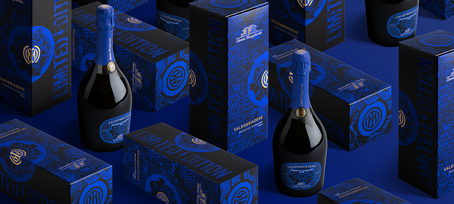
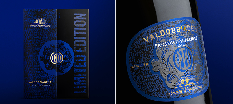
The limited edition
The limited edition of Valdobbiadene Prosecco Superiore DOCG Brut, created in collaboration between Inter and Santa Margherita, a brand of Herita Marzotto Wine Estates, represents a perfect union between the global prestige of the Club and the Italian wine tradition. The challenge of maintaining the identity of both organisations, respecting the winemaking tradition and the iconic nature of the black and blue football shirt, led to the creation of a distinctive design that permeates the entire label and box. The choice of Luxor 425 matt gold and rough screen-printed varnish is combined with a luminescent screen-printing that, when taken to the dark, reveals on the bottle the iconic symbol of the snake and the snake's eyes, the latter only visible in the absence of light. The paper chosen is FSC certified, while consistency and continuity are provided by the secondary packaging embellished with Luxor 425 matt gold and a thick, glossy screen-printed varnish.
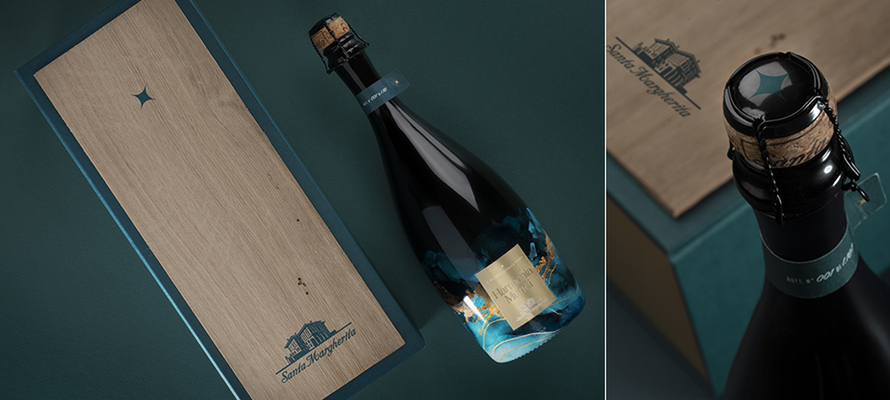
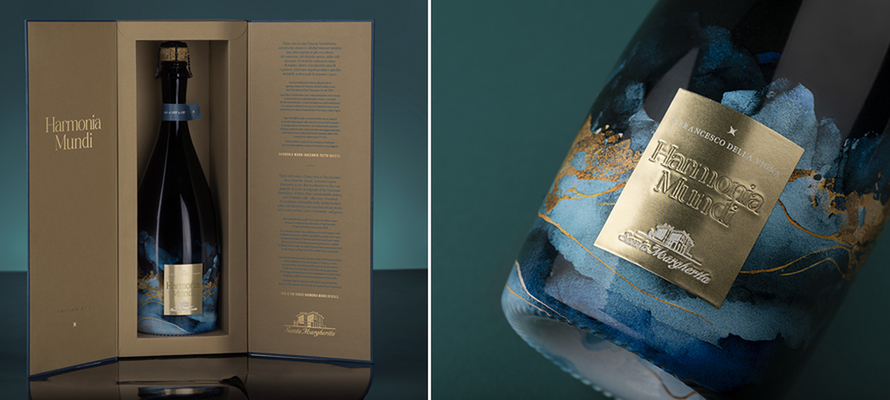
HARMONIA MUNDI
The wine that tells the story of Venice
Harmonia Mundi originates from Venice's oldest urban vineyard, the Convent of San Francesco, established in 1254. The winemaking project is characterised by its organic approach and the enhancement of local traditions. Each bottle is unique, adorned with a strip of wood from old mooring posts, salvaged from the lagoon and transformed into a precious material. Naturally irregular and shaped by time, these strips impart an inimitable character to the bottle, symbolising the fusion of past and present. The bottle’s surface features a sublimation technique that ensures a vivid and lasting colour without losing the glass's transparency. Meanwhile, the label is made of adhesive aluminium, selected for its elegance and weather resistance. This choice guarantees a glossy, reflective surface that highlights the graphic details and gives the bottle a sense of refinement.
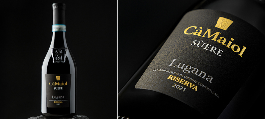
CÀ MAIOL
Elegance for the iconic winery on Lake Garda
Cà Maiol has undertaken a sophisticated rebranding process, renewing its image and packaging to better communicate the essence of the territory and attract an international audience. The restyling takes inspiration from the ‘keystone’ of one of the winery's façades, a symbol of solidity and tradition, reinterpreted in a modern and original way. The label, characterised by an elegant and sober design, is enhanced with hot gold foil, blind embossing and Braille varnish, giving it an exclusive visual and tactile value. The FSC®-certified paper used is an ecological, high-quality choice, ideal for enhancing the finishing and guaranteeing resistance to humidity, maintaining a sustainable footprint. This design conveys the authoritativeness of the winery and its ability to evolve over time, expressing the unique style of Cà Maiol.
By Melissa Ceccon | On PRINTlovers 105
A rebranding that celebrates 90 years of history and passion for wine. A new name that made its official debut at Wine Paris in February, ‘Herita’ symbolises the heritage of what has been achieved to date as the Santa Margherita Wine Group: a successful model that has marked the ‘Italian miracle’, transforming how wine is consumed in Italy and worldwide. This entrepreneurial strategy has exported Italian excellence across borders.
Founded in 1935 by Count Gaetano Marzotto in Fossalta di Portogruaro (VE) and still firmly in the hands of the third generation of the family, Herita Marzotto Wine Estates has become one of the most important Italian players on the world wine scene, with over 27 million bottles sold in more than 90 countries.
Today, Herita represents an oenological mosaic rooted in 10 estates and the same number of brands: Santa Margherita, Torresella, Kettmeir, Ca' del Bosco, Cà Maiol, Lamole di Lamole, Vistarenni, Tenuta Sassoregale, Cantina Mesa, and Roco Winery. There are over 760 productive hectares throughout Italy, in some of the most prestigious wine regions such as Eastern Veneto, Conegliano Valdobbiadene, Lugana, Franciacorta, Chianti Classico, Maremma, and Sardinia. Additionally, there are another 40 productive hectares in the Willamette Valley in Oregon (USA).
There has been a significant territorial expansion. For this reason, the group invests heavily in visual communication for its products. This essential marketing strategy seeks to convey not only the group's heritage but also its identity. We discussed this aspect with Cinzia Coderin, Product Manager of Herita Marzotto Wine Estates, who has been involved in creating and designing labels for over 12 years.
“Before choosing colours, materials, and graphics, I like to understand every characteristic of the wine,” she tells us. Each label that emerges from the Herita Marzotto Wine Estates cellars is not just a simple label; it is an actual work of design, meticulously studied and capable of captivating even the most discerning wine lovers. The group showcases its values of quality, tradition, and innovation in every bottle by carefully selecting materials and printing and finishing techniques that create a clear and easily readable design.
If wine is the beating heart of the group, the exceptional work put into every aspect of the product embodies the soul that makes an Italian company like Herita Marzotto Wine Estates remarkable.
How do you express the group's values and identity through printed materials?
Herita Marzotto Wine Estates carefully curates every visual aspect of its printed materials to convey its values of quality and sustainability. The choice of recycled and FSC-certified papers and the meticulous care taken in packaging and finishing reflects our commitment. Each label is designed to tell the product's story, incorporating clear and distinctive elements such as the logo and the producer's name while communicating the connections to tradition, authenticity, and the brand's identity. This philosophy promotes transparency towards the consumer.
How do you manage the identity of your products, and what role do design and printing play?
The design of the labels is essential for telling the story and establishing a connection with the territories of origin. Each product is distinguished by details that enhance the visual identity of the various brands, conveying values through colours, materials, and finishes. Every graphic element, from colours to finishes, is crafted to express the identity and positioning of the brand. For us, printing is a crucial phase where we take direct responsibility for ensuring quality and visual coherence, always emphasising authenticity and sustainability. The labels begin with a graphic concept and are transformed into ‘business cards’ for Herita.
How do you develop the creativity of your labels? Is everything studied internally within the Group? Or do you have suppliers who also act as consultants?
The process of creating a new label or restyling begins with a detailed brief developed in collaboration with the marketing and sales departments. The creative team, made up of in-house and agency staff, explores ideas and drafts to define the visual direction. We then test the feasibility with the production department, finalising the paper, colour proofs and finishing. The culmination of the process is the press proof, the moment when the label comes to life.
What criteria guide the choice of materials, printing techniques and finishing?
The choice of materials and printing techniques depends on the storytelling we want to convey. We start by understanding the brand message, then choose special papers to reinforce the concept or colours and foils to highlight important details. We carefully study all the latest developments in materials and finishing to keep up to date with market trends and respond to consumer needs.
Sustainability is an essential value for you. How is this reflected in your communication choices, from labels to packaging?
Herita Marzotto Wine Estates integrates environmental responsibility into every aspect of its communication. We use recycled and FSC-certified materials, promoting sustainable practices such as using lightweight bottles to reduce our carbon footprint. In addition, through the Rafcycle project, we reuse label holders to create new products, such as ice buckets, thus offering a sustainable life cycle to our packaging.
Is there a recent project you would like to tell us about that is particularly innovative or challenging?
In June 2024, we presented ‘Harmonia Mundi’, the first sparkling wine made in Venice with grapes grown in the cloisters of San Francesco della Vigna. This exclusive wine is produced in a limited edition, and its packaging recalls the colours and elements of the Lagoon. We used a direct glass decoration technique to create harmonious and ‘wavy’ shades that make each bottle unique.
Looking to the future, what are the next challenges and projects? Are you exploring the use of innovative technologies to enrich the communication and traceability of your products?
We are currently testing AI technology only during the data collection and market analysis phase. Innovative technologies like artificial intelligence, blockchain, and digital watermarks present opportunities to enhance consumer communication and increase transparency. There is still considerable room for growth, but we are enthusiastic about exploring these new possibilities.
IM INTER
The limited edition
The limited edition of Valdobbiadene Prosecco Superiore DOCG Brut, created in collaboration between Inter and Santa Margherita, a brand of Herita Marzotto Wine Estates, represents a perfect union between the global prestige of the Club and the Italian wine tradition. The challenge of maintaining the identity of both organisations, respecting the winemaking tradition and the iconic nature of the black and blue football shirt, led to the creation of a distinctive design that permeates the entire label and box. The choice of Luxor 425 matt gold and rough screen-printed varnish is combined with a luminescent screen-printing that, when taken to the dark, reveals on the bottle the iconic symbol of the snake and the snake's eyes, the latter only visible in the absence of light. The paper chosen is FSC certified, while consistency and continuity are provided by the secondary packaging embellished with Luxor 425 matt gold and a thick, glossy screen-printed varnish.
HARMONIA MUNDI
The wine that tells the story of Venice
Harmonia Mundi originates from Venice's oldest urban vineyard, the Convent of San Francesco, established in 1254. The winemaking project is characterised by its organic approach and the enhancement of local traditions. Each bottle is unique, adorned with a strip of wood from old mooring posts, salvaged from the lagoon and transformed into a precious material. Naturally irregular and shaped by time, these strips impart an inimitable character to the bottle, symbolising the fusion of past and present. The bottle’s surface features a sublimation technique that ensures a vivid and lasting colour without losing the glass's transparency. Meanwhile, the label is made of adhesive aluminium, selected for its elegance and weather resistance. This choice guarantees a glossy, reflective surface that highlights the graphic details and gives the bottle a sense of refinement.
CÀ MAIOL
Elegance for the iconic winery on Lake Garda
Cà Maiol has undertaken a sophisticated rebranding process, renewing its image and packaging to better communicate the essence of the territory and attract an international audience. The restyling takes inspiration from the ‘keystone’ of one of the winery's façades, a symbol of solidity and tradition, reinterpreted in a modern and original way. The label, characterised by an elegant and sober design, is enhanced with hot gold foil, blind embossing and Braille varnish, giving it an exclusive visual and tactile value. The FSC®-certified paper used is an ecological, high-quality choice, ideal for enhancing the finishing and guaranteeing resistance to humidity, maintaining a sustainable footprint. This design conveys the authoritativeness of the winery and its ability to evolve over time, expressing the unique style of Cà Maiol.
31/03/2025


