Gin, the alternative
It has a history of at least eight centuries, as adventurous as it is imaginative. Today, gin is back in the spotlight among spirits thanks to the inventiveness of distillers and barmen and the creative energy of packaging designers and art directors: a choral and international success. We talked about this with Paolo Insinga and Lindsey Jones of Interbrand, who revealed the secrets of their precious packaging, and then took a virtual trip into the world of Italian distilleries, from Trentino to Sardinia.
By Marilde Motta | On PRINTlovers 88
The journey of gin (from the Latin iuniperus, meaning juniper, its basic ingredient) starts in Salerno. The distillate originated as a ‘medicament’ in the Salerno Medical School, where, as early as the 9th century, doctors and apothecaries used juniper berries together with other botanical varieties for therapeutic purposes. Then someone discovered that the mixture was not a bad thing to drink in joyful, or conversely dangerous, circumstances. In the Netherlands and Belgium, in the 16th century, gin was not only used to cheer people up in battle but was also reworked into a local product, which has since been called jenever and is still protected under this name. At the time of the great trade routes to the Indies, gin reached distant shores. In England, this aromatic spirit reached the height of its consumption in the 18th century, to such an extent that laws were passed restricting libations, but it also found ingenious distillation acrobats who created ‘variations on a theme’: Plymouth gin, London gin, Old Tom. In the early 1900s, gin in the USA formed an alliance with literature and cinema; its transformative soul helped it become indispensable in cocktails, beginning its dizzying climb towards high society. Having travelled around the world, gin is now back where it started, and in Italy, there is a flourishing of craft distilleries that are reinventing it. This reawakening of interest is taking place in parallel in other countries, where projects are pervaded by great creativity both in the composition of the bouquet of botanicals and in the design of the bottles. Old ideas about this distillate are disappearing, starting with the colour - no longer just crystal clear, but also pink, yellow, blue and green - and continuing with an increasingly rich and heterogeneous combination of ingredients, aromatic combinations and surprises for the palate.
Gin between local and global
It is one of the world’s most popular spirits, as rooted in its historical and geographical origins as it is capable of being transformist and even irreverent towards tradition. Paolo Insinga, Executive Creative Director of Interbrand’s Italian office, gives an overview of the main trends in total packaging design for gin. “There has been a substantial change over the last decade, and small craft distilleries have given a boost to the growth of the gin market. Particularly in Italy, gin packaging has been freer from stylistic constraints than other spirits and other countries with a longer gin tradition.
The container represents a decisive break from the norm, as in the case of Engine gin (packaged in a tin reminiscent of vintage engine oil packaging, editor’s note), where not only shapes but also materials from very different sectors are used. Strong concepts and the possibility of developing a narrative around the product, naturally supported by a very brilliant production, are crucial.”
Lindsey Jones, Executive Director, Client Partnerships at Interbrand in London, adds, “Gin has a long history and a very creative present that is confronted with a multitude of product varieties. Careful attention to the botanicals and other ingredients has helped it become established and preferred by an increasingly broad audience. In addition, storytelling has helped, as in the case of Hendricks gin, to attract a younger audience. Monkey 47 has also upset traditional codes by presenting a monkey on the label and developing an ironic and irreverent communication. On the other hand, Tanqueray refers to tradition and the shape of its bottle, inspired by art deco, with communication based on codes that evoke refinement and charm.”
Jones goes on to discuss the variety of products and how the identities are reflected in the packaging. “You could classify gins into three areas: craft and limited production, origin-driven and aroma-driven. The packaging structure and label graphics interpret these three classifications. For example, Brooklyn gin is a limited production gin; its message is one of craftsmanship and authenticity, so the glass bottle has a square shape with an embossed copper label. On the other hand, the bottle of Ophir is influenced by the opulent aroma with spicy notes that bring to mind the Orient and the spice route. The aromatic component of Bloom gin is decidedly floral, so the bottle is sleek with light touch decoration that clearly positions this distillate as delicate and suitable for a female audience.” On current trends, Jones adds, “Bottle design is increasingly inspired by perfumery as gin and perfumes are built on the alchemy of aromas and are precious liquids. Different materials are being used for the closure, each with its own identity, and the focus is also on the experience of opening. Ceramic is another trendy material, and the shape does not necessarily follow the function of the liquor bottle but leaves open the possibility of reuse, for example, as a flower vase. Finally, packaging designers are also called upon to think about sustainability. For instance, Cantium gin offers reusable containers while Rock Rose gin provides refills with which the ceramic bottle can be refilled.”
Another two-part discussion on a particular aspect: geographical identity and export strategies. According to Paolo Insinga, “Italy is known for the numerous varieties of products guaranteed by EU denomination and protection marks, but it’s also famous for its rich biodiversity, which plays a decisive role in the case of gin. Many gin labels take advantage of this opportunity and speak of the people, the place, the spirit that animates them, the craftsmanship. The small new producers have limited economic resources, but they develop great creativity in their approach to the market. Lindsey Jones points out: “The UK is now the world’s largest producer and exporter of gin with brands such as Gordons, Beefeater and Hendricks among the seven best-selling brands in the world. The UK is synonymous with gin with highly regarded brands in geographic areas where gin still has an influence. However, it’s not just geographical origin that counts; creativity and originality also play an important role, especially as the market is becoming saturated and distilleries need to raise the bar on brand design and packaging design.”
Trip to the distillery
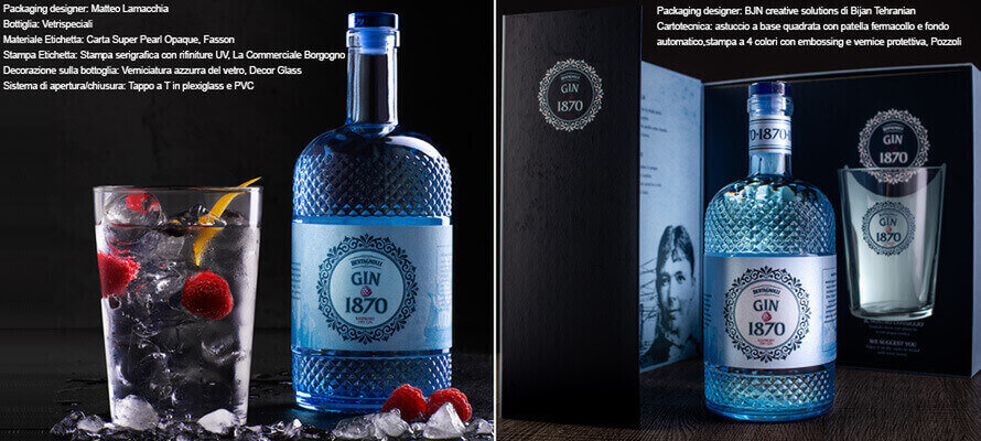
A bottle for every distillery and often a bottle for every label of gin produced by the same distillery. In Italy, there are hundreds of labels and many artisan distilleries that move easily between multinationals and large companies, thanks to a bold and exuberant inventiveness, expressed in the product as much as in the packaging and its set of labels, decorations, jewel closures, mini monographs and cases specially constructed to celebrate the unboxing experience. Anna Boschi, who works in marketing at Distilleria Bertagnolli, explains the concept that inspired the packaging design of their gin. “In 2019, as Distilleria Bertagnolli approached its 150th year of activity, the need arose to renew the celebratory line that paid homage to the founder Giulia de Kreutzenberg who, together with her husband Edoardo Bertagnolli, founded the distillery in Mezzocorona in 1870. That was how Gin 1870 - Raspberry Dry Gin started, a gin with raspberry, pepper - obviously juniper - and two other secret botanicals, housed in a bottle with a fine and elegant diamond pattern, reminiscent of the Belle Époque period. The evocative label entirely wraps around the central section of the bottle. It has a circular frame on the front in which the name of the product and the Distilleria Bertagnolli 1870 logo are inserted, accompanied by the new payoff “cuore trentino” (Trentino heart), created for the restyling of the entire range of Bertagnolli products. The illustrated label tells how Giulia de Kreutzenberg came to know about the gin product; some scenes of this happy story are represented in lithographic style, and the photo of the noblewoman found in the distillery’s historical archives. The distinguishing feature is the blue varnish on the bottle, which matches the colour of the label and the plexiglass stopper. The bottle is completed by a collar showing the year of its foundation.”
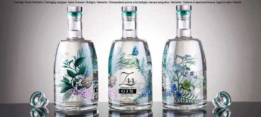
A few kilometres further on and in Trentino we find another gin, another identity, another story. Simon Schweigkofler, Roner Distillerie’s marketing manager, tells us, “We have entrusted design with telling the story of our Alpine Gin Z44, whose special feature is the Swiss stone pine (Zirbel in German) harvested on the Cono Bianco near our distillery at an altitude of 1850 metres. The transparent container shows the snow-covered mountain on the back of the bottle. The illustration depicts the Alpine botanicals typical of the forests surrounding us and gives the gin its unmistakable aroma. Nature, genuine ingredients and our strong bond with the land are the identifying elements of the brand, which have been developed through the illustrations in the graphic representation.”
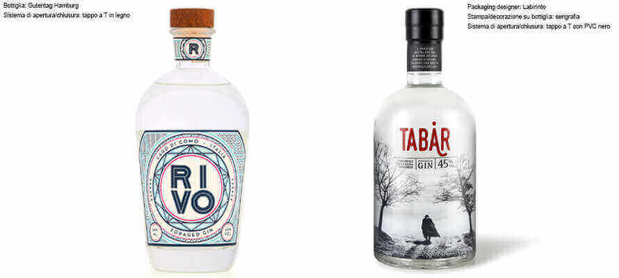
However, on the shores of Lake Como, a gin has come into being that “bewitches” the palate. Marco Rivolta, co-founder of RIVO, traces for us the path that the mind took in the creation of this gin and its bottle. “For centuries, local women searched the meadows around Lake Como for herbs and flowers to prepare medicines and remedies. History would call them witches. We consider them pioneers of unique potions. And it is precisely the element of witches and magic that inspired the packaging: geometric lines chase each other to create abstract figures, which in the details echo two elements of that territory, the mountains and the waves of the lake. The idea was to create a design that recalls Italian craftsmanship, but at the same time, is modern and able to present itself internationally. Even the bottle is intended to evoke the element of magic with its unique ampoule shape. Today, expert ethno-botanists are entrusted with the task of hand-picking and selecting the 12 types of botanicals from the local flora, certifying their origin and guaranteeing their quality.” Rivolta concludes: “It was essential that not only the product but also the packaging, should recall our lake. The challenge was to create it without using clichés that had already been seen. Hence the decision to abstract natural elements with new and original shapes and illustrations. We also wanted to give the shapes a certain intimacy, making them directly recognisable only to those who know our story. In other words, a label to be discovered in detail and little by little.” From Lombardy we move on to Emilia, where Lucia Palazzini, Head of Marketing at Casoni Fabbricazione Liquori, fascinates us with a story of mists and tabarri (‘tabards’, editor’s note).
“Tabard gin is distilled in Finale Emilia, in the Bassa Modenese area, using a technique that is as old as the history of the Casoni factory, which has been producing liqueurs since 1814 in this land, which is always shrouded in fog in winter,” says Palazzini. “Here, our gin is as strong and enveloping as a sip of fog. The symbol of this mist is the tabard, after which the gin is named, which is a man’s cloak typical of the area. It’s also a source of inspiration for the screen-printing on the bottle, which depicts the low Modenese area enveloped in mist, with a man wearing a tabard in the centre. The logo graphically shows the representation of this figure in the second A of the name so that it becomes a representation of the brand.”
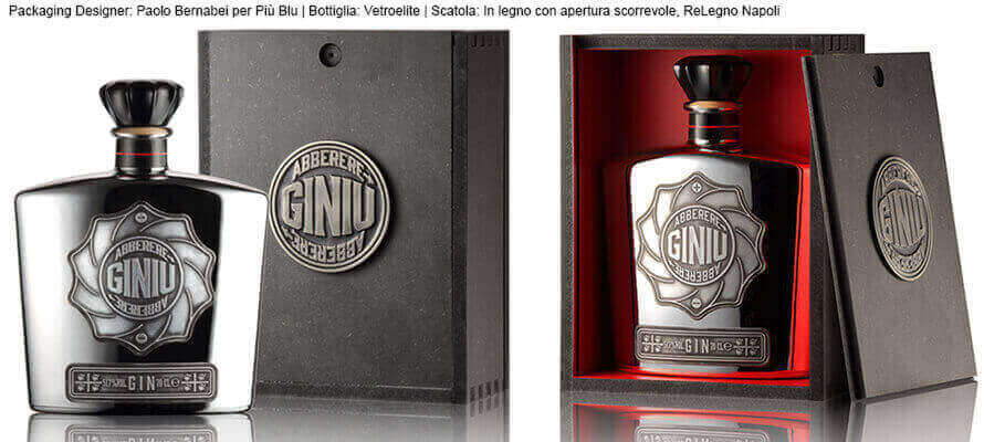
We could go from region to region across the Italian mainland and find dozens of gin producers, but instead, we’ll take a giant leap and land on Sardinia where Distilleria Silvio Carta, after years of testing and in-depth studies, has created Giniu, a gin that wants to tell the story of Sardinia and its scents. Elio Carta, CEO, introduces us to the world of his gin. “For Giniu, we decided to use a unique and highly recognisable bottle, with a clear reference to the packaging of the best French perfumes. The bottle is further enhanced by a cork stopper with a steel top produced by a craftsman in the local forge. Giniu 517 is for the most demanding connoisseur: the bottle, dressed in platinum and glittering, contains the Riserva edition of the top-of-the-range gin from the Silvio Carta distillery. A product of the highest quality, represented by the packaging as much as by the name 517, the identification number of the plot of land in Sardinia where the juniper is harvested at an altitude of over 1,500 metres. So it can be defined as a Cru. And on the elements that contribute to the uniqueness of Giniu, Carta continues, “We decided to screen print the label directly on the glass of the bottle. By choice, the producer’s name does not appear on the front of the bottle but can only be found in the required information on the back. The elements to which more weight has been given are the lettering of the product name and the clear references to its Sardinian origins. Giniu 517 has no label; all the information is engraved directly on the metal.”
The gin unboxing experience
Such special bottles become precious elements that characterise the display in bars and clubs where good drinking becomes inseparable from beauty and an engaging aesthetic experience. These bottles are also signalling aspects of a distinct taste and a very personal lifestyle, so the bottle of gin is becoming the fashion gift. Consequently, creativity is also exerted on the secondary packaging, which enables the delightful unboxing experience. On secondary packaging, Anna Boschi of Bertagnolli says, “Two types of secondary packaging have been developed for our gin: a simple case, which echoes the style and content expressed on the label, and a special tasting pack, containing a bottle and a tumbler screen-printed with the logo and the circular frame in which it is inserted.” Not unlike Bertagnolli, Marco Rivolta, for his RIVO gin, is also thinking of the essential role of secondary packaging, which “gives added value as a gift, or when sold in specialist wine and food shops. The packaging takes up the graphic elements of the label and allows you to deepen and enrich the storytelling already present on the bottle.”
Elio Carta of Distilleria Silvio Carta is even more convinced of the role of the secondary packaging in creating the surprise effect. “Opening the wooden box personalised with the fire-printed design of the Giniu label is a very satisfying experience. Giniu 517, though, is marketed in a precious black wooden box, with the logo engraved on the metal and set into the cap. Furthermore, the inside of the box is painted red to bring out the shine of the platinum even more.”
10/09/2021


