Covers: powerful marketing tools
Not only a case but also a powerful marketing tool. Covers are increasingly often the key to the success of an editorial product – books, magazines, music records, catalogues – especially when, like in e-commerce, we can’t browse the content. So how can we design covers that spark the reader’s interest?
By Lorenzo Capitani | On PRINTlovers #84
Lemon yellow, ink cartridge yellow or, technically, Pantone 108. According to Lucy Feldman of the Wall Street Journal, the majority of covers is this colour. One of the reasons behind this trend is undoubtedly Amazon, which is responsible for about 50% of online book sales and is pushing graphic designers and publisher to use bright colours more and more. This is to ensure that book covers are visible on online platforms, moving away from black and white, which is the most visible contrast to the human eye.
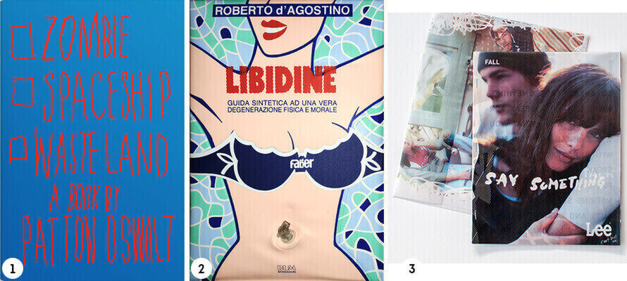
«The digital world transforms objects into icons, – says Feldman – it forces us to give up the third dimension, our sense of touch and sense of smell, and transforms the eye into the only judge». This means that material qualities, like the quality of paper, binding, porosity, and enhancements, have to come to terms with online platforms and formats. Paul Sahre, New York Times graphic designer, agrees: «Amazon is changing the design of book covers, not only in terms of proportions: they have to be legible on all screens, often in very small sizes. In most cases, the details of physical books don’t translate to online space. Take Patton Oswald’s book Zombie Spaceship Wasteland (01): the red text on the blue background is perfect in print, but on a screen, the compression made the colours illegible. It was a mess and completely unexpected. Nowadays, designers need to know about these things too». These observations are valid not only for books but for anything with a cover. Designers must take into consideration all the physical and digital spaces where the product will be seen. Online book shops are full of matt metallic foils, half-bound books with black stripes on the sides, invisible die-cuts and card covers photographed from above, without the joint, so that there are no shadows in the picture.
Sparking an interest
Initially, and for at least three centuries, books were naked. They would be bought without a cover and were bound later depending on the reader’s affluence and taste, as well as their other books. The invention of book covers as we know them today is the result of industrial publishing, which led to many more people reading books and therefore publishers and binders to come up with cheaper solutions. A cover, however, is not only a case but also a powerful communication and marketing tool for books and other printed products alike. The cover frames, attracts inwards, anticipates the content, keeps out the rest of the world. Riccardo Falcinelli, an art director for various publishers, who is working on several papers on this topic, says the cover is «an image that sparks the reader’s interest», that tells a story and «isn’t only a photograph, lettering, a graphic design, a type of package, but the combination of all these things».
According to graphic design handbooks, there are only a few types of book covers, and they all depend on the type of binding. Generally speaking, small staple-bound books will have a simple cover made of a slightly heavier paper, while card covers, with or without dust jackets, are used for glued or sewn soft-binding. Special bindings and covers are variations on the theme and have historical origins, such as Coptic or Japanese binding. These techniques skilfully sew together each part: staple binding and hard-binding are simplifications of these artisanal techniques, which require highly skilled work and which had to make way for the industrialisation of printing. To sew with singer thread, for example, each copy has to be sewn individually with a textile machine. These are fascinating details, and so are enhancements, bold cuts or die-cutting, staggered signature binding, missing spines, visible thread, coloured stitching, and anything else you could possibly imagine. The endless possibilities of bookbinding can turn the very concept of a printed product upside down, as Mondadori did for the first time in 1987, when they created Libidine by Roberto D’Agostino: 20 pages printed on plastic… which were inflatable! (02)
Stitches
Metal staples are an extremely cost-efficient binding method, but they can also be used for printed products with very captivating covers. These are usually a simple paper sheet of a heavier weight to protect the pages on the inside, and they are used for products printed quickly, that are not very durable and are made with lighter and less paper, as staples usually can’t hold more than 96 pages. It is possible to have more pages, but the paper will have to be lighter, the book will be harder to open, and the staple will cut the spine.
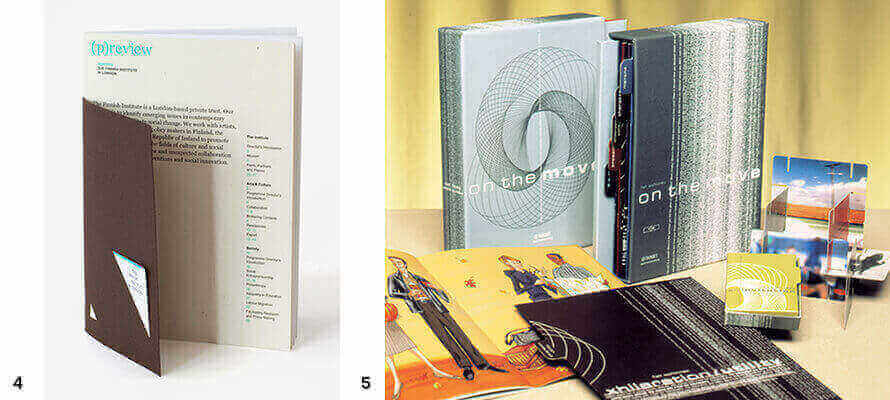
Nonetheless, the cover can be elevated with special materials and coloured threads or by playing with the staples. An example of this is the Lee Jeans catalogue, which has shutter pages and three metal staples on the front panel (03). Or what Studio Emmi did for The Finnish Institute in London: they created two versions of the company profile: a brochure with a cover and smaller business card holder, bound with a metallic staple, and one with a double cover: a card die-cut in the top corner, near the spine, with two cuts to hold business cards, is placed over a second, shorter card, where the index is printed (04). Werner Design Werks created a box containing a series of indexed booklets by die-cutting the cover as it is folded (05).
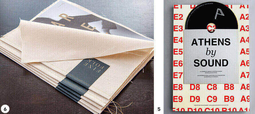
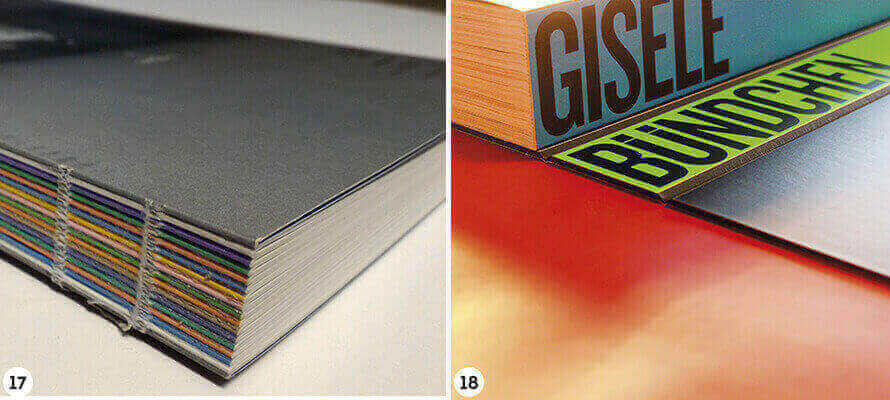
For more elegant solutions, an alternative to the staple is singer thread. Stitching can be on the spine, holding together the signatures, it can be single or double on panels, and it can be used decoratively. It’s a semi-artisanal and relatively slow process. Another example is the work Design Ranch did for the American brand Finefolk: they centred all of their communication around the metaphor of the sewing thread and used Singer thread for all printed products, from envelopes to brochures, which have a fabric cover and use recycled Rolland Enviro paper. (06)
Soft binding
The most popular type of binding is undoubtedly soft-binding, particularly perfect binding. The type of cover and type of binding go hand in hand: the level of automation, even with special or mixed materials (paper and plastics, for example) is always high; milling and different gluing techniques (from vinylic to hot melt to PUR) guarantee durability and make it easy to include other printed products (from sheets of paper and different formats to booklets); there are less weight and thickness limits, and it is a relatively cheap and flexible technique.
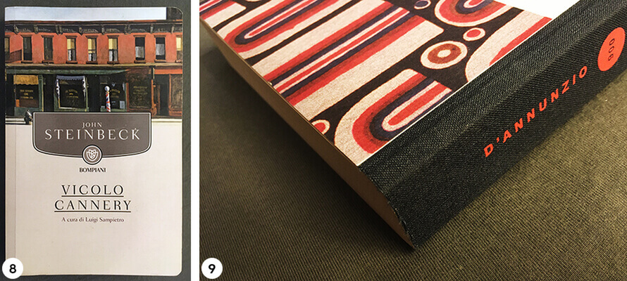
Single sheet signatures and flaps on the front and back panels are very common in both glossy magazines and catalogues. They reinforce the cover, attract the reader’s attention and enable magazines to print wider photographs on the cover and flaps. But there are also less explored possibilities, such as using the front panel as a CD holder: this was done by Company, British designers commissioned by the Greek Ministry of Tourism to design the Athens By Sound catalogue (07). Or the back panel can be closed at the head, opening upwards, using soft-binding techniques. The publishing industry offers some examples: Bompiani has soft-bound book series with rounded corners (08), while Mondadori uses half-bound, raw-cut paperbacks for the “900 Italiano” series (09).
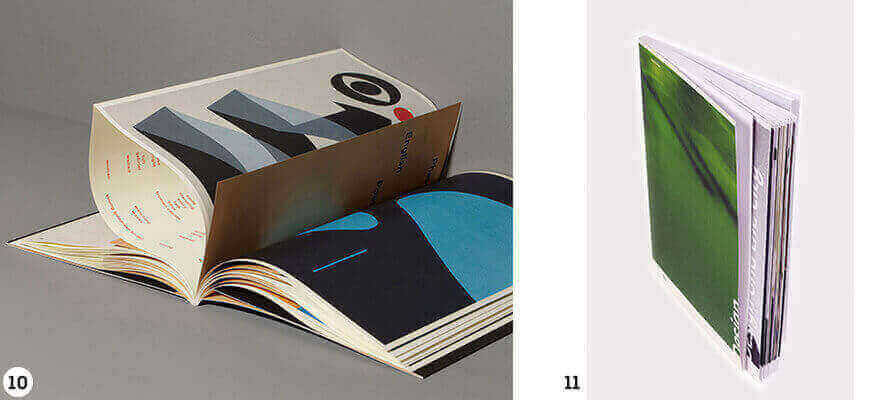
However, it is the French-fold that makes soft-binding impactful. It is a technique also known as Japanese-fold, which consists of gathering, milling and gluing quarters or shutter-folded eighths (depending on the binder) not on the spine side, so on the fold, but on the open edge. The pages will be closed: this may seem counter-intuitive, but the pages on the inside can still be used to engage the reader in a game to discover the content, like in the book An inquiry into meaning and truth created by the Dutch agency Main Studio (10). Gruppo Padovana, similarly, created a book where signatures are French-folded and longer than the rest of the book (11). This technique can be used to recreate the effect of old books, where the reader had to open the pages, by closing the signatures at the head as well. In doing so, however, we need to pay special attention to the weight of the paper and the number of pages, as the volume will be larger on the open side because of the fold, and it could cause an unpleasant fan effect.
Hard binding
Despite what we may think, a hardback is not the noble version of a paperback. Now more than ever, card has permeated the low-end market: the textblock is trimmed and glued, a headband might be added, and the book is ready without any sewing. The effect is the same, the cost is lower, and there is more budget for special effects. After all, the durability of a sewn book might not be necessary. A hard cover consists of a sheet of paper or other material covering two pieces of grey card, bridged by the spine. Usually, the cover material is slightly bigger than the card, so that it can be folded over the card, and the book is held together by endpapers, glued to sheets of paper glued to the inside of the card and the first and last page of the book.
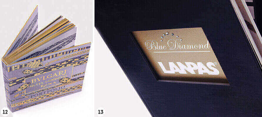
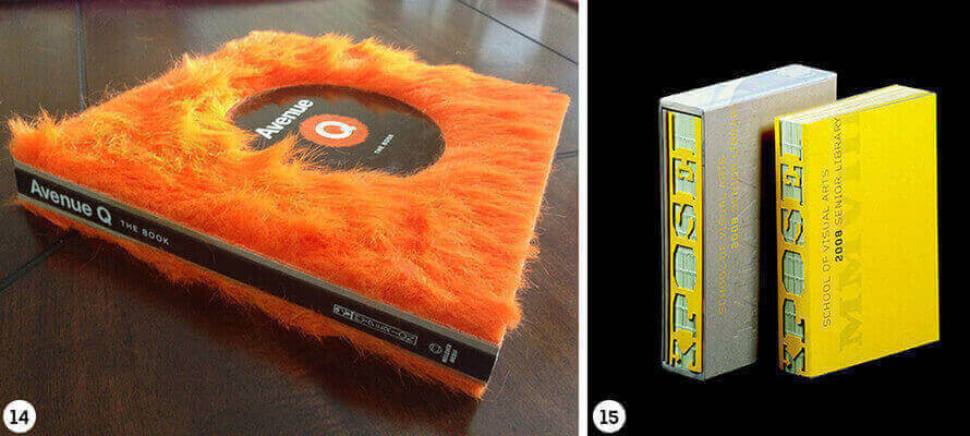
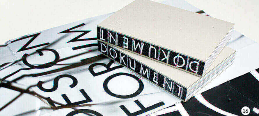
So there’s plenty of elements that can be used to create variations. We can play with materials, for example in half-binding, we can raw cut the entire textblock and not cover the card used for the cover, which doesn’t have to be grey, and highlight the pages by giving them a coloured edge, like in a Bulgari portfolio (12). We can emboss the card, apply an image and die-cut it to show part of the Roman I, like in the Blue Diamond catalogue designed for Lanpas by Gruppo Padovana, which is even embellished with rhinestones (13). We can use a “furry” fabric like in the book on the Avenue Q musical, starring The Muppets (14). We can use the spines: make them round, square or even die-cut them, like in the New York’s School of Visual Arts catalogue, created by the American studio Poulin + Morris (15), or we can make it disappear, showing parts that are usually semi-finished. De-structuring printed products has become a trend, a skilful game for designers and binders.
Visible gluing usually requires stitched binding: signatures are folded, sewn, glued but not cased. The idea is to introduce glue and visible thread in the industrial process, highlighting tactile elements, and making the most of the colours of the paper, the thread or the print. Graphic designer Isolde Fitzel did this for the Dokument publication for the Vienna Design Forum (16). We can even nearly get rid of the cover, like in a book produced by Legatoria Berto, in which signatures and cover cannot be told apart (17).
A visible spine can even be achieved without sewing: after folding, signatures are not milled to achieve a better texture for gluing, but they are cut into individual sheets. These are then glued in a way that creates a flat surface that can be used for printing, stamping or screen-printing. This is the case for the famous Taschen book Gisele Bundchen, which is technically a Swiss hardback with 45° cuts where the textblock is glued to the spine (18). Technical skill can go as far as dos-à-dos biding, where there are three cards and two spines, like in the Bailey+Rankin photography book by the Rankin Photography studio (19).
Variations on a theme
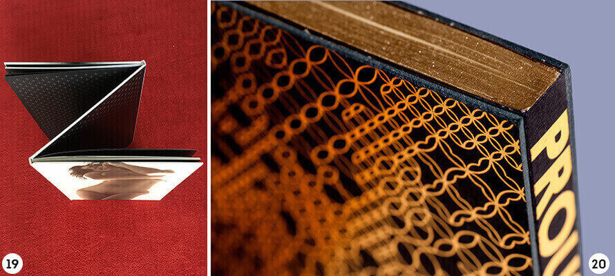
The binding technique which holds the front and back panels and the spine through endpapers on the inside and cover material on the outside is commonly known as ‘Bodoni’ binding. Some very elegant examples are the monograph created for Velux’s 40th anniversary, designed by Elena Ziletti and produced by Intergrafica Verona, or the Saloes de Paris book produced by the Brazilian publisher Carambaia, which brings together 21 essays by Marcel Proust, with black cloth and gold trim (20).
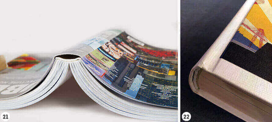
Flexicover soft-binding is unique: the cover is glued to the textblock on the side, while the spine is reinforced with a gauze or strip of paper. This makes the spine of the textblock detached from the spine of the cover. The so-called ‘Dutch’ version is less rigid. The difference lies in the method and material used to make the front and back panels: usually a printed and plasticised paper between 250 and 400 gr/mq, with the edges folded over the card, is used. However, plastic materials can also be used, like in diaries or pocket dictionaries. The cover is attached directly to the textblock, sewn or milled, gluing it to the endpapers. The result is lighter than a hardback, but the cover is equally elegant and perfect for more commercial publications (21).
Covering the cover
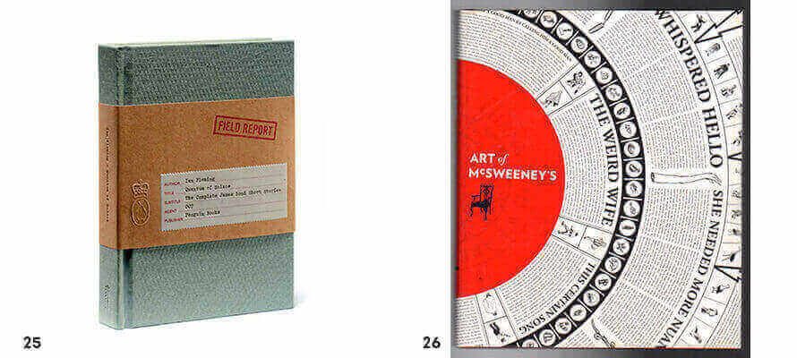
A dust jacket is another way to create added value for a book: it is relatively cheap, has a lot of potential in terms of customisation, and can have communication and marketing purposes as much as protective ones. It was invented at the beginning of the industrialisation of bookbinding, when a dust jacket gave books a more elegant look, while providing enough space for all the information needed to sell the book, specifically the author’s biography and text’s synopsis printed on the flaps. Dust jackets are also widespread with paperbacks, although there are many examples similar to Rizzoli’s non-fiction, which foregoes the dust jacket and prints on the entirety of the card cover, made with Fedrigoni Imitlin paper (22).
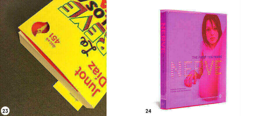
Adelphi, on the other hand, effectively doubles the cover by keeping an internal one in heavier paper, glued to the printed dustjacket. Mondadori ups the game by making the most of the cut: the Oscar 451 collection has a double cover, and the dust jacket is not only die-cut in the front panel, but it also has a flap at the back which functions as a bookmark (23).
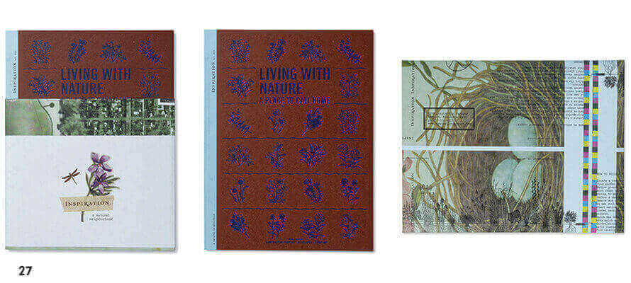
For its 10th anniversary, the online magazine nerve.com published a book covered with see-through, magenta, hot foil stamped vinyl (24). The band around Quantum of Solace, from Penguin’s 007 series, is a playful allusion to MI6 dossiers: it is made of kraft paper, it looks as if the text was written on a typewriter, and the publisher’s logo is stamped (25). Art of McSweeney’s, a commemorative issue of the magazine by the publisher of the same name, made a bold choice: the story begins straight from the dust jacket, which also functions as a poster (26).
Living With Nature is a successful mix of enhancements and creative soft-binding: the signatures are French-folded and printed on natural paper, the cover is printed with three colours and has blue hot foil stamping, and the anti-tear dust jacket, when fully open, becomes a poster (27).
Covers are the great opportunities for creativity. They are the part of a printed product that makes or breaks it. As Chipp Kidd, book designer for Penguin Random House, once said: «Bookshops, even online bookshops, are like clubs: to attract someone’s attention you have 3,5 second at best, so you can choose not to dress up, but you have to accept that you will have no chance of being noticed».
05/03/2021


