Brand design. From gourmet to large-scale distribution
Every design studio aims to find the most effective solution for its clients. But how does the approach change when dealing with a limited selection of products rather than an extensive range? We discussed this with Lettera7 and Doc Design, two studios specialising in brand design in very different fields but with one thing in common: the importance of strategic thinking.
by Roberta Ragona | on PRINTlovers 106
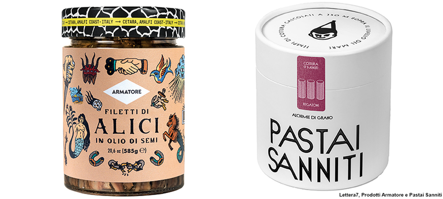
Two design studios, two design approaches that respond to different needs but share a common vision: that of conscious, narrative and structurally sound packaging. Lettera7, a studio based in Vietri sul Mare, explores packaging as a multisensory medium capable of activating brand identity. Doc Design, an agency based in Modena with extensive experience in private label branding, works on complex systems designed to ensure consistency, efficiency and quality throughout the supply chain. Two different pathways that converge in the search for design that works because it is well constructed, even before it is well designed.
Packaging as a sensory experience
Dario Volpe, Creative Director, and Daniele Biancardi, Senior Designer at Lettera7, tell us: “We are a multidisciplinary studio, dealing with various design disciplines ranging from strategy to branding: packaging is one of the ways through which we tell a story that activates the brand. We holistically deal with the project, trying to go beyond the boundaries that have been built around the word design: for example, we are incorporating sound design into our cross-cutting branding work, and in this multisensory perspective, the choice of materials and textures for the packaging is part of the experience. Our idea is always to use the pack as a medium for a story.”
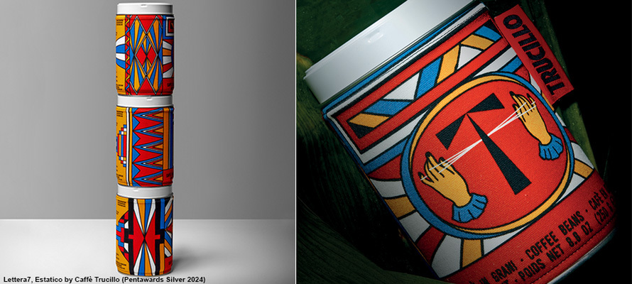
The Trucillo case: telling the story of coffee ecstasy
This approach has earned them numerous awards, such as the packaging created for Trucillo, which won at the 2024 Pentawards. Biancardi explains: “First of all, you need to lay the foundations, so we always start with a brand idea that can be applied to the packaging elements through the materials and graphic treatment. In the case of Trucillo, we found ourselves working with a roaster that makes some of the best ‘research’ coffees: incredible single-origin coffees with enormous knowledge of the raw material. The client requested a special project that could become their flagship, around which to build the rest of the brand story. The amount of inspiration to draw from was enormous because Antonia Trucillo's travels between Honduras and Brazil with the rest of her family were already a world unto themselves. Analysing the product and listening to Antonia's stories, we began to revolve around the word ‘ecstatic’: trying to capture the almost mystical sensation of tasting a coffee that blows you away. We worked starting from the fabric decorations documented during the various trips, which we abstracted and reworked with a personal filter to reproduce the tactile and full-bodied sensation of what could be tasted in the coffee on the fabric sleeve covering the aluminium tin.”
Food design as a cultural expression
The concentrated dimension allows the cultural production dimension expressed in the products to stand out: “There are some products – particularly in the world of food and wine excellence that are an expression of a territory – which, like literature and music, can convey concepts, ideas and emotions: why not food? There is a lot of culture behind some projects.”
Volpe continues: “There are more mass market projects for everyday consumption, so you may not have the time to tell a story: you have to talk about the benefits. However, when the opportunity arises, it is wise to do so because that type of project also elevates all the other product lines that are more for everyday use, but based on the same pursuit of quality. The accompanied purchasing changes how we tell stories on the packaging: if the consumer is alone in front of the shelf, even if they are buying a quality product, they have to rely on what they know and what the packaging tells them. When channels change, what you can tell changes: if I'm tasting coffee, I'm more open and receptive, so time is an integral part of the design work.
Beyond the channel: a solid method for every medium
This search for meaning means keeping the message at the centre, regardless of the medium in which it is expressed: “It is important not to focus on channels as if they were the end and not the means. We don't know what tomorrow holds for the design disciplines, so it is important that the process is solid, and the channels will follow. We try to work like a composer who has a melody, a sound and a structure in their head. Then they understand which instruments to play to strike certain chords. Here, for example, in the relationship between digital and print communication at the moment, it's the same: the important thing is to be credible and focused. Everything should be ‘on life’.”
A fundamental role in this choral process comes at the printing stage: “It is essential to have printing partners with whom you can build a solid relationship when you reach a crucial moment such as prototyping. We started this work by making the cut marks by hand, starting with how the printing press works, designing the die and knowing how it is engineered. It is also important to find local companies with which to develop a participatory prototyping process, because every company has a history of knowledge built on practice.”
Doc Design: rigour and creativity in private labels
But what happens when this attention to detail should be transferred to a field where there are countless references and the number of stakeholders multiplies exponentially? This is the world in which Doc Design operates, a Modena-based agency specialising in brands for the private label (or store brand) sector. This is a sector in which strategic planning is needed to create a structure capable of maintaining quality through countless changes of hands. Fabio Bignardi and Katia Mascia, the agency's founders, explain: “We started working in this field at a time when this type of approach was still virtually unknown in Italy, beginning with a collaboration with XMPR, formerly Michael Peters Retail, one of the European giants in the sector: Italian creativity and Anglo-Saxon rules. Our first clients were the La Rinascente group with UPIM, then the Standa group with two fantasy brands: the era of own brand labelling - white labels and private labels - had not yet begun. From there, we started working for all the major Italian retail chains. This experience showed us a method that is still the basis of what we do today.”
The importance of visual and production consistency
Bignardi explains how their field has a logic that guides how they work on a project: “Strategic thinking consists of three parts: where do I want to go, how do I want to get there, and with what kind of image. Design for large-scale retail is divided into two parts: the first is that of companies, where projects can proceed step by step. On the other hand, signs are managerial, so you have to provide them with a complete project, a solution that can be adapted and managed independently. One of the most complicated components is presenting the project to the client and making them fall in love with it, but all ideas, however extraordinary, must work in the implementation phase.”
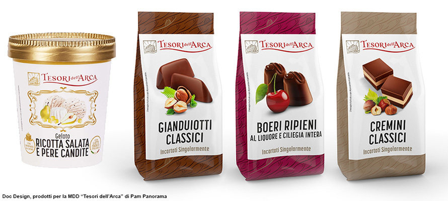
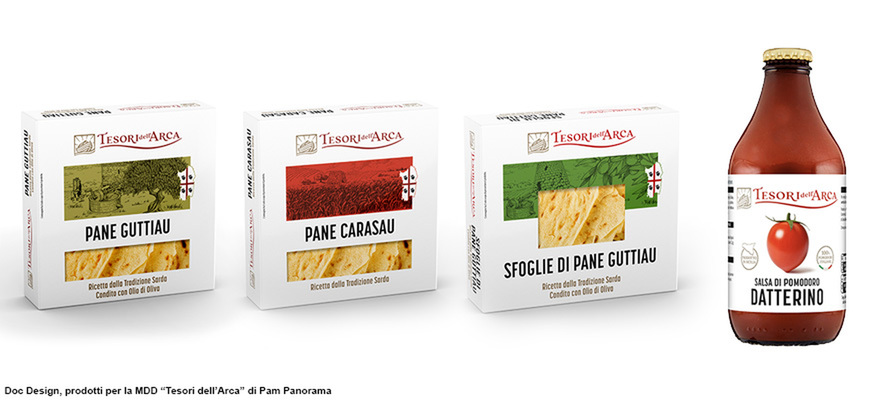
“Another fundamental difference compared to the corporate brand,” continues Bignardi, “is that the company tends to be a single-product company. If it expands into other sectors, it acquires other brands, but its offering remains focused. If, on the other hand, we move to a large-scale retail chain, the range spans from detergents to pasta, and all products must be consistent for the consumer: they must all have the same authority, and this means developing a fully comprehensive project, with any type of printing and materials. It requires in-depth knowledge of the printing systems to be applied to the most varied cases: rotogravure to flexography, pad printing to offset. When you enter a sales point, you can find thousands of branded products, and they must be easily recognisable and coordinated regardless of techniques and materials. It may seem overly analytical, but it allows all the creative work to function convincingly to the consumer. This is the case, for example, with Tesori dell'Arca, PAM's premium line, which we relaunched in 2023 and already has 480 references. Last year, it was selected as one of the best brands at the PLMA (Private Label Manufacturers Association International Trade Show), the most important trade fair in our sector, held in Amsterdam.”
Structure, memory and quality control
Mascia emphasises that one of the agency's roles is that of historical memory: “The number of Tesori dell'Arca references is not unusual: a commercial brand manager has to manage an average of 400 references during the year, i.e. more than one per day. Without a structure that can filter, organise and, above all, record, it would be impossible to manage this volume of work. One of the agency's functions is that of historical memory: customers can access all their past projects through our platform. In this type of company, turnover is very fast, so there is a risk of losing the memory of the project. One of the fundamental issues is the transfer of information, both between different stakeholders and over time. An average project lasts six months, and many things can happen, from changes in packaging to changes in regulations or suppliers.”
Customers should be able to intervene independently on references but with the peace of mind that everything is compliant, as Bignardi points out: “Since 2006, we have enabled our customers to manage projects independently, allowing them to intervene directly on the executives without a change of material or printing supplier causing any interruption. This is also because there is a very delicate aspect in this area involving quality control and regulations. We provide documents that comply with the law and are certifiable, but can be modified. However, when dealing with complex information, it is essential to be able to trace the history of changes to understand where any critical issues may have arisen. In advertising, you can make mistakes and a campaign can go wrong, but on packaging, the company runs serious risks if you don't correctly highlight a piece of information, such as an allergen. Our job is to ensure that this does not happen: when you can focus on the effectiveness and creativity of brand design, it is because everything else is working as it should, without a hitch.”
by Roberta Ragona | on PRINTlovers 106
Two design studios, two design approaches that respond to different needs but share a common vision: that of conscious, narrative and structurally sound packaging. Lettera7, a studio based in Vietri sul Mare, explores packaging as a multisensory medium capable of activating brand identity. Doc Design, an agency based in Modena with extensive experience in private label branding, works on complex systems designed to ensure consistency, efficiency and quality throughout the supply chain. Two different pathways that converge in the search for design that works because it is well constructed, even before it is well designed.
Packaging as a sensory experience
Dario Volpe, Creative Director, and Daniele Biancardi, Senior Designer at Lettera7, tell us: “We are a multidisciplinary studio, dealing with various design disciplines ranging from strategy to branding: packaging is one of the ways through which we tell a story that activates the brand. We holistically deal with the project, trying to go beyond the boundaries that have been built around the word design: for example, we are incorporating sound design into our cross-cutting branding work, and in this multisensory perspective, the choice of materials and textures for the packaging is part of the experience. Our idea is always to use the pack as a medium for a story.”
The Trucillo case: telling the story of coffee ecstasy
This approach has earned them numerous awards, such as the packaging created for Trucillo, which won at the 2024 Pentawards. Biancardi explains: “First of all, you need to lay the foundations, so we always start with a brand idea that can be applied to the packaging elements through the materials and graphic treatment. In the case of Trucillo, we found ourselves working with a roaster that makes some of the best ‘research’ coffees: incredible single-origin coffees with enormous knowledge of the raw material. The client requested a special project that could become their flagship, around which to build the rest of the brand story. The amount of inspiration to draw from was enormous because Antonia Trucillo's travels between Honduras and Brazil with the rest of her family were already a world unto themselves. Analysing the product and listening to Antonia's stories, we began to revolve around the word ‘ecstatic’: trying to capture the almost mystical sensation of tasting a coffee that blows you away. We worked starting from the fabric decorations documented during the various trips, which we abstracted and reworked with a personal filter to reproduce the tactile and full-bodied sensation of what could be tasted in the coffee on the fabric sleeve covering the aluminium tin.”
Food design as a cultural expression
The concentrated dimension allows the cultural production dimension expressed in the products to stand out: “There are some products – particularly in the world of food and wine excellence that are an expression of a territory – which, like literature and music, can convey concepts, ideas and emotions: why not food? There is a lot of culture behind some projects.”
Volpe continues: “There are more mass market projects for everyday consumption, so you may not have the time to tell a story: you have to talk about the benefits. However, when the opportunity arises, it is wise to do so because that type of project also elevates all the other product lines that are more for everyday use, but based on the same pursuit of quality. The accompanied purchasing changes how we tell stories on the packaging: if the consumer is alone in front of the shelf, even if they are buying a quality product, they have to rely on what they know and what the packaging tells them. When channels change, what you can tell changes: if I'm tasting coffee, I'm more open and receptive, so time is an integral part of the design work.
Beyond the channel: a solid method for every medium
This search for meaning means keeping the message at the centre, regardless of the medium in which it is expressed: “It is important not to focus on channels as if they were the end and not the means. We don't know what tomorrow holds for the design disciplines, so it is important that the process is solid, and the channels will follow. We try to work like a composer who has a melody, a sound and a structure in their head. Then they understand which instruments to play to strike certain chords. Here, for example, in the relationship between digital and print communication at the moment, it's the same: the important thing is to be credible and focused. Everything should be ‘on life’.”
A fundamental role in this choral process comes at the printing stage: “It is essential to have printing partners with whom you can build a solid relationship when you reach a crucial moment such as prototyping. We started this work by making the cut marks by hand, starting with how the printing press works, designing the die and knowing how it is engineered. It is also important to find local companies with which to develop a participatory prototyping process, because every company has a history of knowledge built on practice.”
Doc Design: rigour and creativity in private labels
But what happens when this attention to detail should be transferred to a field where there are countless references and the number of stakeholders multiplies exponentially? This is the world in which Doc Design operates, a Modena-based agency specialising in brands for the private label (or store brand) sector. This is a sector in which strategic planning is needed to create a structure capable of maintaining quality through countless changes of hands. Fabio Bignardi and Katia Mascia, the agency's founders, explain: “We started working in this field at a time when this type of approach was still virtually unknown in Italy, beginning with a collaboration with XMPR, formerly Michael Peters Retail, one of the European giants in the sector: Italian creativity and Anglo-Saxon rules. Our first clients were the La Rinascente group with UPIM, then the Standa group with two fantasy brands: the era of own brand labelling - white labels and private labels - had not yet begun. From there, we started working for all the major Italian retail chains. This experience showed us a method that is still the basis of what we do today.”
The importance of visual and production consistency
Bignardi explains how their field has a logic that guides how they work on a project: “Strategic thinking consists of three parts: where do I want to go, how do I want to get there, and with what kind of image. Design for large-scale retail is divided into two parts: the first is that of companies, where projects can proceed step by step. On the other hand, signs are managerial, so you have to provide them with a complete project, a solution that can be adapted and managed independently. One of the most complicated components is presenting the project to the client and making them fall in love with it, but all ideas, however extraordinary, must work in the implementation phase.”
“Another fundamental difference compared to the corporate brand,” continues Bignardi, “is that the company tends to be a single-product company. If it expands into other sectors, it acquires other brands, but its offering remains focused. If, on the other hand, we move to a large-scale retail chain, the range spans from detergents to pasta, and all products must be consistent for the consumer: they must all have the same authority, and this means developing a fully comprehensive project, with any type of printing and materials. It requires in-depth knowledge of the printing systems to be applied to the most varied cases: rotogravure to flexography, pad printing to offset. When you enter a sales point, you can find thousands of branded products, and they must be easily recognisable and coordinated regardless of techniques and materials. It may seem overly analytical, but it allows all the creative work to function convincingly to the consumer. This is the case, for example, with Tesori dell'Arca, PAM's premium line, which we relaunched in 2023 and already has 480 references. Last year, it was selected as one of the best brands at the PLMA (Private Label Manufacturers Association International Trade Show), the most important trade fair in our sector, held in Amsterdam.”
Structure, memory and quality control
Mascia emphasises that one of the agency's roles is that of historical memory: “The number of Tesori dell'Arca references is not unusual: a commercial brand manager has to manage an average of 400 references during the year, i.e. more than one per day. Without a structure that can filter, organise and, above all, record, it would be impossible to manage this volume of work. One of the agency's functions is that of historical memory: customers can access all their past projects through our platform. In this type of company, turnover is very fast, so there is a risk of losing the memory of the project. One of the fundamental issues is the transfer of information, both between different stakeholders and over time. An average project lasts six months, and many things can happen, from changes in packaging to changes in regulations or suppliers.”
Customers should be able to intervene independently on references but with the peace of mind that everything is compliant, as Bignardi points out: “Since 2006, we have enabled our customers to manage projects independently, allowing them to intervene directly on the executives without a change of material or printing supplier causing any interruption. This is also because there is a very delicate aspect in this area involving quality control and regulations. We provide documents that comply with the law and are certifiable, but can be modified. However, when dealing with complex information, it is essential to be able to trace the history of changes to understand where any critical issues may have arisen. In advertising, you can make mistakes and a campaign can go wrong, but on packaging, the company runs serious risks if you don't correctly highlight a piece of information, such as an allergen. Our job is to ensure that this does not happen: when you can focus on the effectiveness and creativity of brand design, it is because everything else is working as it should, without a hitch.”
04/07/2025


