Eco-cleaning revolution
To the cry of “just add water!” more and more household care products are appearing on the shelves in solid, powder or concentrated form. New formulations that are light to carry and have a low environmental impact require new communication codes, new approaches to distribution and packaging that respond to eco-design principles.
By Roberta Ragona | On PRINTlovers #90
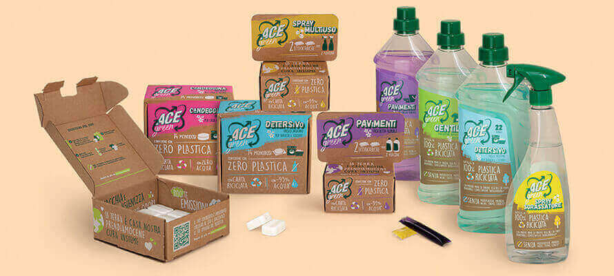
It is a gradual but unstoppable revolution that goes hand in hand with the one taking place in cosmetics, with which it shares communication codes and has an aesthetic dialogue. It allows companies to optimise the logistics chain by having to move only the concentrated active ingredients and not the weight of water, it is advantageous for consumers in terms of convenience, and last but not least, it is good for the environment. Eco-cleaning is a scenario that includes different players. There are the big brands that have always been present in large-scale distribution - such as ACE, a giant that recently launched its own green line with the creativity of the DLVBBDO agency. Then there are brands built over time around conscious consumption experiences - such as Officina Naturae and Bioermi di Allegro Natura. And there are also digital-first products created directly with subscription boxes and direct-to-consumer, such as R5. Each of these contexts brings design challenges and different ways of communicating with consumers that impact packaging choices. According to the latest Istituto Italiano Imballaggio (Italian Institute of Packaging) analysis of the household cleaning sector, plastic packaging - both rigid and flexible - will continue to dominate the landscape in 2020, providing 94% of the packaging for household cleaning products. However, this also includes biodegradable plastic packaging, which is growing steadily and is currently used mainly in concentrated refills for detergents and accounts for 1.5% of the total. The remaining 6% consists of 4% paper and cardboard boxes - used primarily for powder products and tabs - 1.5% metal containers, and the remaining 0.3% paper-based rigid laminated containers. But what are the criteria to be taken into account when developing these new formats?
Each formulation has its own material
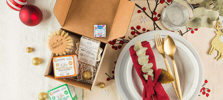
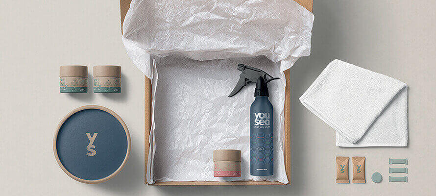
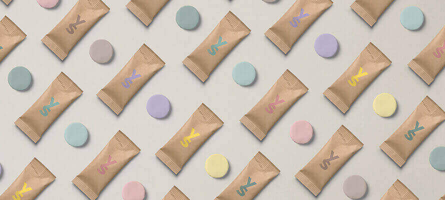
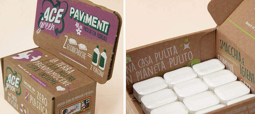
Antonella Manenti, Art Director of HENRY & CO., the firm specialising in sustainable design that created Yousea’s packaging, explains that “acidity is a key issue in-home care, even more so than in cosmetics. All packaging must take this into account, especially when we have concentrated active ingredients. Another factor is the frequency of use of the product, so we can think about packaging degradation times based on preservation requirements, taking advantage of the characteristics of bioplastics. The other aspect, says Gianluca Carone, Senior graphic designer at DLVBBDO who created the ACE Green identity, is moisture resistance. “Not only for powders but also for liquid and solid concentrates, moisture is a relevant factor: it is essential to use materials with barrier capacity. Obviously, the new packaging must guarantee the same resistance to water-attack and protection from sunlight as traditional packaging, so we have preferred sealed packaging without large openings to the outside. We have chosen packaging made of planar flexographic printing, which is then die-cut, set up in paper converting and finished by offset printing.” Eco-design principles are an essential guide in the design of packs in terms of both materials and shapes, as Pierluca Urbinati, one of the two founders of Officina Naturae. This Rimini-based company has created special flat-shouldered bottles for its products to reduce the amount of air transported as much as possible and make full use of pallet space, all using a bioplastic derived from sugar cane waste since 2014.
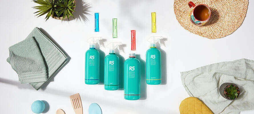
R5, a company from Bergamo that produces sustainable detergents and cosmetics made entirely in Italy, has chosen a special packaging for its refills made of polyvinyl alcohol (PVA). This water-soluble synthetic polymer is biodegradable and does not release toxic substances. The PVA film contains the concentrate but does not need to be disposed of, as it dissolves in water inside the detergent bottle. The refill set is contained in a recycled cardboard grid pack. For the supply of the adhesive labels, R5 works with a supplier who guarantees a chemical-free printing process, water-based varnishes, reduced water consumption during printing, and FSC certified recycled paper. Plastic is still a valuable ally in concentrated products, and Cristina Mollis, founder of R5, talks about “smart plastic”: the principle is to use plastic only where it is needed, favouring PET, which in the lifecycle assessment of materials was found to be the best both from a chemical point of view in preserving the product from degradation and in terms of end-of-life disposal.
Valuable design and conscious luxury
Recent years have brought an evolution in formulations and in-home care design. It’s a path opened up by brands working on both cosmetics and home care, who constantly listen to the desires of an attentive public. Antonella Manenti calls it “conscious luxury”. “These are objects with a strong component of consumption value: they make people feel part of a community, they have an aesthetic component that makes them suitable for lasting over time. The longevity of the packaging corresponds to the time it takes the consumer to make informed choices, an investment that pays off in the long run.”
However, the quest for minimalism cannot forget its duty to inform and educate the consumer, as the case of Allegro Natura demonstrates. Cristina Gerbino, Senior Marketing Manager of the Piedmont-based company specialising in eco-bio cosmetics and detergents, tells us how a flexible solution has been created for its Bioermi range. The super-concentrates are sold in small dark glass bottles and contain a reference label inside. The consumer can choose whether to decant the vial into the special 500 ml screen-printed glass bottle or use another container with the label attached and thus have all the usage and safety information at hand. The idea of the screen-printed glass bottle is to take detergent products from under to over the sink, with packaging that is as aesthetically pleasing as it is sustainable and protects the product from light and oxidation. In the case of Officina Naturae, the dialogue between cosmetics and homecare started with cleaning products and then moved on to body care. Consistency of language becomes fundamental to address an informed target that tends to have very strong internal loyalty, i.e. it knows the brand for a particular product and, if the experience is positive, tends to explore and move on to the brand’s other offerings. This loyalty is created by product formulations and reinforced by consistent communication. But communication codes also change according to the audience, and when the audience is all Italian families, the design must be effective and straight to the point. The work done by ACE with DLVBBDO for the launch of its ACE Green line is emblematic in this sense. “Starting with the materials - cardboard and 100% recycled plastic - right through to the graphics and vocabulary, we chose to use clear, essential language that educates the consumer about the benefits of the product for their home and in environmental terms, and can make them understand the commitment to making products with less impact for the same level of effectiveness,” says Gianluca Carone of DLVBBDO. “The main sales channels are the large-scale retail trade and drugstores: both in terms of brand identity and sales channels, ACE is aimed at all Italian families. At the moment, according to Ipsos data, only 18% of consumers are willing to choose companies that are committed to the circular economy if this means higher prices: this is why ACE Green has decided to work on performance and sustainability while keeping prices in line with the brand.”
Distribution does the packaging
The different sales channels are a factor that impacts directly or indirectly on design choices. In large-scale distribution, the packaging must “speak for itself” and be self-sufficient in its product communication. At the same time, for brands present in specialised shops such as small chains, herbalist shops, and bio-perfumeries such as Officina Naturae and Allegro Natura, the one-to-one relationship between customer and retailer is fundamental in educating people about the use and advantages of products with which they are less familiar. This is why there is plenty of room for more experimental design choices.
In the case of R5, on the other hand, which started as a product with digital as its main sales channel, the subscription box is a fundamental tool that will be extended to the entire product range. A choice based on numbers: 30% of the brand’s buyers are subscribers, and the rate of return buyers on the site is 40% of the total.
What is the fate of physical shops in this scenario, and what consequences does it have for packaging? According to Antonella Manenti, the future of the large-scale retail trade is to become a collection point where people can stock up and dispose of used packaging. From a design point of view, the trend is more and more towards single-use materials, reducing or eliminating the use of glues and, where couplings are necessary, simplifying separation at the time of disposal (for example, glass with a plastic label because it is easier to remove and dispose of than classic glued paper labels). With a view to efficiency and reducing waste, Pierluca Urbinati of Officina Naturae points out that we are increasingly moving in the direction of concentrated products, which guarantee maximum effectiveness of the active ingredients with minimum product waste, taking advantage of the possibilities of compostable or soluble packaging that allow to be packaged without overpackaging. The movement is increasingly towards the point where the detergent shelf is no longer an unavoidable necessity to be hidden under the sink but an integral part of the home landscape, as functional as it is beautiful to look at.
11/03/2022


